AUGUST 2015 URBAN MOBILITY. Scorecard
|
|
|
- Joy Jodie Harrison
- 6 years ago
- Views:
Transcription


1 AUGUST URBAN MOBILITY Scorecard
2
3 2015 URBAN MOBILITY SCORECARD Published jointly by The Texas A&M Transportation Institute and INRIX David Schrank Research Scientist Bill Eisele Senior Research Engineer Tim Lomax Research Fellow And Jim Bak Research Analyst Texas A&M Transportation Institute The Texas A&M University System mobility.tamu.edu INRIX, Inc. inrix.com August 2015
4 DISCLAIMER The contents of this report reflect the views of the authors, who are responsible for the facts and the accuracy of the information presented herein. Acknowledgements Shawn Turner, David Ellis and Phil Lasley Concept and Methodology Development Michelle Young, Lauren Simcic and Cheyenne McWilliams Report Preparation Lauren Geng and Jian Shen GIS Assistance Tobey Lindsey Web Page Creation and Maintenance Richard Cole, Bernie Fette, Michelle Hoelscher and Rick Davenport Media Relations John Henry Cover Artwork Dolores Hott and Nancy Pippin Printing and Distribution Rick Schuman and Myca Craven of INRIX Technical Support and Media Relations 2015 Urban Mobility Scorecard ii
5 Table of Contents 2015 Urban Mobility Scorecard... 1 Turning Congestion Data Into Insight... 3 One Page of Congestion Problems... 5 More Detail About Congestion Problems... 6 The Trouble With Planning Your Trip...10 The Future of Congestion...11 Congestion Relief An Overview of the Strategies...12 Analysis Using the Best Congestion Data & Analysis Methodologies...14 National Performance Measurement...15 Concluding Thoughts...17 References...39 Page 2015 Urban Mobility Scorecard iii
6
7 2015 Urban Mobility Scorecard The national congestion recession is over. Urban areas of all sizes are experiencing the challenges seen in the early 2000s population, jobs and therefore congestion are increasing. The U.S. economy has regained nearly all of the 9 million jobs lost during the recession and the total congestion problem is larger than the pre-recession levels. For the report and congestion data on your city, see: The data from 1982 to 2014 (see Exhibit 1) show that, short of major economic problems, congestion will continue to increase if projects, programs and policies are not expanded. The problem is very large. In 2014, congestion caused urban Americans to travel an extra 6.9 billion hours and purchase an extra 3.1 billion gallons of fuel for a congestion cost of $160 billion. Trucks account for $28 billion (17 percent) of that cost, much more than their 7 percent of traffic. From 2013 to 2014, 95 of America s 100 largest metro areas saw increased traffic congestion, from 2012 to 2013 only 61 cities experienced increases. In order to reliably arrive on time for important freeway trips, travelers had to allow 48 minutes to make a trip that takes 20 minutes in light traffic. Employment was up by more than 500,000 jobs from 2013 to 2014 (1); if transportation investment continues to lag, congestion will get worse. Exhibit 2 shows the historical national congestion trend. More detailed speed data on more roads and more hours of the day from INRIX (2) a leading private sector provider of travel time information for travelers and shippers, have caused congestion estimates in most urban areas to be higher than in previous Urban Mobility Scorecards. The best mobility improvement programs involve a mix of strategies adding capacity of all kinds, operating the system to get the best bang for the buck, travel and work schedule options and encouraging homes and jobs to be closer. This involves everyone - agencies, businesses, manufacturers, commuters and travelers. Each region should use the combination of strategies that match its goals and vision. The recovery from economic recession has proven that the problem will not solve itself. Exhibit 1. Major Findings of the 2015 Urban Mobility Scorecard (471 U.S. Urban Areas) (Note: See page 2 for description of changes since the 2012 report) Measures of Individual Congestion Yearly delay per auto commuter (hours) Travel Time Index Planning Time Index (Freeway only) Wasted" fuel per auto commuter (gallons) Congestion cost per auto commuter (2014 $) $400 $810 $930 $950 $960 The Nation s Congestion Problem Travel delay (billion hours) Wasted fuel (billion gallons) Truck congestion cost (billions of 2014 dollars) $28 Congestion cost (billions of 2014 dollars) $42 $114 $149 $156 $160 Yearly delay per auto commuter The extra time spent during the year traveling at congested speeds rather than free-flow speeds by private vehicle drivers and passengers who typically travel in the peak periods. Travel Time Index (TTI) The ratio of travel time in the peak period to travel time at free-flow conditions. A Travel Time Index of 1.30 indicates a 20-minute free-flow trip takes 26 minutes in the peak period. Planning Time Index (PTI) The ratio of travel time on the worst day of the month to travel time in free-flow conditions. Wasted fuel Extra fuel consumed during congested travel. Congestion cost The yearly value of delay time and wasted fuel by all vehicles. Truck congestion cost - The yearly value of operating time and wasted fuel for commercial trucks Urban Mobility Scorecard 1
8 Year Travel Time Index Exhibit 2. National Congestion Measures, 1982 to 2014 Delay Per Commuter (Hours) Total Delay (Billion Hours) Fuel Wasted (Billion Gallons) Total Cost (Billions of 2014 Dollars) $ $ $ $ $ $ $ $ $ $ $ $ $ $ $ $ $ $ $ $ $ $ $ $ $ $ $ $ $ $ $ $ $42 Notes: See Exhibit 1 for explanation of measures. For more congestion information and for congestion information on your city, see Tables 1 to 4 and Urban Mobility Scorecard 2
9 Turning Congestion Data Into Insight (And the New Data Providing a More Accurate View) The 2015 Urban Mobility Scorecard is the 4 th that TTI and INRIX (2) have prepared. The data behind the 2015 Urban Mobility Scorecard are hundreds of speed data points on almost every mile of major road in urban America for almost every 15-minute period of the average day of the week. For the congestion analyst, this means 900 million speeds on 1.3 million miles of U.S. streets and highways an awesome amount of information. For the policy analyst and transportation planner, this means congestion problems can be described in detail, and solutions can be targeted with much greater specificity and accuracy. Key aspects of the 2015 Urban Mobility Scorecard are summarized below. Congestion estimates are presented for each of the 471 U.S. urban areas. Improvements in the INRIX traffic speed data and the data provided by the states to the Federal Highway Administration (3) means that for the first time the Urban Mobility Scorecard can provide an estimate of the congestion effects on residents of every urban area. See Table 4 for a few 2014 congestion measures in each of the 370 urban areas that have not been intensively studied. Speeds collected by INRIX every 15 minutes from a variety of sources every day of the year on almost every major road are used in the study. The data for all minute periods of the day makes it possible to track congestion problems for the midday, overnight and weekend time periods. For more information about INRIX, go to This data improvement created significant difference in congestion estimates compared with past Reports/Scorecards more congestion overall, a higher percentage of congestion on streets and different congestion estimates for many urban areas. As has been our practice, past measure values were revised to provide our best estimate of congestion trends. More detail is provided on truck travel and congestion. Estimates of truck volume during the day were developed (in past reports, trucks were assumed to have the same patterns as cars travel). This changed delay and fuel estimates in different ways for several cities. The measure of the variation in travel time from day-to-day now uses a more representative tripbased process (4) rather than the old dataset that used individual road links. The Planning Time Index (PTI) is based on the idea that travelers want to be on-time for an important trip 19 out of 20 times; so one would be late to work only one day per month (on-time for 19 out of 20 work days each month). For example, a PTI value of 1.80 indicates that a traveler should allow 36 minutes to make an important trip that takes 20 minutes in low traffic volumes. The new values are lower, and closer to real-world experience. Many of the slow speeds that were formerly considered too slow to be a valid observation are now being retained in the INRIX dataset. Experience and increased travel speed sample sizes have increased the confidence in the data. Where speed estimates are required, the estimation process is benefitting from the increased number of speeds in the dataset. The methodology is described on the mobility study website (5). More information on the performance measures and data can be found at: Urban Mobility Scorecard 3
10
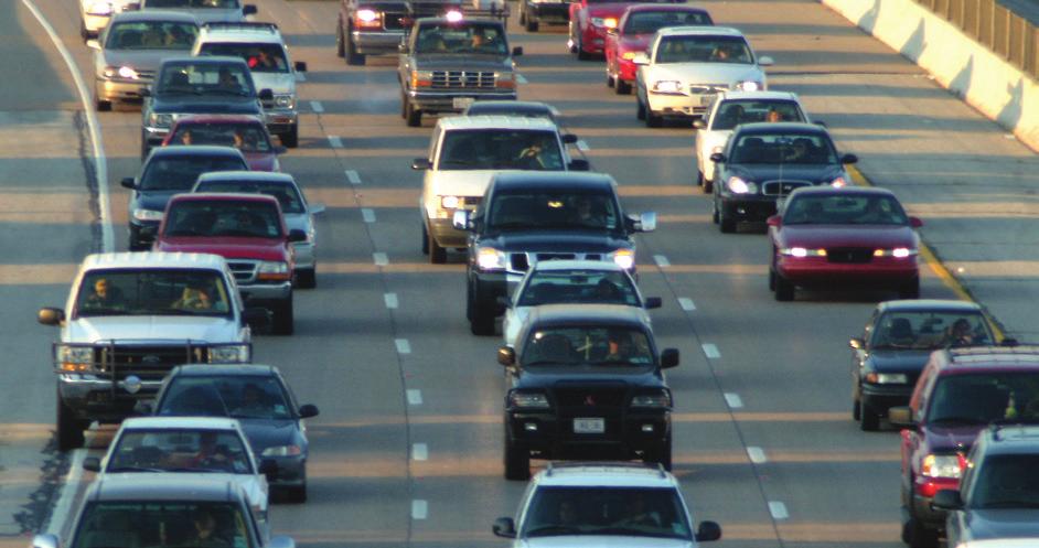
11 One Page of Congestion Problems In the biggest regions and most congested corridors, traffic jams can occur at any hour, weekdays or weekends. The problems that travelers and shippers face include extra travel time, extra cost from wasted fuel and lost productivity and increasing unreliability where bad weather, roadwork, a malfunctioning traffic signal, a local event or a small accident or stalled vehicle can result in major delays. Some key measures are listed below. See data for your city at Congestion costs are increasing. The congestion invoice for the cost of extra time and fuel in the 471 U.S. urban areas was (all values in constant 2014 dollars): In 2014 $160 billion In 2000 $114 billion In 1982 $42 billion Congestion wastes a massive amount of time, fuel and money. In 2014: 6.9 billion hours of extra time (more than the time it would take to drive to Pluto and back, if there was a road). 3.1 billion gallons of wasted fuel (more than 90 minutes worth of flow in the Missouri River). and if all that isn t bad enough, folks making important trips had to plan for nearly 2 ½ times as much travel time as in light traffic conditions in order to account for the effects of unexpected crashes, bad weather, special events and other irregular congestion causes. Congestion is also a type of tax $160 billion of delay and fuel cost (the negative effect of uncertain or longer delivery times, missed meetings, business relocations and other congestion-related effects are not included) (equivalent to the lost productivity, clinic visit and medication costs for 53 million cases of poison ivy). 18 percent ($28 billion) of the delay cost was the effect of congestion on truck operations; this does not include any value for the goods being transported in the trucks. The cost to the average auto commuter was $960 in 2014 compared to an inflation-adjusted $400 in Congestion affects people who travel during the peak period. The average auto commuter: Spent an extra 42 hours traveling in 2014 up from 18 hours in Wasted 19 gallons of fuel in 2014 a week s worth of fuel for the average U.S. driver up from 4 gallons in In areas with over one million persons, 2014 auto commuters experienced: o an average of 63 hours of extra travel time o a road network that was congested for 6 hours of the average weekday o had a congestion tax of $1,440 Congestion is also a problem at other hours. Approximately 41 percent of total delay occurs in the midday and overnight (outside of the peak hours) times of day when travelers and shippers expect free-flow travel. Many manufacturing processes depend on a free-flow trip for efficient production and congested networks interfere with those operations Urban Mobility Scorecard 5

12 More Detail About Congestion Problems Congestion, by every measure, has increased substantially over the 33 years covered in this report. And almost every area has recovered from the economic recession; almost all regions have worse congestion than before the 2008 crash. Traffic problems as measured by per-commuter measures are about the same as a decade ago, but because there are so many more commuters, and more congestion during off-peak hours, total delay has increased by almost one billion hours. The total congestion cost has also risen with more wasted hours, greater fuel consumption and more trucks stuck in stop-and-go traffic. Immediate solutions and long-term plans are needed to reduce undesirable congestion. The recession reduced construction costs, or at least slowed their growth. Urban areas and states can still take advantage of this situation but each area must craft a set of programs, policies and projects that are supported by their communities. This mix will be different in every city, but all of them can be informed by data and trend information. Congestion is worse in areas of every size it is not just a big city problem. The growing delays also hit residents of smaller cities (Exhibit 3). Big towns and small cities have congestion problems every economy is different and smaller regions often count on good mobility as a quality-of-life aspect that allows them to compete with larger, more economically diverse regions. As the national economy improves, it is important to develop the consensus on action steps -- major projects, programs and funding efforts take 10 to 15 years to develop. Exhibit 3. Congestion Growth Trend Hours of Delay per Auto Commuter Small = less than 500,000 Medium = 500,000 to 1 million Large = 1 million to 3 million Very Large = more than 3 million 2015 Urban Mobility Scorecard 6
. Midday hours comprise a significant share of the congestion problem. Exhibit 4.")
13 Congestion Patterns Congestion builds through the week from Monday to Friday. The two weekend days have less delay than any weekday (Exhibit 4). Congestion is worse in the evening, but it can be a problem during any daylight hour (Exhibit 5). Midday hours comprise a significant share of the congestion problem. Exhibit 4. Percent of Delay for Each Day Exhibit 5. Percent of Delay for Hours of Day 20% 16% 12% 8% 4% 0% Mon Tue Wed Thu Fri Sat Sun 12% 10% 8% 6% 4% 2% 0% Mid 6A Noon 6P Mid Congestion on Freeways and Streets Streets have more delay than freeways, but there are also many more miles of streets (Exhibit 6). Approximately 40 percent of delay occurs in off-peak hours. Freeway delay is much less of the problem in areas under 1 million population. Off Peak Streets 29% Peak Streets 32% Exhibit 6. Percent of Delay - Road Type and Time of Day Peak Freeways 29% Off Peak Freeways 10% Peak Freeways 10% Off Peak Streets 41% Peak Streets 43% Off Peak Freeways 6% Urban Areas Over 1M Population Urban Areas Under 1M Population 2015 Urban Mobility Scorecard 7
. Exhibit 7.")

14 Rush Hour Congestion Severe and extreme congestion levels affected only 1 in 9 trips in 1982, but 1 in 4 trips in The most congested sections of road account for 80% of peak period delays, but only have 26% of the travel (Exhibit 7). Exhibit 7. Peak Period Congestion in 2014 About 26% of trips are in severe congestion.. Severe 12% Extreme 14% Heavy 14% Moderate 20% Uncongested 18% Light 22% but those worst trips experience 80% of the extra travel time. Light 2% Extreme 63% Heavy 11% Severe 17% Moderate 7% Truck Congestion Trucks account for 18 percent of the urban congestion invoice although they only represent 7 percent of urban travel (Exhibit 8). The costs in Exhibit 8 do not include the extra costs borne by private companies who build additional distribution centers, buy more trucks and build more satellite office centers to allow them to overcome the problems caused by a congested and inefficient transportation network. Exhibit Congestion Cost for Urban Passenger and Freight Vehicles Travel by Vehicle Type Truck 7% Congestion Cost by Vehicle Type Truck 18% Passenger Vehicle 93% Passenger Vehicle 82% 2015 Urban Mobility Scorecard 8
 While this is associated with a good thing -- economic and population growth in our major metro areas it is also clear this growth is outpacing the investment in infrastructure and")

15 Since the Congestion Decline During the Recession. American motorists are enduring about 5 percent more delay than the pre-recession peak in (Exhibit 2) While this is associated with a good thing -- economic and population growth in our major metro areas it is also clear this growth is outpacing the investment in infrastructure and programs to address the increased demand on the network. Cities with employment and population growth faster than the national averages also experienced some of the biggest increases in traffic congestion. Cities that showed little to no change in traffic congestion were also those where employment and population growth was slower than the national average 53 of the 101 urban areas saw the total urban area delay exceed the pre-recession levels within 3 years; an immediate snapback was seen in more than one-quarter of the studied regions. 22 areas still have lower total annual delay than in 2007/8. (Exhibit 9) In contrast to total delay, average auto commuter delay is still less than pre-recession levels in 60 areas Commuters in 16 areas saw the rapid snapback - hours per commuter exceeding the 2007/8 values in 3 or fewer years. (Exhibit 8) Exhibit 9. Number of Years Before Congestion Returned to Pre-Recession Levels Total Urban Area Delay Delay Per Urban Auto Commuter (1) 6 or 7 Years Not Yet Recovered (22 Areas) (25) 4 or 5 Years (28 Areas) Zero or 1 Year (25) 2 or 3 Years Not Yet Recovered (60 Urban Areas) (10) 2 or 3 Years (16) 4 or 5 Years (6 Areas) Zero or 1 Year (9) 6 or 7 Years 2015 Urban Mobility Scorecard 9


16 The Trouble With Planning Your Trip We ve all made urgent trips catching an airplane, getting to a medical appointment, or picking up a child at daycare on time. We know we need to leave a little early to make sure we are not late for these important trips, and we understand that these trips will take longer during the rush hour. The need to add extra time isn t just a rush hour consideration. Trips during the off-peak can also take longer than expected. If we have to catch an airplane at 1 p.m., we might still be inclined to add a little extra time, and the data indicate that our intuition is correct. Exhibit 10 illustrates this problem. Say your typical trip takes 20 minutes when there are few other cars on the road. That is represented by the green bar across the morning, midday, and evening. Your trip usually takes longer, on average, whether that trip is in the morning, midday, or evening. This average trip time is shown in the solid yellow bar in Exhibit 10 in 2014 the average big city auto commute was 25 minutes in the morning and 27 minutes in the evening peak. Now, if you have to make a very important trip during any of these time periods there is additional planning time you must allow to reliably arrive on-time. And, as shown in Exhibit 10 (red bar), it isn t just a rush hour problem it can happen any time of the day and amounts to an extra 29 minutes in the morning, 35 minutes in the evening and even 14 minutes for your 20-minute trip in the midday. The news isn t much better for those planning trips in areas with fewer than 1 million people 14 and 18 minutes longer in the morning and evening peaks. Data for individual urban areas is presented in Table 3 (in the back of the report). Exhibit 10. How Much Extra Time Should You Allow to Be On-Time? Areas with More Than 1 Million Population Areas with Less Than 1 Million Population 2015 Urban Mobility Scorecard 10
17 The Future of Congestion Before the economic recession, congestion was increasing at between 2 and 4 percent every year which meant that extra travel time for the average commuter increased slightly less than 1 hour every year. The economic recession set back that trend a few years, but the trend in the last few years indicates congestion is rising again. Congestion is the result of an imbalance between travel demand and the supply of transportation capacity whether that is freeway lanes, bus seats or rail cars. As the number of residents or jobs goes up in an improving economy, or the miles or trips that those people make increases, the road and transit systems also need to, in some combination, either expand or operate more efficiently. As the rising congestion levels in this report demonstrate, however, this is an infrequent occurrence. Travelers are not only paying the price for this inadequate response, but traffic congestion can also become a drain on further economic growth. As one estimate of congestion in the near future, this report uses the expected population growth and congestion trends from the period of sustained economic growth between 2000 and 2005 to get an idea of what the next five years might hold. The basic input and analysis features: The combined role of the government and private sector will yield approximately the same rate of transportation system expansion (both roadway and public transportation). The analysis assumes that policies and funding levels will remain about the same. The growth in usage of any of the alternatives (biking, walking, work or shop at home) will continue at the same rate. The period before the economic recession (from 2000 to 2005) was used as the indicator of the effect of growth. These years had generally steady economic growth in most U.S. urban regions; these years are assumed to be the best indicator of the future level of investment in solutions and the resulting increase in congestion for each urban area. The congestion estimate for any single region will be affected by the funding, project selections and operational strategies; the simplified estimation procedure used in this report did not capture these variations. Using this simplified approach the following offers an idea of the national congestion problem in The national congestion cost will grow from $160 billion to $192 billion in 2020 (in 2014 dollars). Delay will grow to 8.3 billion hours in Wasted fuel will increase to 3.8 billion gallons in The average commuter s congestion cost will grow to $1,100 in 2020 (in 2014 dollars). The average commuter will waste 47 hours and 21 gallons in Urban Mobility Scorecard 11
18 Congestion Relief An Overview of the Strategies We recommend a balanced and diversified approach to reduce congestion one that focuses on more of everything; more policies, programs, projects, flexibility, options and understanding. It is clear that our current investment levels have not kept pace with the problems. Most urban regions have big problems now more congestion, poorer pavement and bridge conditions and less public transportation service than they would like. There will be a different mix of solutions in metro regions, cities, neighborhoods, job centers and shopping areas. Some areas might be more amenable to construction solutions, other areas might use more technology to promote and facilitate travel options, operational improvements, or land use redevelopment. In all cases, the solutions need to work together to provide an interconnected network of smart transportation services as well as improve the quality-of-life. There will also be a range of congestion targets. Many large urban areas, for example, use a target speed of 35 mph or 45 mph for their freeways; if speeds are above that level, there is not a congestion problem. Smaller metro areas, however, typically decide that good mobility is one part of their qualityof-life goals, and have higher speed expectations. Even within a metro region, the congestion target will typically be different between downtown and the remote suburbs, different for freeways and streets, and different for rush hours than midday travel. The level of congestion deemed unacceptable is a local decision. The Urban Mobility Scorecard uses one consistent, easily understood comparison level. But that level is not the goal, it is only an expression of the problem. The Scorecard is only one of many pieces of information that should be considered when determining how much of the problem to solve. Better data can play a valuable role in all of the analyses. Advancements in volume collection, travel speed data and origin to destination travel paths for people and freight allow transportation agencies at all government levels and the private sector to better identify existing chokepoints, possible alternatives and growth patterns. The solution begins with better understanding of the challenges, problems, possibilities and opportunities where, when, how and how often mobility problems occur and moves into similar questions about solutions where, when, how can mobility be improved. These data will allow travelers to capitalize on new transportation services, identify novel programs, have better travel time reliability and improve their access to information. More information on the possible solutions, places they have been implemented and the effects estimated in this report can be found on the website None of these ideas are the whole mobility solution, but they can all play a role. Get as much service as possible from what we have Many low-cost improvements have broad public support and can be rapidly deployed. These operations programs require innovation, new monitoring technologies and staffing plans, constant attention and adjustment, but they pay dividends in faster, safer and more reliable travel. Rapidly removing crashed vehicles, timing the traffic signals so that more vehicles see green lights, and improving road and intersection designs are relatively simple actions. More complex changes such as traffic signals that rapidly adapt to different traffic patterns, systems that smooth traffic flow and reduce traffic collisions and 2015 Urban Mobility Scorecard 12
19 communication technologies that assist travelers (in all modes) and the transportation network in achieving goals are also a part of the get the best bang for the buck approach. Add capacity in critical corridors Handling more freight or person travel on freeways, streets, rail lines, buses or intermodal facilities often requires more. Important corridors or growing regions can benefit from more street and highway lanes, new or expanded public transportation facilities, and larger bus and rail fleets. Some of the more will also be in the form of advancements in connected and autonomous vehicles cars, trucks, buses and trains that communicate with each other and with the transportation network that will reduce crashes and congestion. Provide choices This might involve different travel routes, travel modes or lanes that involve a toll for high-speed and reliable service. These options allow travelers and shippers to customize their travel plans. There is much more transportation information available on websites, smartphones and apps, radio, TV and in their car or at their transit stop; the information involves displays of existing travel times, locations of roadwork or crashes, transit ridership and arrival information and a variety of trip planner resources. They allow travelers to make real-time decisions about when to depart on a trip, what route or mode to take, whether they are interested in paying a toll in order to guarantee an arrival time or perhaps just sleep in for a while and telecommute on a particularly bad day. In the past, this information was more difficult to find, tough to understand or was not updated very frequently. Today s commuters have much better information, delivered when and where its needed in a format they can use to make decisions Change the usage patterns There are solutions that involve changes in the way employers and travelers conduct business to avoid traveling in the traditional rush hours. Flexible work hours, internet connections or phones allow employees to choose work schedules that meet family needs and the needs of their jobs. These are not typically agency-led or agency-directed strategies they are workers and managers getting together to identify virtuous combinations of work hours, commute modes, office space arrangements and electronic communication mechanisms. Companies have seen productivity increase when workers are able to adjust their hours and commute trips to meet family or other obligations. Those companies also save on parking space and office requirements and see less staff turnover and, therefore, lower recruiting and training costs. Diversify the development patterns These typically involve denser developments with a mix of jobs, shops and homes, so that more people can walk, bike or take transit to more, and closer, destinations. Sustaining the quality-of-life and gaining economic development without the typical increment of congestion in each of these sub-regions appears to be part, but not all, of the mobility solution. Analytical advancements in fields of transportation, land development, education and other information sources mean that home purchasers have much more information about their commute options and the expectations they should have. A range of home types, locations and prices when matched with more information about, for example, historic travel times, elementary and secondary education quality, entertainment and cultural sites provides the type of information that consumers want. Realistic expectations are also part of the solution. Large urban areas will be congested. Some locations near key activity centers in smaller urban areas will also be congested. Identifying solutions and funding sources that meet a variety of community goals is challenging enough without attempting to eliminate congestion in all locations at all times. Congestion does not have to be an all-day event, and in many cases improving travel time awareness and predictability can be a positive first step towards improving urban mobility. Case studies, analytical methods and data are available to support development of these strategies and monitor the effectiveness of deployments. There are also many good state and regional mobility reports that provide ideas for communicating the findings of the data analysis Urban Mobility Scorecard 13
20 Analysis Using the Best Congestion Data & Analysis Methodologies The base data for the 2015 Urban Mobility Scorecard came from INRIX, the U.S. Department of Transportation and the states (2, 3). Several analytical processes were used to develop the final measures, but the biggest improvement in the last two decades is provided by the INRIX data. The speed data covering most travel on most major roads in U.S. urban regions eliminates the difficult process of estimating speeds and dramatically improves the accuracy and level of understanding about the congestion problems facing US travelers. The methodology is described in a technical report (5) that is posted on the mobility report website: The INRIX traffic speeds are collected from a variety of sources and compiled in their Historical Profile database. Commercial vehicles, smart phones and connected cars with location devices feed time and location data points to INRIX. The proprietary process filters inappropriate data (e.g., pedestrians walking next to a street) and compiles a dataset of average speeds for each road segment. TTI was provided a dataset of 15- minute average speeds for each link of major roadway covered in the Historical Profile database (approximately 1.3 million miles in 2014). Traffic volume estimates were developed with a set of procedures developed from computer models and studies of real-world travel time and volume data. The congestion methodology uses daily traffic volume converted to 15-minute volumes using a national traffic count dataset (6). The 15-minute INRIX speeds were matched to the 15-minute volume estimates for each road section on the FHWA maps. An estimation procedure was also developed for the sections of road that did not have INRIX data. As described in the methodology website, the road sections were ranked according to volume per lane and then matched with a similar list of sections with INRIX and volume per lane data (as developed from the FHWA dataset) (5) Urban Mobility Scorecard 14
21 What Gets Measured, Gets Done National Performance Measurement Many of us have heard this saying, and it is very appropriate when discussing transportation system performance measurement. Performance measurement at the national level is gaining momentum. Many state and local transportation agencies are implementing performance measurement activities to operate their systems as efficiently as possible with limited resources. The Moving Ahead for Progress in the 21 st Century Act (MAP-21) was signed into law on July 6, 2012 to fund surface transportation. Among other aspects, MAP-21 establishes performance-based planning and programming to improve transportation decision-making and increase the accountability and transparency of the Federal highway funding program (7). As part of the transition to a performance and outcome-based Federal highway funding program, MAP- 21 establishes national performance goals in the following areas (7): Safety Infrastructure condition Congestion reduction System reliability Freight movement and economic vitality Environmental sustainability Reduced project delivery delays MAP-21 requirements provide the opportunity to improve agency operations. While transportation professionals will calculate the required MAP-21 performance measures, there is also an opportunity to develop processes and other measures to better understand their systems. The requirements of MAP- 21 are specified through a Rulemaking process. At the time of this writing, the Notice of Proposed Rulemaking (NPRM) for system performance measures (congestion, reliability) has not been released by the United States Department of Transportation (USDOT). While the specific requirements of MAP-21 related to system performance measures are not yet known, the data, measures, and methods in the Urban Mobility Scorecard provide transportation professionals with a 33-year trend of foundational knowledge to inform performance measurement and target setting at the urban area level. The measures and techniques have stood the test of time to communicate mobility conditions and potential solutions. Don t Let Perfect be the Enemy of Good Occasionally there is reluctance at transportation agencies to dive in and begin performance measurement activities because there is a concern that the data or methods are just not good enough. Over the years, the Urban Mobility Report (and now the Scorecard) has taken advantage of data improvements and associated changes in analysis methods and the use of more powerful computational methods (for example, geographic information systems). Such adaptations are typical when conducting on-going performance reporting. As the successful 33-year data trend of UMR/UMS suggests, changes can be made as improvements become available. The key is to get started! 2015 Urban Mobility Scorecard 15
22
23 Concluding Thoughts The national economy has improved since the last Urban Mobility Scorecard, and unfortunately congestion has gotten worse. This has been the case in the past, and it appears that the economycongestion linkage is as dependable as gravity. Some analysts had touted the decline in driving per capita and dip in congestion levels as a sign that traffic congestion would, in essence, fix itself. That is not happening. The other seemingly dependable trend not enough of any solution being deployed also appears to be holding in most growing regions. That is really the lesson from this series of reports. The mix of solutions that are used is relatively less important than the amount of solution being implemented. All of the potential congestion-reducing strategies should be considered, and there is a role and location for most of the strategies. Getting more productivity out of the existing road and public transportation systems is vital to reducing congestion and improving travel time reliability. Businesses and employees can use a variety of strategies to modify their work schedules, traveling times and travel modes to avoid the peak periods, use less vehicle travel and increase the amount of electronic travel. In growth corridors, there also may be a role for additional capacity to move people and freight more rapidly and reliably. Some areas are seeing renewed interest in higher density living in neighborhoods with a mix of residential, office, shopping and other developments. These places can promote shorter trips that are more amenable to walking, cycling or public transportation modes. The 2015 Urban Mobility Scorecard points to national measures of the congestion problem for the 471 urban areas in 2014: $160 billion of wasted time and fuel Including $28 billion of extra truck operating time and fuel An extra 6.9 billion hours of travel and 3.1 billion gallons of fuel consumed The average urban commuter in 2014: spent an extra 42 hours of travel time on roads than if the travel was done in low-volume conditions used 19 extra gallons of fuel which amounted to an average value of $960 per commuter Traffic congestion has grown since the low point in 2009 during the economic recession. An additional 600 million hours and 700 million gallons of fuel were consumed in 2014 than in Congestion, in terms of average extra hours and gallons of fuel consumed by the average commuter, has not returned to pre-recession levels in 60 of the 101 urban areas that were intensively studied. But there have been increases in the extra hours of travel time and gallons those commuters suffer showing that the economic recession has not been a permanent cure for traffic congestion problems. States and cities have been addressing the congestion problems they face with a variety of strategies and more detailed data analysis. Some of the solution lies in identifying congestion that is undesirable that which significantly diminishes the quality of life and economic productivity and some lies in using the smart data systems and range of technologies, projects and programs to achieve results and communicate the effects to assure the public that their project dollars are being spent wisely Urban Mobility Scorecard 17
24 2015 Urban Mobility Scorecard National Congestion Tables Table 1. What Congestion Means to You, 2014 Yearly Delay per Auto Excess Fuel per Auto Congestion Cost per Urban Area Commuter Travel Time Index Commuter Auto Commuter Hours Rank Value Rank Gallons Rank Dollars Rank Very Large Average (15 areas) ,433 Washington DC-VA-MD ,834 1 Los Angeles-Long Beach-Anaheim CA ,711 3 San Francisco-Oakland CA ,675 4 New York-Newark NY-NJ-CT ,739 2 Boston MA-NH-RI ,388 9 Seattle WA ,491 5 Chicago IL-IN ,445 7 Houston TX ,490 6 Dallas-Fort Worth-Arlington TX , Atlanta GA , Detroit MI , Miami FL , Phoenix-Mesa AZ , Philadelphia PA-NJ-DE-MD , San Diego CA Very Large Urban Areas over 3 million population. Large Urban Areas over 1 million and less than 3 million population. Medium Urban Areas over 500,000 and less than 1 million population. Small Urban Areas less than 500,000 population. Yearly Delay per Auto Commuter Extra travel time during the year divided by the number of people who commute in private vehicles in the urban area. Travel Time Index The ratio of travel time in the peak period to the travel time at free-flow conditions. A value of 1.30 indicates a 20-minute free-flow trip takes 26 minutes in the peak period. Excess Fuel Consumed Increased fuel consumption due to travel in congested conditions rather than free-flow conditions. Congestion Cost Value of travel time delay (estimated at $17.67 per hour of person travel and $94.04 per hour of truck time) and excess fuel consumption (estimated using state average cost per gallon for gasoline and diesel). Note: Please do not place too much emphasis on small differences in the rankings. There may be little difference in congestion between areas ranked (for example) 6 th and 12 th. The actual measure values should also be examined. The best congestion comparisons are made between similar urban areas. 18
25 2015 Urban Mobility Scorecard 19 Table 1. What Congestion Means to You, 2014, Continued Urban Area Yearly Delay per Auto Commuter Travel Time Index Excess Fuel per Auto Commuter Congestion Cost per Auto Commuter Hours Rank Value Rank Gallons Rank Dollars Rank Large Average (31 areas) $1,045 San Jose CA ,422 8 Riverside-San Bernardino CA , Austin TX , Portland OR-WA , Denver-Aurora CO , Oklahoma City OK , Baltimore MD , Minneapolis-St. Paul MN , Las Vegas-Henderson NV Orlando FL , Nashville-Davidson TN , Virginia Beach VA San Antonio TX , Charlotte NC-SC Indianapolis IN , Louisville-Jefferson County KY-IN , Memphis TN-MS-AR , Providence RI-MA Sacramento CA St. Louis MO-IL , San Juan PR , Cincinnati OH-KY-IN Columbus OH Tampa-St. Petersburg FL Kansas City MO-KS Pittsburgh PA Cleveland OH Jacksonville FL Milwaukee WI Salt Lake City-West Valley City UT , Richmond VA Large Urban Areas over 1 million and less than 3 million population. Yearly Delay per Auto Commuter Extra travel time during the year divided by the number of people who commute in private vehicles in the urban area. Travel Time Index The ratio of travel time in the peak period to the travel time at free-flow conditions. A value of 1.30 indicates a 20-minute free-flow trip takes 26 minutes in the peak period. Excess Fuel Consumed Increased fuel consumption due to travel in congested conditions rather than free-flow conditions. Congestion Cost Value of travel time delay (estimated at $17.67 per hour of person travel and $94.04 per hour of truck time) and excess fuel consumption (estimated using state average cost per gallon for gasoline and diesel). Note: Please do not place too much emphasis on small differences in the rankings. There may be little difference in congestion between areas ranked (for example) 6 th and 12 th. The actual measure values should also be examined. The best congestion comparisons are made between similar urban areas.
26 2015 Urban Mobility Scorecard 20 Table 1. What Congestion Means to You, 2014, Continued Urban Area Yearly Delay per Auto Commuter Travel Time Index Excess Fuel per Auto Commuter Congestion Cost per Auto Commuter Hours Rank Value Rank Gallons Rank Dollars Rank Medium Average (33 areas) $870 Honolulu HI , Bridgeport-Stamford CT-NY , Baton Rouge LA , Tucson AZ , Hartford CT , New Orleans LA , Tulsa OK Albany NY Charleston-North Charleston SC , Buffalo NY New Haven CT Grand Rapids MI Rochester NY Columbia SC Springfield MA-CT Toledo OH-MI Albuquerque NM Colorado Springs CO Knoxville TN Wichita KS Birmingham AL Raleigh NC El Paso TX-NM Omaha NE-IA Allentown PA-NJ Cape Coral FL McAllen TX Akron OH Sarasota-Bradenton FL Dayton OH Fresno CA Provo-Orem UT Bakersfield CA Medium Urban Areas over 500,000 and less than 1 million population. Yearly Delay per Auto Commuter Extra travel time during the year divided by the number of people who commute in private vehicles in the urban area. Travel Time Index A value of 1.30 indicates a 20-minute free-flow trip takes 26 minutes in the peak period. Excess Fuel Consumed Increased fuel consumption due to travel in congested conditions rather than free-flow conditions. Congestion Cost Value of travel time delay and excess fuel consumption (estimated using state average cost per gallon for gasoline and diesel). Note: Please do not place too much emphasis on small differences in the rankings. There may be little difference in congestion between areas ranked (for example) 6 th and 12 th. The actual measure values should also be examined. The best congestion comparisons are made between similar urban areas.
27 2015 Urban Mobility Scorecard Table 1. What Congestion Means to You, 2014, Continued Urban Area Yearly Delay per Auto Commuter Travel Time Index Excess Fuel per Auto Commuter Congestion Cost per Auto Commuter Hours Rank Value Rank Gallons Rank Dollars Rank Small Average (22 areas) $705 Jackson MS Little Rock AR Pensacola FL-AL Spokane WA Worcester MA-CT Anchorage AK Boise City ID Poughkeepsie-Newburgh NY-NJ Madison WI Boulder CO Salem OR Beaumont TX Eugene OR Greensboro NC Corpus Christi TX Oxnard CA Brownsville TX Winston-Salem NC Laredo TX Stockton CA Lancaster-Palmdale CA Indio-Cathedral City CA Area Average $1,190 Remaining Areas Average $370 All 471 Area Average $960 Very Large Urban Areas over 3 million population. Large Urban Areas over 1 million and less than 3 million population. Medium Urban Areas over 500,000 and less than 1 million population. Small Urban Areas less than 500,000 population. Yearly Delay per Auto Commuter Extra travel time during the year divided by the number of people who commute in private vehicles in the urban area. Travel Time Index The ratio of travel time in the peak period to the travel time at free-flow conditions. A value of 1.30 indicates a 20-minute free-flow trip takes 26 minutes in the peak period. Excess Fuel Consumed Increased fuel consumption due to travel in congested conditions rather than free-flow conditions. Congestion Cost Value of travel time delay (estimated at $17.67 per hour of person travel and $94.04 per hour of truck time) and excess fuel consumption (estimated using state average cost per gallon for gasoline and diesel). Note: Please do not place too much emphasis on small differences in the rankings. There may be little difference in congestion between areas ranked (for example) 6 th and 12 th. The actual measure values should also be examined. The best congestion comparisons are made between similar urban areas. 21
28 2015 Urban Mobility Scorecard Table 2. What Congestion Means to Your Town, 2014 Urban Area Travel Delay Excess Fuel Consumed Truck Congestion Cost Total Congestion Cost (1,000 Hours) Rank (1,000 Gallons) Rank ($ million) Rank ($ million) Rank Very Large Average (15 areas) 231,970 99,490 $885 $5,260 New York-Newark NY-NJ-CT 628, , , ,712 1 Los Angeles-Long Beach-Anaheim CA 622, , , ,318 2 Chicago IL-IN 302, , , ,222 3 Washington DC-VA-MD 204, , ,560 5 Houston TX 203, , , ,924 4 Miami FL 195, , ,444 6 Dallas-Fort Worth-Arlington TX 186, , ,202 7 Philadelphia PA-NJ-DE-MD 157, , ,669 8 Phoenix-Mesa AZ 155, , ,641 9 Detroit MI 155, , , Boston MA-NH-RI 153, , , Atlanta GA 148, , , San Francisco-Oakland CA 146, , , Seattle WA 139, , , San Diego CA 79, , , Very Large Urban Areas over 3 million population. Large Urban Areas over 1 million and less than 3 million population. Medium Urban Areas over 500,000 and less than 1 million population. Small Urban Areas less than 500,000 population. Travel Delay Extra travel time during the year. Excess Fuel Consumed Value of increased fuel consumption due to travel in congested conditions rather than free-flow conditions (using state average cost per gallon). Truck Congestion Cost Value of increased travel time and other operating costs of large trucks (estimated at $94.04 per hour of truck time) and the extra diesel consumed (using state average cost per gallon). Congestion Cost Value of delay and fuel cost (estimated at $17.67 per hour of person travel, $94.04 per hour of truck time and state average fuel cost). Note:Please do not place too much emphasis on small differences in the rankings. There may be little difference in congestion between areas ranked (for example) 6 th and 12 th. The actual measure values should also be examined. The best congestion comparisons are made between similar urban areas. 22
29 2015 Urban Mobility Scorecard 23 Table 2. What Congestion Means to Your Town, 2014, Continued Urban Area Travel Delay Excess Fuel Consumed Truck Congestion Cost Total Congestion Cost (1,000 Hours) Rank (1,000 Gallons) Rank ($ million) Rank ($ million) Rank Large Average (31 areas) 55,390 25,690 $235 $1,280 San Jose CA 104, , , Minneapolis-St. Paul MN 99, , , Riverside-San Bernardino CA 99, , , Denver-Aurora CO 91, , , Baltimore MD 87, , , Portland OR-WA 72, , , Tampa-St. Petersburg FL 71, , , St. Louis MO-IL 69, , , San Antonio TX 64, , , Las Vegas-Henderson NV 63, , , San Juan PR 60, , , Sacramento CA 60, , , Orlando FL 52, , , Austin TX 51, , , Cincinnati OH-KY-IN 48, , , Virginia Beach VA 48, , , Indianapolis IN 46, , , Oklahoma City OK 45, , , Kansas City MO-KS 45, , , Cleveland OH 45, , , Pittsburgh PA 44, , , Columbus OH 40, , Nashville-Davidson TN 38, , , Memphis TN-MS-AR 37, , Providence RI-MA 37, , Milwaukee WI 37, , Louisville-Jefferson County KY-IN 35, , Charlotte NC-SC 34, , Jacksonville FL 29, , Salt Lake City-West Valley City UT 26, , Richmond VA 26, , Very Large Urban Areas over 3 million population. Large Urban Areas over 1 million and less than 3 million population. Medium Urban Areas over 500,000 and less than 1 million population. Small Urban Areas less than 500,000 population. Travel Delay Extra travel time during the year. Excess Fuel Consumed Value of increased fuel consumption due to travel in congested conditions rather than free-flow conditions (using state average cost per gallon). Truck Congestion Cost Value of increased travel time and other operating costs of large trucks (estimated at $94.04 per hour of truck time) and the extra diesel consumed (using state average cost per gallon). Congestion Cost Value of delay and fuel cost (estimated at $17.67 per hour of person travel, $94.04 per hour of truck time and state average fuel cost). Note:Please do not place too much emphasis on small differences in the rankings. There may be little difference in congestion between areas ranked (for example) 6 th and 12 th. The actual measure values should also be examined. The best congestion comparisons are made between similar urban areas.
30 2015 Urban Mobility Scorecard 24 Table 2. What Congestion Means to Your Town, 2014, Continued Urban Area Travel Delay Excess Fuel Consumed Truck Congestion Cost Total Congestion Cost (1,000 Hours) Rank (1,000 Gallons) Rank ($ million) Rank ($ million) Rank Medium Average (33 areas) 20,000 9,815 $94 $475 New Orleans LA 39, , , Bridgeport-Stamford CT-NY 37, , Tucson AZ 35, , Tulsa OK 30, , Hartford CT 28, , Honolulu HI 27, , Buffalo NY 26, , Baton Rouge LA 23, , Raleigh NC 23, , Grand Rapids MI 21, , Rochester NY 20, , Albuquerque NM 20, , Albany NY 20, , Birmingham AL 19, , El Paso TX-NM 19, , Springfield MA-CT 18, , Charleston-North Charleston SC 18, , Omaha NE-IA 18, , Allentown PA-NJ 17, , Wichita KS 16, , New Haven CT 16, , Columbia SC 16, , McAllen TX 16, , Colorado Springs CO 16, , Toledo OH-MI 15, , Knoxville TN 14, , Dayton OH 14, , Sarasota-Bradenton FL 14, , Cape Coral FL 12, , Akron OH 12, , Fresno CA 11, , Provo-Orem UT 8, , Bakersfield CA 8, , Travel Delay Extra travel time during the year. Excess Fuel Consumed Value of increased fuel consumption due to travel in congested conditions rather than free-flow conditions (using state average cost per gallon). Truck Congestion Cost Value of increased travel time and other operating costs of large trucks (estimated at $94.04 per hour of truck time) and the extra diesel consumed (using state average cost per gallon). Congestion Cost Value of delay and fuel cost (estimated at $17.67 per hour of person travel, $94.04 per hour of truck time and state average fuel cost). Note:Please do not place too much emphasis on small differences in the rankings. There may be little difference in congestion between areas ranked (for example) 6 th and 12 th. The actual measure values should also be examined. The best congestion comparisons are made between similar urban areas.
31 2015 Urban Mobility Scorecard Table 2. What Congestion Means to Your Town, 2014, Continued Urban Area Travel Delay Excess Fuel Consumed Truck Congestion Cost Total Congestion Cost (1,000 Hours) Rank (1,000 Gallons) Rank ($ million) Rank ($ million) Rank Small Average (22 areas) 8,170 3, Little Rock AR 14, , Worcester MA-CT 13, , Spokane WA 13, , Poughkeepsie-Newburgh NY-NJ 12, , Jackson MS 12, , Boise City ID 11, , Madison WI 11, , Pensacola FL-AL 11, , Beaumont TX 8, , Corpus Christi TX 8, , Greensboro NC 7, , Anchorage AK 7, , Salem OR 6, , Eugene OR 6, , Oxnard CA 6, , Winston-Salem NC 6, , Stockton CA 5, , Lancaster-Palmdale CA 4, , Boulder CO 4, , Laredo TX 3, , Brownsville TX 3, , Indio-Cathedral City CA 1, Area Total 6,036,500 2,697,300 24, , Area Average 59,800 26, ,370 Remaining Area Total 906, ,200 4,040 21,170 Remaining Area Average 2,400 1, All 471 Area Total 6,942,700 3,121,500 28, ,600 All 471 Area Average 14,710 6, Very Large Urban Areas over 3 million population. Large Urban Areas over 1 million and less than 3 million population. Medium Urban Areas over 500,000 and less than 1 million population. Small Urban Areas less than 500,000 population. Travel Delay Extra travel time during the year. Excess Fuel Consumed Value of increased fuel consumption due to travel in congested conditions rather than free-flow conditions (using state average cost per gallon). Truck Congestion Cost Value of increased travel time and other operating costs of large trucks (estimated at $94.04 per hour of truck time) and the extra diesel consumed (using state average cost per gallon). Congestion Cost Value of delay and fuel cost (estimated at $17.67 per hour of person travel, $94.04 per hour of truck time and state average fuel cost). Note:Please do not place too much emphasis on small differences in the rankings. There may be little difference in congestion between areas ranked (for example) 6 th and 12 th. The actual measure values should also be examined. The best congestion comparisons are made between similar urban areas. 25
32 2015 Urban Mobility Scorecard Table 3. How Reliable is Freeway Travel in Your Town, 2014 Urban Area Freeway Planning Time Index Freeway Travel Time Index Freeway Commuter Stress Index Value Rank Value Rank Value Rank Very Large Average (15 areas) Los Angeles-Long Beach-Anaheim CA Washington DC-VA-MD Seattle WA San Francisco-Oakland CA Chicago IL-IN New York-Newark NY-NJ-CT Houston TX Miami FL Boston MA-NH-RI Detroit MI Phoenix-Mesa AZ San Diego CA Dallas-Fort Worth-Arlington TX Atlanta GA Philadelphia PA-NJ-DE-MD Very Large Urban Areas over 3 million population. Large Urban Areas over 1 million and less than 3 million population. Medium Urban Areas over 500,000 and less than 1 million population. Small Urban Areas less than 500,000 population. Freeway Planning Time Index A travel time reliability measure that represents the total travel time that should be planned for a trip to be late for only 1 work trip per month. A PTI of 2.00 means that 40 minutes should be planned for a 20-minute trip in light traffic (20 minutes x 2.00 = 40 minutes). Freeway Travel Time Index The ratio of travel time in the peak period to the travel time at low volume conditions. A value of 1.30 indicates a 20-minute free-flow trip takes 26 minutes in the peak period (20 minutes x 1.30 = 26 minutes). Note that the TTI reported in Table 3 is only for freeway facilities to compare to the freeway-only PTI values. Freeway Commuter Stress Index The travel time index calculated for only the peak direction in each peak period (a measure of the extra travel time for a commuter). Note: Please do not place too much emphasis on small differences in the rankings. There may be little difference in congestion between areas ranked (for example) 6 th and 12 th. The actual measure values should also be examined. 26
33 2015 Urban Mobility Scorecard 27 Table 3. How Reliable is Freeway Travel in Your Town, 2014, Continued Urban Area Freeway Planning Time Index Freeway Travel Time Index Freeway Commuter Stress Index Value Rank Value Rank Value Rank Large Average (31 areas) Portland OR-WA San Jose CA Riverside-San Bernardino CA Denver-Aurora CO San Juan PR Baltimore MD Minneapolis-St. Paul MN Charlotte NC-SC Austin TX Sacramento CA Virginia Beach VA Louisville-Jefferson County KY-IN Tampa-St. Petersburg FL Cincinnati OH-KY-IN Nashville-Davidson TN Orlando FL Jacksonville FL Providence RI-MA Columbus OH Las Vegas-Henderson NV St. Louis MO-IL Salt Lake City-West Valley City UT Indianapolis IN San Antonio TX Memphis TN-MS-AR Oklahoma City OK Kansas City MO-KS Milwaukee WI Cleveland OH Pittsburgh PA Richmond VA Very Large Urban Areas over 3 million population. Large Urban Areas over 1 million and less than 3 million population. Medium Urban Areas over 500,000 and less than 1 million population. Small Urban Areas less than 500,000 population. Freeway Planning Time Index A travel time reliability measure that represents the total travel time that should be planned for a trip to be late for only 1 work trip per month. A PTI of 2.00 means that 40 minutes should be planned for a 20-minute trip in light traffic (20 minutes x 2.00 = 40 minutes). Freeway Travel Time Index The ratio of travel time in the peak period to the travel time at low volume conditions. A value of 1.30 indicates a 20-minute free-flow trip takes 26 minutes in the peak period (20 minutes x 1.30 = 26 minutes). Note that the TTI reported in Table 3 is only for freeway facilities to compare to the freeway-only PTI values. Freeway Commuter Stress Index The travel time index calculated for only the peak direction in each peak period (a measure of the extra travel time for a commuter). Note: Please do not place too much emphasis on small differences in the rankings. There may be little difference in congestion between areas ranked (for example) 6 th and 12 th. The actual measure values should also be examined.
34 2015 Urban Mobility Scorecard 28 Table 3. How Reliable is Freeway Travel in Your Town, 2014, Continued Urban Area Freeway Planning Time Index Freeway Travel Time Index Freeway Commuter Stress Index Value Rank Value Rank Value Rank Medium Average (33 areas) New Orleans LA Bridgeport-Stamford CT-NY Baton Rouge LA Honolulu HI Charleston-North Charleston SC Hartford CT Colorado Springs CO Buffalo NY Raleigh NC Tucson AZ Toledo OH-MI New Haven CT Albany NY Birmingham AL Bakersfield CA Wichita KS Grand Rapids MI Columbia SC Albuquerque NM Rochester NY Sarasota-Bradenton FL Akron OH Knoxville TN Allentown PA-NJ El Paso TX-NM Tulsa OK Fresno CA Cape Coral FL Dayton OH Omaha NE-IA Springfield MA-CT McAllen TX Provo-Orem UT Medium Urban Areas over 500,000 and less than 1 million population. Freeway Planning Time Index A PTI of 2.00 means that 40 minutes should be planned for a 20-minute trip in light traffic (20 minutes x 2.00 = 40 minutes). Freeway Travel Time Index A value of 1.30 indicates a 20-minute free-flow trip takes 26 minutes in the peak period (20 minutes x 1.30 = 26 minutes). Freeway Commuter Stress Index The travel time index calculated for only the peak direction in each peak period (a measure of the extra travel time for a commuter). Note: Please do not place too much emphasis on small differences in the rankings. There may be little difference in congestion between areas ranked (for example) 6 th and 12 th. The actual measure values should also be examined.
35 2015 Urban Mobility Scorecard Table 3. How Reliable is Freeway Travel in Your Town, 2014, Continued Urban Area Freeway Planning Time Index Freeway Travel Time Index Freeway Commuter Stress Index Value Rank Value Rank Value Rank Small Average (22 areas) Boulder CO Stockton CA Anchorage AK Boise City ID Oxnard CA Madison WI Little Rock AR Spokane WA Winston-Salem NC Jackson MS Eugene OR Poughkeepsie-Newburgh NY-NJ Worcester MA-CT Beaumont TX Salem OR Corpus Christi TX Pensacola FL-AL Greensboro NC Laredo TX Lancaster-Palmdale CA Brownsville TX Indio-Cathedral City CA Area Average Remaining Area Average All 471 Area Average Very Large Urban Areas over 3 million population. Large Urban Areas over 1 million and less than 3 million population. Medium Urban Areas over 500,000 and less than 1 million population. Small Urban Areas less than 500,000 population. Freeway Planning Time Index A travel time reliability measure that represents the total travel time that should be planned for a trip to be late for only 1 work trip per month. A PTI of 2.00 means that 40 minutes should be planned for a 20-minute trip in light traffic (20 minutes x 2.00 = 40 minutes). Freeway Travel Time Index The ratio of travel time in the peak period to the travel time at low volume conditions. A value of 1.30 indicates a 20-minute free-flow trip takes 26 minutes in the peak period (20 minutes x 1.30 = 26 minutes). Note that the TTI reported in Table 3 is only for freeway facilities to compare to the freeway-only PTI values. Freeway Commuter Stress Index The travel time index calculated for only the peak direction in each peak period (a measure of the extra travel time for a commuter). Note: Please do not place too much emphasis on small differences in the rankings. There may be little difference in congestion between areas ranked (for example) 6 th and 12 th. The actual measure values should also be examined. 29
36 Table 4. Key Congestion Measures for 370 Urban Areas, 2014 Annual Hours of Delay Annual Congestion Cost Total Per Auto Total $ per Auto Urban Area (000) Commuter (Million $) Commuter Aberdeen-Bel Air S-Bel Air N MD 4, Abilene TX 1, Aguadilla-Isabela-San Sebastian PR 4, Albany GA 1, Alexandria LA 1, Altoona PA 1, Amarillo TX 3, Ames IA Anderson IN 1, Anderson SC 1, Ann Arbor MI 8, Anniston AL Antioch CA 4, Appleton WI 2, Arecibo PR 1, Asheville NC 7, Athens-Clarke County GA 2, Atlantic City NJ 6, Auburn AL 1, Augusta-Richmond County GA-SC 12, Avondale-Goodyear AZ 2, Bangor ME Barnstable Town MA 7, Battle Creek MI 1, Bay City MI Bellingham WA 1, Beloit WI-IL Bend OR 1, Benton Harbor-St. Joseph-Fair Plain MI Billings MT 1, Binghamton NY-PA 2, Bismarck ND Blacksburg VA Bloomington IN 1, Bloomington-Normal IL 1, Bonita Springs FL 6, Bowling Green KY 1, Bremerton WA 3, Bristol TN-VA Brunswick GA Burlington NC 1, Burlington VT 1, Camarillo CA 1, Canton OH 4, Cape Girardeau MO-IL Carbondale IL Carson City NV Cartersville GA Casa Grande AZ Urban Mobility Scorecard 30
37 Table 4. Key Congestion Measures for 370 Urban Areas, 2014 (continued) Annual Hours of Delay Annual Congestion Cost Total Per Auto Total $ per Auto Urban Area (000) Commuter (Million $) Commuter Casper WY Cedar Rapids IA 1, Champaign IL 1, Charleston WV 3, Charlottesville VA 1, Chattanooga TN-GA 11, Cheyenne WY Chico CA Clarksville TN-KY 2, Cleveland TN Coeur d'alene ID 1, College Station-Bryan TX 2, Columbia MO 1, Columbus GA-AL 4, Columbus IN Concord CA 21, Concord NC 2, Conroe-The Woodlands TX 3, Conway AR Corvallis OR Cumberland MD-WV-PA Dalton GA 1, Danbury CT-NY 2, Danville IL Danville VA-NC Davenport IA-IL 5, Davis CA Daytona Beach-Port Orange FL 4, Decatur AL Decatur IL 1, DeKalb IL Deltona FL 2, Denton-Lewisville TX 11, Des Moines IA 6, Dothan AL 1, Dover DE 1, Dover-Rochester NH-ME Dubuque IA-IL Duluth MN-WI 2, Durham NC 9, Eau Claire WI 1, El Centro-Calexico CA El Paso de Robles-Atascadero CA Elkhart IN-MI 2, Elmira NY Erie PA 3, Evansville IN-KY 3, Fairbanks AK Fairfield CA 1, Fajardo PR Fargo ND-MN 5, Farmington NM 1, Urban Mobility Scorecard 31
38 Table 4. Key Congestion Measures for 370 Urban Areas, 2014 (continued) Annual Hours of Delay Annual Congestion Cost Total Per Auto Total $ per Auto Urban Area (000) Commuter (Million $) Commuter Fayetteville NC 6, Fayetteville-Springdale-Rogers AR-MO 7, Flagstaff AZ Flint MI 9, Florence AL 1, Florence SC 1, Florida-Imbrey-Barceloneta PR Fond du Lac WI Fort Collins CO 5, Fort Smith AR-OK 2, Fort Walton Beach-Navarre-Wright FL 4, Fort Wayne IN 9, Frederick MD 2, Fredericksburg VA 4, Gadsden AL Gainesville FL 3, Gainesville GA 2, Galveston TX Gastonia NC-SC 2, Gilroy-Morgan Hill CA 1, Glens Falls NY 1, Goldsboro NC Grand Forks ND-MN Grand Junction CO 1, Great Falls MT Greeley CO 1, Green Bay WI 3, Greenville NC 1, Greenville SC 10, Guayama PR 1, Gulfport MS 4, Hagerstown MD-WV-PA 3, Hammond LA Hanford CA Harlingen TX 1, Harrisburg PA 10, Harrisonburg VA Hattiesburg MS 1, Hazleton PA Hemet CA Hickory NC 4, High Point NC 2, Hinesville GA Holland MI 1, Hot Springs AR Houma LA 2, Huntington WV-KY-OH 3, Huntsville AL 7, Idaho Falls ID Iowa City IA Ithaca NY Jackson MI 1, Urban Mobility Scorecard 32
39 Table 4. Key Congestion Measures for 370 Urban Areas, 2014 (continued) Annual Hours of Delay Annual Congestion Cost Total Per Auto Total $ per Auto Urban Area (000) Commuter (Million $) Commuter Jackson TN 1, Jacksonville NC 1, Janesville WI Jefferson City MO Johnson City TN 1, Johnstown PA Jonesboro AR 1, Joplin MO 1, Juana Diaz PR Kailua (Honolulu County)-Kaneohe HI 1, Kalamazoo MI 5, Kankakee IL Kennewick-Richland WA 2, Kenosha WI 1, Killeen TX 2, Kingsport TN-VA 1, Kingston NY 1, Kissimmee FL 7, Kokomo IN 1, La Crosse WI-MN 1, Lady Lake-The Villages FL Lafayette IN 2, Lafayette LA 7, Lafayette-Louisville-Erie CO 1, Lake Charles LA 2, Lake Havasu City AZ Lake Jackson-Angleton TX Lakeland FL 4, Lancaster PA 7, Lansing MI 7, Las Cruces NM 1, Lawrence KS 1, Lawton OK Lebanon PA Leesburg-Eustis-Tavares FL 1, Leominster-Fitchburg MA 1, Lewiston ID-WA Lewiston ME Lexington Park-Cal-Ches Ranch Est MD Lexington-Fayette KY 8, Lima OH Lincoln NE 5, Livermore CA 1, Lodi CA Logan UT Lompoc CA Longmont CO 1, Longview TX 1, Longview WA-OR Lorain-Elyria OH 2, Lubbock TX 2, Lynchburg VA 2, Urban Mobility Scorecard 33
40 Table 4. Key Congestion Measures for 370 Urban Areas, 2014 (continued) Annual Hours of Delay Annual Congestion Cost Total Per Auto Total $ per Auto Urban Area (000) Commuter (Million $) Commuter Macon GA 2, Madera CA Manchester NH 2, Mandeville-Covington LA 1, Manhattan KS Mankato MN Mansfield OH Manteca CA Marysville WA 2, Mauldin-Simpsonville SC Mayaguez PR 1, McKinney TX 1, Medford OR 1, Merced CA 1, Michigan City-La Porte IN-MI Middletown OH Midland MI Midland TX Mission Viejo-Lk Forest-San Clemente CA 17, Missoula MT 1, Mobile AL 10, Modesto CA 6, Monessen-California PA Monroe LA 1, Monroe MI Montgomery AL 6, Morgantown WV 1, Morristown TN 1, Mount Vernon WA Muncie IN 1, Murrieta-Temecula-Menifee CA 3, Muskegon MI 2, Myrtle Beach-Socastee SC-NC 7, Nampa ID 2, Napa CA 1, Nashua NH-MA 3, New Bedford MA 1, Newark OH North Port-Port Charlotte FL 1, Norwich-New London CT-RI 3, Ocala FL 1, Odessa TX 1, Ogden-Layton UT 10, Olympia-Lacey WA 3, Oshkosh WI Owensboro KY 1, Palm Coast-Daytona Bch-Port Orange FL 9, Panama City FL 3, Parkersburg WV-OH Pascagoula MS Peoria IL 4, Petaluma CA Urban Mobility Scorecard 34
41 Table 4. Key Congestion Measures for 370 Urban Areas, 2014 (continued) Annual Hours of Delay Annual Congestion Cost Total Per Auto Total $ per Auto Urban Area (000) Commuter (Million $) Commuter Pine Bluff AR Pittsfield MA Pocatello ID Ponce PR 1, Port Huron MI 1, Port St. Lucie FL 8, Porterville CA Portland ME 2, Portsmouth NH-ME 1, Pottstown PA Prescott Valley-Prescott AZ 1, Pueblo CO 1, Racine WI 1, Radcliff-Elizabethtown KY Rapid City SD 1, Reading PA 5, Redding CA 2, Reno NV 8, Roanoke VA 4, Rochester MN 1, Rock Hill SC 1, Rockford IL 7, Rocky Mount NC Rome GA 1, Round Lk Bch-McHenry-Grayslake IL-WI Saginaw MI 2, Salinas CA 2, Salisbury MD-DE 1, San Angelo TX San German-Cabo Rojo-Sabana Grnd PR San Luis Obispo CA Santa Barbara CA 3, Santa Clarita CA 3, Santa Cruz CA 3, Santa Fe NM 1, Santa Maria CA 1, Santa Rosa CA 5, Saratoga Springs NY Savannah GA 8, Scranton PA 8, Seaside-Monterey CA 1, Sheboygan WI Sherman TX Shreveport LA 8, Sierra Vista AZ Simi Valley CA Sioux City IA-NE-SD Sioux Falls SD 2, Slidell LA South Bend IN-MI 5, South Lyon-Howell MI 2, Spartanburg SC 3, Urban Mobility Scorecard 35
42 Table 4. Key Congestion Measures for 370 Urban Areas, 2014 (continued) Annual Hours of Delay Annual Congestion Cost Total Per Auto Total $ per Auto Urban Area (000) Commuter (Million $) Commuter Springfield IL 2, Springfield MO 7, Springfield OH St. Augustine FL 1, St. Cloud MN 2, St. George UT 1, St. Joseph MO-KS State College PA Sumter SC Syracuse NY 9, Tallahassee FL 5, Temple TX 1, Terre Haute IN 1, Texarkana TX-AR 1, Texas City TX 1, Thousand Oaks CA 5, Titusville FL Topeka KS 2, Tracy CA Trenton NJ 6, Turlock CA Tuscaloosa AL 2, Twin Rivers-Highstown NJ 1, Tyler TX 2, Uniontown-Connellsville PA Utica NY 2, Vacaville CA Valdosta GA 1, Vallejo CA 3, Vero Beach-Sebastian FL 1, Victoria TX 1, Victorville-Hesperia CA 4, Villas NJ Vineland NJ 1, Visalia CA 1, Waco TX 2, Waldorf MD 1, Walla Walla-WA-OR Warner Robins GA 1, Waterbury CT 3, Waterloo IA Watsonville CA 1, Wausau WI Weirton-Steubenville WV-OH-PA Wenatchee WA West Bend WI Westminster-Eldersburg MD 1, Wheeling WV-OH Wichita Falls TX 1, Williamsport PA 1, Wilmington NC 4, Winchester VA Urban Mobility Scorecard 36
43 Table 4. Key Congestion Measures for 370 Urban Areas, 2014 (continued) Annual Hours of Delay Annual Congestion Cost Total Per Auto Total $ per Auto Urban Area (000) Commuter (Million $) Commuter Winter Haven FL 2, Yakima WA 2, Yauco PR York PA 3, Youngstown OH-PA 7, Yuba City CA 1, Yuma AZ-CA 1, Zephyrhills FL Urban Mobility Scorecard 37
44
45 References 1. Current Employment Statistics, U.S. Bureau of Labor Statistics, U.S. Department of Labor, Washington D.C., 2. National Average Speed Database, 2009 to INRIX. Kirkland, WA Federal Highway Administration. "Highway Performance Monitoring System," 1982 to 2010 Data. November Available: 4. SHRP2 Project C11, Chapter 3. Reliability Analysis Tool: Technical Documentation and User s Guide Prepared by: Cambridge Systematics, Inc. and Weris, Inc. Prepared for: Transportation Research Board July Available: 5. Urban Mobility Scorecard Methodology. Texas A&M Transportation Institute, College Station, Texas Available: 6. Development of Diurnal Traffic Distribution and Daily, Peak and Off-Peak Vehicle Speed Estimation Procedures for Air Quality Planning. Final Report, Work Order B-94-06, Prepared for Federal Highway Administration, April Moving Ahead for Progress in the 21 st Century Act (MAP-21): A Summary of Highway Provisions. United States Department of Transportation, Federal Highway Administration, Office of Policy and Governmental Affairs, July 17, Available: Urban Mobility Scorecard 39
46
47 Appendix A Methodology for the 2015 Urban Mobility Scorecard The procedures used in the 2015 Urban Mobility Scorecard have been developed by the Texas A&M Transportation Institute over several years and several research projects. The congestion estimates for all study years are recalculated every time the methodology is altered to provide a consistent data trend. The estimates and methodology from this report should be used in place of any other previous measures. All the measures and many of the input variables for each year and every city are provided in a spreadsheet that can be downloaded at This appendix documents the analysis conducted for the methodology utilized in preparing the 2015 Urban Mobility Scorecard. This methodology incorporates private sector traffic speed data from INRIX for calendar year 2014 into the calculation of the mobility performance measures presented in the initial calculations. The roadway inventory data source for most of the calculations is the Highway Performance Monitoring System from the Federal Highway Administration (1). A detailed description of that dataset can be found at: Methodology Changes for the 2015 UMS There are several changes to the UMS methodology for the 2015 Urban Mobility Scorecard. The largest changes have to do with the reliability measure (Planning Time Index), estimates of daily truck volumes, and the ever-increasing INRIX speed data set size. These changes are documented in more detail in the following sections of the Methodology. Here are brief summaries of what has changed: Estimates of hourly truck volume were developed and incorporated. In past reports, trucks were assumed to have the same patterns as car travel. The measure of the variation in travel time from day-to-day now uses a more representative trip-based process rather than the old dataset that used individual road links. The Planning Time Index (PTI) is based on the ideas that travelers want to be on-time for an important trip 19 out of 20 times; so one would be late to work only one day per month (on-time for 19 out of the 20 work days each month). For example, a PTI value of 1.80 indicates that a traveler should allow 36 minutes to make an important trip that takes 20 minutes in low traffic volumes. Speeds supplied by INRIX are collected every 15-minutes from a variety of sources every day of the year on most major roads. Many of the slow speeds formerly considered too slow to be a valid observation are now being retained in the INRIX dataset. Experience and increased travel speed sample sizes have increased the confidence in the data Urban Mobility Scorecard Methodology A-1
48 Summary The Urban Mobility Scorecard (UMS) procedures provide estimates of mobility at the areawide level. The approach that is used describes congestion in consistent ways allowing for comparisons across urban areas or groups of urban areas. Calculation procedures use a dataset of traffic speeds from INRIX, a private company that provides travel time information to a variety of customers. INRIX s 2014 data is an annual average of traffic speed for each section of road for every 15 minutes of each day for a total of 672 day/time period cells (24 hours x 7 days x 4 periods per hour). INRIX s speed data improves the freeway and arterial street congestion measures in the following ways: Real rush hour speeds used to estimate a range of congestion measures; speeds are measured not estimated. Overnight speeds were used to identify the free-flow speeds that are used as a comparison standard; low-volume speeds on each road section were used as the comparison standard. The volume and roadway inventory data from FHWA s Highway Performance Monitoring System (HPMS) files were used with the speeds to calculate travel delay statistics; the best speed data is combined with the best volume information to produce high-quality congestion measures. The Congestion Measure Calculation with Speed and Volume Datasets The following steps were used to calculate the congestion performance measures for each urban roadway section. 1. Obtain HPMS traffic volume data by road section 2. Match the HPMS road network sections with the INRIX traffic speed dataset road sections 3. Estimate traffic volumes for each hour time interval from the daily volume data 4. Calculate average travel speed and total delay for each hour interval 5. Establish free-flow (i.e., low volume) travel speed 6. Calculate congestion performance measures 7. Additional steps when volume data had no speed data match The mobility measures require four data inputs: Actual travel speed Free-flow travel speed Vehicle volume Vehicle occupancy (persons per vehicle) to calculate person-hours of travel delay 2015 Urban Mobility Scorecard Methodology A-2
49 The 2014 INRIX traffic speed data provide a better data source for the first two inputs, actual and freeflow travel time. The UMS analysis requires vehicle and person-volume estimates for the delay calculations; these were obtained from FHWA s HPMS dataset. The geographic referencing systems are different for the speed and volume datasets, a geographic matching process was performed to assign traffic speed data to each HPMS road section for the purposes of calculating the performance measures. When INRIX traffic speed data were not available for sections of road or times of day in urban areas, the speeds were estimated. This estimation process is described in more detail in Step 7. Step 1. Identify Traffic Volume Data The HPMS dataset from FHWA provided the source for traffic volume data, although the geographic designations in the HPMS dataset are not identical to the INRIX speed data. The daily traffic volume data must be divided into the same time interval as the traffic speed data (hour intervals). While there are some detailed traffic counts on major roads, the most widespread and consistent traffic counts available are average daily traffic (ADT) counts. The hourly traffic volumes for each section, therefore, were estimated from these ADT counts using typical time-of-day traffic volume profiles developed from continuous count locations or other data sources. The section Estimation of Hourly Traffic Volumes shows the average hourly volume profiles used in the measure calculations. Volume estimates for each day of the week (to match the speed database) were created from the average volume data using the factors in Exhibit A-1. Automated traffic recorders from around the country were reviewed and the factors in Exhibit A-1 are a best-fit average for both freeways and major streets. Creating an hourly volume to be used with the traffic speed values, then, is a process of multiplying the annual average by the daily factor and by the hourly factor. Exhibit A-1. Day of Week Volume Conversion Factors Adjustment Factor Day of Week (to convert average annual volume into day of week volume) Monday to Thursday +5% Friday +10% Saturday -10% Sunday -20% 2015 Urban Mobility Scorecard Methodology A-3
50 Step 2. Combine the Road Networks for Traffic Volume and Speed Data The second step was to combine the road networks for the traffic volume and speed data sources, such that an estimate of traffic speed and traffic volume was available for each roadway segment in each urban area. The combination (also known as conflation) of the traffic volume and traffic speed networks was accomplished using Geographic Information Systems (GIS) tools. The INRIX speed network was chosen as the base network; an ADT count from the HPMS network was applied to each segment of roadway in the speed network. The traffic count and speed data for each roadway segment were then combined into areawide performance measures. Step 3. Estimate Traffic Volumes for Shorter Time Intervals The third step was to estimate traffic volumes for 15-minute time intervals for each day of the week to match with the time aggregation of the speed data. Typical time-of-day traffic distribution profiles are needed to estimate hourly traffic flows from average daily traffic volumes. Previous analytical efforts 1,2 have developed typical traffic profiles at the hourly level (the roadway traffic and inventory databases are used for a variety of traffic and economic studies). These traffic distribution profiles were developed for the following different scenarios (resulting in 16 unique profiles): Functional class: freeway and non-freeway Day type: weekday and weekend Traffic congestion level: percentage reduction in speed from free-flow (varies for freeways and streets) Directionality: peak traffic in the morning (AM), peak traffic in the evening (PM), approximately equal traffic in each peak The 16 traffic distribution profiles shown in Exhibits A-2 through A-6 are considered to be very comprehensive, as they were developed from 713 continuous traffic monitoring locations in urban areas of 37 states. 1 Roadway Usage Patterns: Urban Case Studies. Prepared for Volpe National Transportation Systems Center and Federal Highway Administration, July 22, Development of Diurnal Traffic Distribution and Daily, Peak and Off-peak Vehicle Speed Estimation Procedures for Air Quality Planning. Final Report, Work Order B-94-06, Prepared for Federal Highway Administration, April Urban Mobility Scorecard Methodology A-4
51 Exhibit A-2. Weekday Traffic Distribution Profile for No to Low Congestion 12% 10% Percent of Daily Volume 8% 6% 4% 2% 0% 0:00 2:00 4:00 6:00 8:00 10:00 12:00 14:00 16:00 18:00 20:00 22:00 Hour of Day AM Peak, Freeway Weekday AM Peak, Non-Freeway Weekday PM Peak, Freeway Weekday PM Peak, Non-Freeway Weekday Exhibit A-3. Weekday Traffic Distribution Profile for Moderate Congestion 12% 10% Percent of Daily Volume 8% 6% 4% 2% 0% 0:00 2:00 4:00 6:00 8:00 10:00 12:00 14:00 16:00 18:00 20:00 22:00 Hour of Day AM Peak, Freeway Weekday AM Peak, Non-Freeway Weekday PM Peak, Freeway Weekday PM Peak, Non-Freeway Weekday 2015 Urban Mobility Scorecard Methodology A-5
52 Exhibit A-4. Weekday Traffic Distribution Profile for Severe Congestion 12% 10% Percent of Daily Volume 8% 6% 4% 2% 0% 0:00 2:00 4:00 6:00 8:00 10:00 12:00 14:00 16:00 18:00 20:00 22:00 Hour of Day AM Peak, Freeway Weekday AM Peak, Non-Freeway Weekday PM Peak, Freeway Weekday PM Peak, Non-Freeway Weekday Exhibit A-5. Weekend Traffic Distribution Profile 12% 10% Percent of Daily Volume 8% 6% 4% 2% 0% 0:00 2:00 4:00 6:00 8:00 10:00 12:00 14:00 16:00 18:00 20:00 22:00 Hour of Day Freeway Weekend Non-Freeway Weekend 2015 Urban Mobility Scorecard Methodology A-6
53 12% Exhibit A-6. Weekday Traffic Distribution Profile for Severe Congestion and Similar Speeds in Each Peak Period 10% Percent of Daily Volume 8% 6% 4% 2% 0% 0:00 2:00 4:00 6:00 8:00 10:00 12:00 14:00 16:00 18:00 20:00 22:00 Hour of Day Freeway Non-Freeway The next step in the traffic flow assignment process is to determine which of the 16 traffic distribution profiles should be assigned to each XD Network roadway link ( XD Network is the geography used by INRIX to define the roadways), such that the hourly traffic flows can be calculated from traffic count data supplied by HPMS. The assignment should be as follows: Functional class: assign based on HPMS functional road class o Freeway access-controlled highways o Non-freeway all other major roads and streets Day type: assign volume profile based on each day o Weekday (Monday through Friday) o Weekend (Saturday and Sunday) Traffic congestion level: assign based on the peak period speed reduction percentage calculated from the private sector speed data. The peak period speed reduction is calculated as follows: 1) Calculate a simple average peak period speed (add up all the morning and evening peak period speeds and divide the total by the 8 periods in the eight peak hours) for each XD Network 2015 Urban Mobility Scorecard Methodology A-7
54 path using speed data from 6 a.m. to 10 a.m. (morning peak period) and 3 p.m. to 7 p.m. (evening peak period). 2) Calculate a free-flow speed during the light traffic hours (e.g., 10 p.m. to 5 a.m.) to be used as the baseline for congestion calculations. 3) Calculate the peak period speed reduction by dividing the average combined peak period speed by the free-flow speed. For Freeways: o o o speed reduction factor ranging from 90% to 100% (no to low congestion) speed reduction factor ranging from 75% to 90% (moderate congestion) speed reduction factor less than 75% (severe congestion) For Non-Freeways: o speed reduction factor ranging from 80% to 100% (no to low congestion) o speed reduction factor ranging from 65% to 80% (moderate congestion) o speed reduction factor less than 65% (severe congestion) Directionality: Assign this factor based on peak period speed differentials in the private sector speed dataset. The peak period speed differential is calculated as follows: 1) Calculate the average morning peak period speed (6 a.m. to 10 a.m.) and the average evening peak period speed (3 p.m. to 7 p.m.) 2) Assign the peak period volume curve based on the speed differential. The lowest speed determines the peak direction. Any section where the difference in the morning and evening peak period speeds is 6 mph or less will be assigned the even volume distribution Urban Mobility Scorecard Methodology A-8
55 Truck-Only Volume Profiles New to the 2015 Urban Mobility Scorecard is the use of truck-only volume curves. The mixed-vehicle process is repeated to create 15-minute truck volumes from daily truck volumes. However, much of the necessary information (e.g., facility type, day type, and time of day peaking) have already been determined in the mixed-vehicle volume process. The eight truck-only profiles used to create the 15- minute truck volumes are shown in Exhibits A-7 through A-9. The truck-only profiles are identical for all congestion levels. Exhibit A-7. Weekday Freeway Truck-Traffic Distribution Profiles Exhibit A-8. Weekday Non-Freeway Truck-Traffic Distribution Profiles 2015 Urban Mobility Scorecard Methodology A-9
56 Exhibit A-9. Weekend Truck-Traffic Distribution Profiles Step 4. Calculate Travel Time The hourly speed and volume data were combined to calculate the total travel time for each 15-minute time period. The 15-minute volume for each segment was multiplied by the corresponding travel time to get a quantity of vehicle-hours; these were summed for all 24 hours across the entire urban area. Step 5. Establish Free-Flow Travel Speed and Time The calculation of congestion measures required establishing a congestion threshold, such that delay was accumulated for any time period once the speeds are lower than the congestion threshold. There has been considerable debate about the appropriate congestion thresholds, but for the purpose of the UMS methodology, the data were used to identify the speed at low volume conditions (for example, 10 p.m. to 5 a.m.). This speed is relatively high, but varies according to the roadway design characteristics. An upper limit of 65 mph was placed on the freeway free-flow speed to maintain a reasonable estimate of delay; no limit was placed on the arterial street free-flow speeds. Step 6. Calculate Congestion Performance Measures The mobility performance measures were calculated using the equations shown in the next section of this methodology once the 15-minute dataset of actual speeds, free-flow travel speeds and traffic volumes was prepared Urban Mobility Scorecard Methodology A-10
57 Step 7. Estimate Speed Data Where Volume Data Had No Matched Speed Data The UMS methodology analyzes travel on all freeways and arterial streets in each urban area. In many cases, the arterial streets are not maintained by the state DOT s so they are not included in the roadway network GIS shapefile that is reported in HPMS (all roadway classes will eventually be added to the GIS roadway shapefiles by the state DOTs as mandated by FHWA). A technique for handling the unmatched sections of roadway was used in the 2015 UMS. The percentage of arterial streets that had INRIX speed data is approximately 75 percent across the U.S. while the freeway match percentage is approximately 90 percent. After the original conflation of the volume and speed networks in each urban area was completed, there were unmatched volume sections of roadway and unmatched INRIX speed sections of roadway. After reviewing how much speed data was unmatched in each urban area, it was decided that unmatched data would be handled differently in urban areas over under one million in population versus areas over one million in population. Areas Under One Million Population The HPMS volume data for each urban area that was unmatched was separated into freeway and arterial street sections. The HPMS sections of road were divided by each county in which the urban area was located. If an urban area was located in two counties, the unmatched traffic volume data from each county would be analyzed separately. The volume data were then aggregated such that it was treated like one large traffic count for freeways and another for street sections. The unmatched speed data were separated by county also. All of the speed data and free-flow speed data were then averaged together to create a speed profile to represent the unmatched freeway sections and unmatched street sections. The volume data and the speed data were combined and Steps 1 through 6 were repeated for the unmatched data in these smaller urban areas Urban Mobility Scorecard Methodology A-11
58 Areas Over One Million Population In urban areas with populations over one million, the unmatched data were handled in one or two steps depending on the area. The core counties of these urban areas (these include the counties with at least 15 to 20 percent of the entire urban area s VMT) were treated differently because they tended to have more unmatched speed data available than some of the more suburban counties. In the suburban counties (non-core), where less than 15 or 20 percent of the area s VMT was in a particular county, the volume and speed data from those counties were treated the same as the data in smaller urban areas with populations below one million discussed earlier. Steps 1 through 6 were repeated for the non-core counties of these urban areas. In each of the core counties, all of the unmatched HPMS sections were gathered and ranked in order of highest traffic density (VMT per lane-mile) down to lowest for both freeways and arterial streets. These sections of roadway were divided into three groups. The top 25 percent of the lane-miles, with highest traffic density, were grouped together into the first set. The next 25 percent were grouped into a second set and the remaining lane-miles were grouped into a third set. Similar groupings were made with the unmatched speed data for each core county for both functional classes of roadway. The roadway sections of unmatched speed data were ordered from most congested to least congested based on their Travel Time Index value. Since the lane-miles of roadway for these sections were not available with the INRIX speed data, the listing was divided into the same splits as the traffic volume data (25/25/50 percent). (The Travel Time Index was used instead of speed because the TTI includes both free-flow and actual speed). The volume data from each of the 3 groups were matched with the corresponding group of speed data and steps 1 through 6 were repeated for the unmatched data in the core counties Urban Mobility Scorecard Methodology A-12
59 Calculation of the Congestion Measures This section summarizes the methodology utilized to calculate many of the statistics shown in the Urban Mobility Scorecard and is divided into three main sections containing information on the constant values, variables and calculation steps of the main performance measures of the mobility database. Not all of the measures are reported in the 2015 Urban Mobility Scorecard. In some cases, the measures below were last reported in the 2012 Urban Mobility Report (UMR); this is noted in the pages that follow. 1. National Constants 2. Urban Area Constants and Inventory Values 3. Variable and Performance Measure Calculation Descriptions 1) Travel Delay 2) Annual Person Delay 3) Annual Delay per Auto Commuter 4) Total Peak Period Travel Time (last reported in 2012 UMR) 5) Travel Time Index 6) Commuter Stress Index 7) Planning Time Index 8) Carbon Dioxide (CO 2 ) Production and Wasted Fuel (CO 2 last reported in 2012 UMR) 9) Total Congestion Cost and Truck Congestion Cost 10) Truck Commodity Value (last reported in 2012 UMR) 11) Number of Rush Hours 12) Percent of Daily and Peak Travel in Congested Conditions 13) Percent of Congested Travel Generally, the sections are listed in the order that they will be needed to complete all calculations Urban Mobility Scorecard Methodology A-13
60 National Constants The congestion calculations utilize the values in Exhibit A-10 as national constants values used in all urban areas to estimate the effect of congestion. Exhibit A-10. National Congestion Constants for 2015 Urban Mobility Scorecard Constant Vehicle Occupancy Average Cost of Time ($2014) (2) Commercial Vehicle Operating Cost ($2014) (3) Total Travel Days (7x52) 1 Adjusted annually using the Consumer Price Index. Value 1.25 persons per vehicle $17.67 per person hour 1 $94.04 per vehicle hour days Vehicle Occupancy The average number of persons in each vehicle during peak period travel is Working Days and Weeks With the addition of the INRIX speed data in the 2011 UMR, the calculations are based on a full year of data that includes all days of the week rather than just the working days. The delay from each day of the week is multiplied by 52 work weeks to annualize the delay. Total delay for the year is based on 364 total travel days in the year. Average Cost of Time The 2014 value of person time used in the report is $17.67 per hour based on the value of time, rather than the average or prevailing wage rate (2). Commercial Vehicle Operating Cost Truck travel time and operating costs (excluding diesel costs) are valued at $94.04 per hour (3) Urban Mobility Scorecard Methodology A-14
61 Urban Area Variables In addition to the national constants, four urbanized area or state specific values were identified and used in the congestion cost estimate calculations. Daily Vehicle-Miles of Travel The daily vehicle-miles of travel (DVMT) is the average daily traffic (ADT) of a section of roadway multiplied by the length (in miles) of that section of roadway. This allows the daily volume of all urban facilities to be presented in terms that can be utilized in cost calculations. DVMT was estimated for the freeways and principal arterial streets located in each urbanized study area. These estimates originate from the HPMS database and other local transportation data sources. Population, Peak Travelers and Commuters Population data were obtained from a combination of U.S. Census Bureau estimates and the Federal Highway Administration s Highway Performance Monitoring System (HPMS) (1,4). Estimates of peak period travelers are derived from the National Household Travel Survey (NHTS) (5) data on the time of day when trips begin. Any resident who begins a trip, by any mode, between 6 a.m. and 10 a.m. or 3 p.m. and 7 p.m. is a peak-period traveler. Data are available for many of the major urban areas and a few of the smaller areas. Averages for areas of similar size are used in cities with no specific data. The traveler estimate for some regions (e.g.,high tourism areas) may not represent all of the transportation users on an average day. The same NHTS data were also used to estimate the commuters who were traveling during the peak periods by private vehicle a subset of the peak period travelers. Fuel Costs Statewide average fuel cost estimates were obtained from daily fuel price data published by the American Automobile Association (AAA) (6). Values for gasoline and diesel are reported separately. Truck Percentage The percentage of passenger cars and trucks for each urban area was estimated from the Highway Performance Monitoring System dataset (1). The values are used to estimate congestion costs and are not used to adjust the roadway capacity Urban Mobility Scorecard Methodology A-15
62 Variable and Performance Measure Calculation Descriptions The major calculation products are described in this section. In some cases the process requires the use of variables described elsewhere in this methodology. Travel Delay Most of the basic performance measures presented in the 2015 Urban Mobility Scorecard are developed in the process of calculating travel delay the amount of extra time spent traveling due to congestion. The travel delay calculations have been greatly simplified with the addition of the INRIX speed data. This speed data reflects the effects of both recurring delay (or usual) and incident delay (crashes, vehicle breakdowns, etc.). The delay calculations are performed at the individual roadway section level and for each hour of the week. Depending on the application, the delay can be aggregated into summaries such as weekday peak period, weekend, weekday off-peak period, etc. Any observed speed faster than the free-flow speed is changed to the free-flow speed so that delay is zero, rather than providing a delay credit (negative delay value) to the calculation. Annual Person Delay This calculation is performed to expand the daily vehicle-hours of delay estimates for freeways and arterial streets to a yearly estimate in each study area. To calculate the annual person-hours of delay, multiply each day-of-the-week delay estimate by the average vehicle occupancy (1.25 persons per vehicle) and by 52 weeks per year (Equation A-3). Annual Delay per Auto Commuter Annual delay per auto commuter is a measure of the extra travel time endured throughout the year by auto commuters who make trips during the peak period. The procedure used in the Urban Mobility Scorecard applies estimates of the number of people and trip departure times during the morning and 2015 Urban Mobility Scorecard Methodology A-16
63 evening peak periods from the National Household Travel Survey (5) to the urban area population estimate to derive the average number of auto commuters and number of travelers during the peak periods (7). The delay calculated for each commuter comes from delay during peak commute times and delay that occurs during other times of the day. All of the delay that occurs during the peak hours of the day (6:00 a.m. to 10:00 a.m. and 3:00 p.m. to 7:00 p.m.) is assigned to the pool of commuters. In addition to this, the delay that occurs outside of the peak period is assigned to the entire population of the urban area. Equation A-4 shows how the delay per auto commuter is calculated. The reason that the off-peak delay is also assigned to the commuters is that their trips are not limited to just peak driving times but they also contribute to the delay that occurs during other times of the weekdays and the weekends. Total Peak Period Travel Time (Last reported in the 2012 UMR) Total travel time is the sum of travel delay and free-flow travel time. In the 2012 Urban Mobility Report, both quantities are calculated for freeways, arterial, collector, and local streets. Previously, peak period travel time excluded collector and local streets because data were largely unavailable and incomplete. Though still sparse, these data elements have been included this year, offering a refinement to previous efforts. As data become more available, so will the measure s refinement. For this report, the four roadway classifications have been grouped into two primary categories: primary roads (freeways and arterials) and minor roads (collectors and local streets). Total peak period daily delay is the amount of extra time spent traveling during the morning peak hours of 6:00 a.m. and 10:00 a.m. and the evening peak hours of 3:00 p.m. and 7:00 p.m. due to congestion. Equation A-5 is modeled after Equation A-2 but includes factors to convert daily delay into peak period delay and vehicle-hours into a person hours Urban Mobility Scorecard Methodology A-17
64 Total peak period free-flow travel time is the amount of time needed to travel the roadway section length at the free-flow speeds (provided by INRIX for each roadway section) during the day s peak hours (Equation A-6). Equation A-6 converts vehicle hours to person hours. Peak period travel time is the sum of peak period delay and free-flow travel time for each roadway type (both primary and minor roads) (Equation A-7). The metric considers commuters rather than the total population to reflect actual travel time for those experiencing the worst congestion. Travel Time Index The Travel Time Index (TTI) compares peak period travel time to free-flow travel time. The Travel Time Index includes both recurring and incident conditions and is, therefore, an estimate of the conditions faced by urban travelers. Equation A85 illustrates the ratio used to calculate the TTI. The ratio has units of time divided by time and the Index, therefore, has no units. This unitless feature allows the Index to be used to compare trips of different lengths to estimate the travel time in excess of that experienced in free-flow conditions. The free-flow travel time for each functional class is subtracted from the average travel time to estimate delay. The Travel Time Index is calculated by comparing total travel time to the free-flow travel time (Equations A-8 and A-9) Urban Mobility Scorecard Methodology A-18
65 The change in Travel Time Index values is computed by subtracting 1.0 from all the TTI values so that the resulting values represent the change in extra travel time rather than the change in the numerical TTI values. For example, the increase in extra travel time from a TTI of 1.25 to 1.50 is 100 percent (extra travel time of 50 percent compared to 25 percent). Commuter Stress Index The Commuter Stress Index (CSI) is the same as the TTI except that it includes only the travel in the peak directions during the peak periods; the TTI includes travel in all directions during the peak period. Thus, the CSI is more indicative of the work trip experienced by each commuter on a daily basis. Planning Time Index (Freeway Only) The Planning Time Index (PTI) was new beginning with the 2012 Urban Mobility Report. Results are shown in Table 3 of the 2015 Urban Mobility Scorecard. The PTI is based on the idea that travelers want to be on-time for an important trip 19 out of 20 times; so one would be late to work only one day per month (on-time for 19 out of 20 work days each month). For example, a PTI value of 1.80 indicates that a traveler should allow 36 minutes to make an important trip that takes 20 minutes in low traffic volumes. The PTI values in Table 3 are for freeways only. The PTI is the 95 th percentile travel time relative to the free-flow travel time as shown in Equation A-10. The 2015 Urban Mobility Scorecard estimates the PTI for trips using average link (XD Network link) freeway PTI values. Researchers compute these trip PTI estimates using Equation A-11, which is from the Strategic Highway Research Program, 2 (SHRP2) Analytical Procedures for Determining the Impacts of Reliability Mitigation Strategies (8). Where: PTI trip PTI link = PTI for a trip (reported for freeways in Table 3 of the 2015 UMS); and = Average of PTIs for all the XD Network links weighted by VMT in the urban area Urban Mobility Scorecard Methodology A-19
66 Exhibit A-11 illustrates a distribution of travel times for a morning commute. Travel times can vary over a calendar year; the extreme cases usually have identifiable causes. It also quantifies and illustrates the relationship between the free-flow travel time, average travel time, 80 th percentile travel time, and 95 th percentile travel time. Carbon Dioxide (CO 2 ) Production and Wasted Fuel (CO 2 was last reported in 2012 UMR) This methodology uses data from the United States Environmental Protection Agency s (EPA) MOtor Vehicle Emission Simulator (MOVES) model. MOVES is a model developed by the EPA to estimate emissions from mobile sources. Researchers primarily used MOVES to obtain vehicle emission rates, climate data, and vehicle fleet composition data. The methodology uses data from three primary data sources: 1) the FHWA s HPMS, 2) INRIX traffic speed data, and 3) EPA s MOVES model. Five steps are implemented in the methodology: 1. Group Similar Urban Areas considers seasonal variations and the percentage of travel that occurs with the air conditioner on, which impacts CO 2 production. 2. Obtain CO 2 Emission Rates for Urban Area Group emission rates (in grams per mile) were created for each of the 14 groups from Step #1. 3. Fit Curves to CO 2 Emission Rates curves were created relating speed and emission rates from Step #2. 4. Calculate CO 2 Emissions and Fuel Consumption During Congested Conditions combine speed, volume and emission rates to calculate emissions during congested conditions. Estimate fuel consumption using factors that relate the amount of gas (or diesel for trucks) produced for the CO 2 emissions produced. 5. Estimate the CO 2 Emissions and Fuel Consumption During Free-flow Conditions, and Estimate Wasted Fuel and CO 2 Due to Congestion repeat the calculations from Step #4 using the freeflow speeds when few cars are on the road. Free-flow results are subtracted from congestedconditions results to obtain CO 2 emissions and fuel wasted due to congestion Urban Mobility Scorecard Methodology A-20
67 2015 Urban Mobility Scorecard Methodology A-23 Exhibit A-11. Example of Morning Commute Travel Time Distribution
68 Step 1. Group Similar Urban Areas For some pollutants, the influence of weather conditions causes vehicle tail-pipe emissions to vary considerably by location. Tail-pipe CO 2 emissions, however, are not directly influenced by weather conditions, although they still vary by location because they are influenced by air conditioning use. Traveling with the air conditioner turned on lowers fuel efficiency and increases CO 2 emission rates. Thus, locations with warmer climates typically have higher emission rates because more travel occurs with the air conditioner turned on. It was not feasible to use emission rates for every county in the United States, so researchers instead created representative climate-type groups to account for the impact of climate on CO 2 emission rates. To create these groups, TTI researchers grouped the UMR urban areas based on similar seasonal AConFraction (ACF) values a term used in MOVES to indicate the fraction of travel that occurs with the air conditioner turned on. For example, a vehicle traveling 100 miles with an ACF of 11 percent would travel 11 of those 100 miles with the air conditioner turned on. Because ACF is a factor of temperature and relative humidity, researchers collected hourly temperature and relative humidity data for a county within each urban area included in TTI s UMR from the MOVES database. Researchers collected the climate data by county, rather than urban area (or city), because the MOVES database only has climate data available by county. For simplicity, one county per urban area (or city) was selected because the climate differences between adjacent counties were not significant. TTI researchers used methods similar to those used in MOVES to calculate the seasonal AConFraction (ACF) for each county. Researchers developed seasonal ACFs based on hourly temperature and relative humidity data from MOVES. They used this hourly data to calculate hourly ACFs, which they then weighted by hourly traffic volume data from MOVES and averaged for each month. To produce the weighted seasonal ACFs, researchers averaged these weighted monthly ACFs over three-month periods for the seasons defined by MOVES. To group the counties (or urban areas) based on similar seasonal climates, researchers used temperature and relative humidity scatter plots to visually identify which counties had similar climates. To refine the tentative groups, researchers previewed each group s average seasonal ACF values and removed any counties that differed from the group averages. The standard to which researchers 2015 Urban Mobility Scorecard Methodology A-22
69 allowed a county to vary from the average was approximately 5 to 10 percent or less. Researchers determined this margin for error during the grouping process based on the need to create a manageable number of groups without sacrificing accuracy. Several counties did not share similar seasonal ACF values with any group, so they retained their original values and would be calculated individually. Exhibit A-12 shows the groupings of urban areas. Exhibit A-12. The Continental United States with Each County Shaded by Group Step 2. Obtain CO 2 Emission Rates for Urban Area Group TTI researchers used MOVES to produce emission rates for different vehicle types and locations. Researchers used these emission rates by combining them with volume and speed data to incorporate CO 2 emissions as described in Step 4. Researchers produced emission rates for every ACF value assigned to the groups in Step 1. For each ACF value, researchers produced emission rates for each vehicle type, fuel type, and road type used in the UMR Urban Mobility Scorecard Methodology A-23
70 MOVES has many different vehicle classifications, but TTI s UMR has just three broad categories: lightduty vehicles, medium-duty trucks, and heavy-duty trucks. To obtain emission rates, researchers selected MOVES vehicle types that were most similar to the vehicle types of the UMR. Multiple SourceTypes from MOVES meet the description of each vehicle type used in TTI s UMR (lightduty vehicles, medium-duty trucks, and heavy-duty trucks). For example, both the combination shorthaul and combination long-haul trucks qualify as heavy-duty trucks. Rather than weighting the emission rates of every SourceType, researchers selected a single SourceType to supply emission rates for each UMR vehicle type because many SourceTypes have similar emission rates (light-duty vehicles are an exception, however). To determine which SourceType would supply the emission rates for a vehicle type, researchers chose the SourceType with the highest percentage of vehicle-miles of travel (VMT) within each UMR vehicle type. TTI researchers used a different method for light-duty vehicles because not all SourceTypes within this classification have similar emission rates. The light-duty vehicle classification consists of passenger cars, passenger trucks, and light commercial trucks. Passenger trucks and light commercial trucks have similar emission rates, but passenger car emission rates are substantially different. To create one set of emission rates for this vehicle type (light-duty vehicles), researchers combined and weighted the emission rates of two different SourceTypes passenger cars (59%) and passenger trucks (41%). Researchers used only the passenger truck SourceType to supply the emission rates for both passenger trucks and light commercial trucks because they have similar emission rates, and because passenger trucks account for more VMT. Emission rates also differ for specific fuel types, and TTI researchers selected a fuel type for each vehicle type based on fuel usage data in MOVES. Given that light commercial trucks account for a small portion of the light-duty vehicle population, researchers used the gasoline emission rates to represent all fuel usage for light-duty vehicles when calculating emissions. Researchers used the diesel emission rates to represent all fuel usage for medium-duty trucks and heavy-duty trucks. TTI researchers ran MOVES for the appropriate vehicle types, fuel types, and road types to obtain emission rates in grams per mile Urban Mobility Scorecard Methodology A-24
71 Step 3. Fit Curves to CO 2 Emission Rates TTI researchers developed curves to calculate emission rates for a given speed. Researchers later used the equations for each curve to calculate emissions. MOVES produces emission rates for speeds of 2.5 to 75 mph in increments of five (except for 2.5 mph). Using Microsoft Excel, researchers initially constructed speed-dependent emission factor curves by fitting one to three polynomial curves (spline) to the emission rate data from MOVES (see Exhibit A-13 example). Researchers compared emission rates generated with the polynomial spline to the underlying MOVES-generated emission rates. Exhibit A-13. Example Light-duty Vehicle Emission Rate Curve-set Showing Three Emission Rate Curves The polynomial spline that was deemed sufficiently accurate by researchers was a two-segment spline using one 6 th -order polynomial for the 0 30 mph segment and another 6 th -order polynomial for the mph segment. Speeds over 60 used the emission rates of the mph polynomial at 60 mph. Note that these speeds are averages, and variability with speed (slope) is negligable for speeds greater than 60 mph. Lower average speeds have higher speed fluctations (or more stop-and-go), which causes higher emission rates. From a CO 2 perspective, these slower speeds are of great concern. Because there are fewer speed fluctuations at higher speeds, which results in a more efficient system operation, it is desirable for urban areas to operate during the relatively free-flow conditions as much as possible. Thus, the authors capped emissions generation at approximately 60 mph Urban Mobility Scorecard Methodology A-25
72 Step 4. Calculate CO 2 Emissions and Fuel Consumption During Congested Conditions To calculate emissions, researchers combined the emission rates with hourly speed data supplied by INRIX and hourly volume data supplied by Highway Performance Monitoring System (HPMS). Researchers used SAS to automate the process of calculating emissions. This process involves selecting the appropriate emission rate equations (or curves), using the speed data to calculate emission rates, and combining the volume data with the emission rates to calculate emissions. The volume and speed data are structured for each 15-minutes for each day of the week. This means there will be a separate speed and volume value for light-duty vehicles, medium-duty trucks, and heavyduty trucks for each 15-minutes of each day of the week. To account for the seasonal climate changes, researchers calculated a separate emission rate for each season. After calculating the emission rates, researchers combined these emission rates with the volume data to calculate emissions for each season. Lastly, researchers sum the emissions of each season, vehicle type, and day of the week to produce the annual emission estimates. Researchers produced the annual emission estimates for congested conditions, which includes freeflow. Researchers used factors that relate CO 2 emissions from a gallon of gasoline (8,887 grams CO 2 /gallon) and diesel (10,180 grams CO 2 /gallon), in relation with the vehicle types and associated fuel type used, to estimate fuel consumption during congestion conditions, which includes free-flow. Step 5. Estimate the CO 2 Emissions and Fuel Consumption During Free-flow Conditions and Estimate Wasted Fuel and CO 2 Due to Congestion Researchers repeated the calculations in Step #4 using the speeds when few cars are on the road to estimate free-flow emissions and fuel consumption. To estimate the CO 2 emissions from congestion, researchers subtracted the free-flow condition emissions estimates from the congested-conditions emissions estimate from Step #4. This is shown in Equation A-12. To estimate wasted fuel due to congestion, researchers subtracted the fuel consumed during free-flow from the fuel used during congested conditions (Equation A-13) Urban Mobility Scorecard Methodology A-26
73 A Word about Assumptions in the CO 2 and Fuel Methodology Table 4 of the main 2012 Urban Mobility Report presents the results of the steps above. Table 4 reports the total millions of pounds of CO 2 emissions that occur during free-flow in each urban area, which is a result of Step 5. The additional results of Step 5 (additional emissions because of congestion) are reported in Table 4 in pounds per auto commuter and millions of pounds for each urban area. As shown in Table 4, the emissions produced during congestion are only about 3 percent (from all 498 urban areas) of emissions produced during free-flow. A number of national-level assumptions are used as model inputs (e.g., volume, speed, vehicle composition, fuel types). This analysis also only includes freeways and principal arterial streets. The assumptions allow for a relatively simple and replicable methodology for each urban area. More detailed and localized inputs and analyses are conducted by local or state agencies; those are better estimates of CO 2 production. The analysis is based upon the urban area boundaries which are a function of state and local agency updates. Localized CO 2 inventory analyses will likely include other/all roadways (including collectors and local streets) and will likely have a different area boundary (e.g., often based upon metropolitan statistical area). Finally, Step 5 uses the difference between actual congested-condition CO 2 emissions and free-flow CO 2 emissions and fuel consumption. According to the methodology, this difference is the wasted fuel and "additional" CO 2 produced due to congestion. Some may note that if the congestion were not present, speeds would be higher, throughput would increase, and this would generally result in lower fuel consumption and CO 2 emissions thus the methodology could be seen as overestimating the wasted fuel and additional CO 2 produced due to congestion. Similarly, if there is substantial induced demand due to the lack of congestion, it is possible that more CO 2 could be present than during congested conditions because of more cars traveling at free-flow. While these are notable considerations and may be true for specific corridors, the UMS analysis is at the areawide level for all principal arterials and freeways and the assumption is that overestimating and underestimating will approximately balance out 2015 Urban Mobility Scorecard Methodology A-27
74 over the urban area. Therefore, the methodology provides a credible method for consistent and replicable analysis across all urban areas. Total Congestion Cost and Truck Fuel Cost Two cost components are associated with congestion: delay cost and fuel cost. These values are directly related to the travel speed calculations. The following sections and Equations A-14 through A- 16 show how to calculate the cost of delay and fuel effects of congestion. Passenger Vehicle Delay Cost. The delay cost is an estimate of the value of lost time in passenger vehicles in congestion. Equation A-14 shows how to calculate the passenger vehicle delay costs that result from lost time. Passenger Vehicle Fuel Cost. Fuel cost due to congestion is calculated for passenger vehicles in Equation A-15. This is done by associating the wasted fuel, the percentage of the vehicle mix that is passenger, and the fuel costs. Truck or Commercial Vehicle Delay Cost. The delay cost is an estimate of the value of lost time in commercial vehicles and the increased operating costs of commercial vehicles in congestion. Equation A-16 shows how to calculate the passenger vehicle delay costs that result from lost time Urban Mobility Scorecard Methodology A-28
75 Truck or Commercial Vehicle Fuel Cost. Fuel cost due to congestion is calculated for commercial vehicles in Equation A-16. This is done by associating the wasted fuel, the percentage of the vehicle mix that is commercial, and the fuel costs. Total Congestion Cost. Equation A-18 combines the cost due to travel delay and wasted fuel to determine the annual cost due to congestion resulting from incident and recurring delay. Truck Commodity Value (Last reported in 2012 UMR) The data for this performance measure came from the Freight Analysis Framework (FAF) and the Highway Performance Monitoring System (HPMS) from the Federal Highway Administration. The basis of this measure is the integration of the commodity value supplied by FAF and the truck vehicle-miles of travel (VMT) calculated from the HPMS roadway inventory database. There are 5 steps involved in calculating the truck commodity value for each urban area. 1. Calculate the national commodity value for all truck movements 2. Calculate the HPMS truck VMT percentages for states, urban areas and rural roadways 3. Estimate the state and urban commodity values using the HPMS truck VMT percentages 4. Calculate the truck commodity value of origins and destinations for each urban area 5. Average the VMT-based commodity value with the origin/destination-based commodity value for each urban area. Step 1 - National Truck Commodity Value. The FAF (version 3) database has truck commodity values that originate and end in 131 regions of the U.S. The database contains a 131 by 131 matrix of truck goods movements (tons and dollars) between these regions. Using just the value of the commodities that originate within the 131 regions, the value of the commodities moving within the 131 regions is determined (if the value of the commodities destined for the 131 regions was included also, the commodity values would be double-counted). The FAF database has commodity value estimates for different years. The base year for FAF-3 is 2007 with estimates of commodity values in 2010 through 2040 in 5-year increments Urban Mobility Scorecard Methodology A-29
76 Step 2 Truck VMT Percentages. The HPMS state truck VMT percentages are calculated in Equation A- 19 using each state s estimated truck VMT and the national truck VMT. This percentage will be used to approximate total commodity value at the state level. The urban percentages within each state are calculated similarly, but with respect to the state VMT. The equation used for the urban percentage is given in Equation A-20. The rural truck VMT percentage for each state is shown in Equation A-21. The urban area truck VMT percentage is used in the final calculation. The truck VMT in each urban area in a given state is divided by all of the urban truck VMT for the state (Equation A-20). Step 3 Estimate State and Urban Area VMT from Truck VMT percentages. The national estimate of truck commodity value from Step 1 is used with the percentages calculated in Step 2 to assign a VMTbased commodity value to the urban and rural roadways within each state and to each urban area Urban Mobility Scorecard Methodology A-30
77 Step 4 Calculate Origin/Destination-Based Commodity Value. The results in Step 3 show the commodity values for the U.S. distributed based on the truck VMT flowing through states in both rural portions and urban areas. The Step 3 results place equal weighting on a truck mile in a rural area and a truck mile in an urban area. Step 4 redistributes the truck commodity values with more emphasis placed on the urban regions where the majority of the truck trips were originating or ending. The value of commodities with trips that began or ended in each of the 131 FAF regions was calculated and the results were combined to get a total for the U.S. The percentage of the total U.S. origin/ destination-based commodity values corresponding to each of the FAF regions, shown in Equations A-26 and A-27, was calculated and these percentages were used to redistribute the national freight commodity value estimated in Step 1 that were based only on the origin-based commodities. Equation A-28 shows that this redistribution was first done at the state level by summing the FAF regions within each state. After the new state commodity values were calculated, the commodity values were assigned to each urban area within each state based on the new percentages calculated from the origin/destination-based commodity data. Urban areas not included in a FAF region were assigned a commodity value based on their truck VMT relative to all the truck VMT which remained unassigned to a FAF region (Equation A-29) Urban Mobility Scorecard Methodology A-31
78 Step 5 Final Commodity Value for Each Urban Area. The VMT-based commodity value and the O/Dbased commodity value were averaged for each urban area to create the final commodity value to be presented in the Urban Mobility Report. Number of Rush Hours (Congested Hours), Congested Lane-Miles, and Congested VMT The number of rush hours (congested hours) is computed with a new method in the 2015 Urban Mobility Scorecard. For each XD Network directional roadway link the 15-minute average speeds during the peak eight hours are evaluated for all five weekdays. If any 15-minute speed is less than 90 percent of the uncongested speed on a freeway, or less than 75 percent of the uncongested speed on an arterial, the section of road is marked as congested for that 15-minute period (9). If 30 percent of the urban area freeway system is congested, the 15-minute period is considered congested. Similarly, if 50 percent of the arterial road sections across the urban area are congested, the associated 15-minute period is considered congested. The number of congested 15-minute periods across the urban area (freeway or arterial) are summed to determine the urban area congested hours ( rush hours ) (10). Congested lane-miles are similarly identified; speed below congestion threshold (90 percent/75 percent of uncongested speed on freeways/arterials). These lane-miles are summed for those time periods across the urban area separately for freeways and arterials. Congested vehicle-miles of travel is also summed for each 15-minute period for urban area freeways and arterial streets. These summations of peak period vehicle-miles of travel and lane-miles are compared with the peak-period totals to determine the percent that is congested Urban Mobility Scorecard Methodology A-32
79 References 1 Federal Highway Administration. Highway Performance Monitoring System, 1982 to 2010 Data. November Available: 2 McFarland, W.F. M. Chui. The Value of Travel Time: New Estimates Developed Using a Speed Choice Model. Transportation Research Record N. 1116, Transportation Research Board, Washington, D.C., Ellis, David, Cost Per Hour and Value of Time Calculations for Passenger Vehicles and Commercial Trucks for Use in the Urban Mobility Report. Texas Transportation Institute, Populations Estimates. U.S. Census Bureau. Available: National Household Travel Survey, Summary of Travel Trends. Available: 6 American Automobile Association, Fuel Gauge Report Available: 7 Means of Transportation to Work. American Community Survey Available: 8 Analytical Procedures for Determining the Impacts of Reliability Mitigation Strategies. Strategic Highway Research Program, 2 (SHRP2) Report S2-L03-RR-1. National Research Council, Transportation Research Board, Washington, D.C., Available: 9 Turner, S., R. Margiotta, and T. Lomax. Lessons Learned: Monitoring Highway Congestion and Reliability Using Archived Traffic Detector Data. FHWA-HOP Federal Highway Administration, Washington, D.C., October Estimates of Relative Mobility in Major Texas Cities, Texas Transportation Institute, Research Report 313-1F, Urban Mobility Scorecard Methodology A-33
80


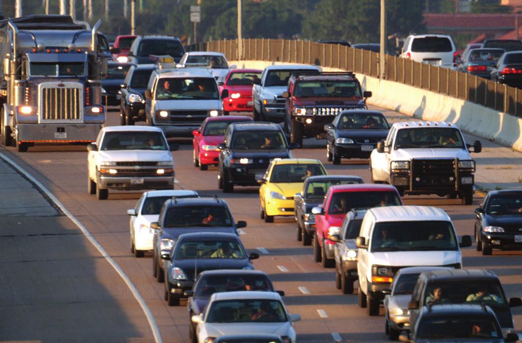
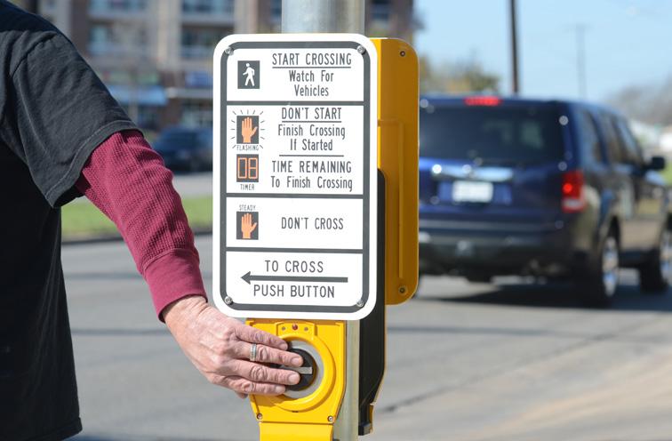
81 2015 URBAN MOBILITY Scorecard David Schrank Bill Eisele Tim Lomax Texas A&M Transportation Institute mobility.tamu.edu Jim Bak INRIX, Inc. inrix.com
2014 URBAN MOBILITY REPORT SWUTC/15/
 2014 URBAN MOBILITY REPORT SWUTC/15/161302-1 2014 URBAN MOBILITY REPORT Powered by INRIX Traffic Data David Schrank Research Scientist Bill Eisele Senior Research Engineer And Tim Lomax Research Fellow
BLACK KNIGHT HPI REPORT
 CONTENTS 1 OVERVIEW 2 NATIONAL OVERVIEW 3 LARGEST STATES AND METROS 4 MARCH S BIGGEST MOVERS 5 20 LARGEST STATES 6 40 LARGEST METROS 7 ADDITIONAL INFORMATION OVERVIEW Each month, the Data & Analytics division
Marion County s Nov Transit Referendum
 Marion County s Nov. 2016 Transit Referendum Would ask the public for dedicated transit funding Indiana Code 8-25-2 (SEA 176, 2014) authorizes advisory referenda by county to dedicate an income tax to
Proposal 145: Transit Referendum
 Proposal 145: Transit Referendum Will ask the public for dedicated transit funding Indiana Code 8-25-2 (SEA 176, 2014) authorizes advisory referenda by county for an income tax between.1% and.25% 3 step
Kenosha-Racine-Milwaukee (KRM)
") Kenosha-Racine-Milwaukee (KRM) Commuter Rail #147925 November 6, 2009 1 Guidance of KRM Commuter Rail Studies Intergovernmental Partnership Technical Steering Committee Temporary and Limited Authority
Kenosha-Racine-Milwaukee (KRM) Commuter Rail #147925 November 6, 2009 1 Guidance of KRM Commuter Rail Studies Intergovernmental Partnership Technical Steering Committee Temporary and Limited Authority
National Congestion Tables Table 1. What Congestion Means to You, 2014 Yearly Delay per Auto
 18 National Congestion Tables Table 1. What Congestion Means to You, 2014 Yearly Delay per Auto Excess Fuel per Auto Congestion Cost per Urban Area Commuter Travel Time Index Commuter Auto Commuter Hours
Microeconomics Capital Markets Public Private Partnerships User Fees Autonomous Vehicles
 Free Market Transportation Denver Association of Business Economists, October 17, 2017 Microeconomics Capital Markets Public Private Partnerships User Fees Autonomous Vehicles *I am a lawyer who went to
Performance Measure Summary - New York-Newark NY-NJ-CT. Performance Measures and Definition of Terms
 Performance Measure Summary - New York-Newark NY-NJ-CT There are several inventory and performance measures listed in the pages of this Urban Area Report for the years from 1982 to 2014. There is no single
Performance Measure Summary - Boston MA-NH-RI. Performance Measures and Definition of Terms
 Performance Measure Summary - Boston MA-NH-RI There are several inventory and performance measures listed in the pages of this Urban Area Report for the years from 1982 to 2014. There is no single performance
Performance Measure Summary - El Paso TX-NM. Performance Measures and Definition of Terms
 Performance Measure Summary - El Paso TX-NM There are several inventory and performance measures listed in the pages of this Urban Area Report for the years from 1982 to 2014. There is no single performance
Performance Measure Summary - Louisville-Jefferson County KY-IN. Performance Measures and Definition of Terms
 Performance Measure Summary - Louisville-Jefferson County KY-IN There are several inventory and performance measures listed in the pages of this Urban Area Report for the years from 1982 to 2014. There
Measuring Accessibility. Andrew Owen Director, Accessibility Observatory May 17, 2017
 Measuring Accessibility Andrew Owen Director, Accessibility Observatory May 17, 2017 1. Overview 2. Methodology 3. Reporting Accessibility 4. Policy Implications 1. Overview What is Accessibility? Accessibility
Performance Measure Summary - Minneapolis-St. Paul MN-WI. Performance Measures and Definition of Terms
 Performance Measure Summary - Minneapolis-St. Paul MN-WI There are several inventory and performance measures listed in the pages of this Urban Area Report for the years from 1982 to 2014. There is no
Technical Memorandum Analysis Procedures and Mobility Performance Measures 100 Most Congested Texas Road Sections What s New for 2015
 Technical Memorandum Analysis Procedures and Mobility Performance Measures 100 Most Congested Texas Road Sections Prepared by Texas A&M Transportation Institute August 2015 This memo documents the analysis
The Green Dividend. Cities facilitate less driving, saving money and stimulating the local economy. Joseph Cortright, Impresa September 2007
 The Green Dividend Cities facilitate less driving, saving money and stimulating the local economy Joseph Cortright, Impresa September 2007 Does being green pay? Is conservation just noble self-sacrifice;
Performance Measure Summary - Corpus Christi TX. Performance Measures and Definition of Terms
 Performance Measure Summary - Corpus Christi TX There are several inventory and performance measures listed in the pages of this Urban Area Report for the years from 1982 to 2014. There is no single performance
Performance Measure Summary - Allentown PA-NJ. Performance Measures and Definition of Terms
 Performance Measure Summary - Allentown PA-NJ There are several inventory and performance measures listed in the pages of this Urban Area Report for the years from 1982 to 2014. There is no single performance
Performance Measure Summary - Toledo OH-MI. Performance Measures and Definition of Terms
 Performance Measure Summary - Toledo OH-MI There are several inventory and performance measures listed in the pages of this Urban Area Report for the years from 1982 to 2014. There is no single performance
Performance Measure Summary - Nashville-Davidson TN. Performance Measures and Definition of Terms
 Performance Measure Summary - Nashville-Davidson TN There are several inventory and performance measures listed in the pages of this Urban Area Report for the years from 1982 to 2014. There is no single
Performance Measure Summary - Pensacola FL-AL. Performance Measures and Definition of Terms
 Performance Measure Summary - Pensacola FL-AL There are several inventory and performance measures listed in the pages of this Urban Area Report for the years from 1982 to 2014. There is no single performance
Performance Measure Summary - Washington DC-VA-MD. Performance Measures and Definition of Terms
 Performance Measure Summary - Washington DC-VA-MD There are several inventory and performance measures listed in the pages of this Urban Area Report for the years from 1982 to 2014. There is no single
Performance Measure Summary - Charlotte NC-SC. Performance Measures and Definition of Terms
 Performance Measure Summary - Charlotte NC-SC There are several inventory and performance measures listed in the pages of this Urban Area Report for the years from 1982 to 2014. There is no single performance
Performance Measure Summary - Omaha NE-IA. Performance Measures and Definition of Terms
 Performance Measure Summary - Omaha NE-IA There are several inventory and performance measures listed in the pages of this Urban Area Report for the years from 1982 to 2014. There is no single performance
Performance Measure Summary - Grand Rapids MI. Performance Measures and Definition of Terms
 Performance Measure Summary - Grand Rapids MI There are several inventory and performance measures listed in the pages of this Urban Area Report for the years from 1982 to 2014. There is no single performance
Performance Measure Summary - Seattle WA. Performance Measures and Definition of Terms
 Performance Measure Summary - Seattle WA There are several inventory and performance measures listed in the pages of this Urban Area Report for the years from 1982 to 2014. There is no single performance
Performance Measure Summary - Austin TX. Performance Measures and Definition of Terms
 Performance Measure Summary - Austin TX There are several inventory and performance measures listed in the pages of this Urban Area Report for the years from 1982 to 2014. There is no single performance
Performance Measure Summary - Spokane WA. Performance Measures and Definition of Terms
 Performance Measure Summary - Spokane WA There are several inventory and performance measures listed in the pages of this Urban Area Report for the years from 1982 to 2014. There is no single performance
Performance Measure Summary - Buffalo NY. Performance Measures and Definition of Terms
 Performance Measure Summary - Buffalo NY There are several inventory and performance measures listed in the pages of this Urban Area Report for the years from 1982 to 2014. There is no single performance
Performance Measure Summary - Tucson AZ. Performance Measures and Definition of Terms
 Performance Measure Summary - Tucson AZ There are several inventory and performance measures listed in the pages of this Urban Area Report for the years from 1982 to 2014. There is no single performance
Performance Measure Summary - Hartford CT. Performance Measures and Definition of Terms
 Performance Measure Summary - Hartford CT There are several inventory and performance measures listed in the pages of this Urban Area Report for the years from 1982 to 2014. There is no single performance
Performance Measure Summary - Fresno CA. Performance Measures and Definition of Terms
 Performance Measure Summary - Fresno CA There are several inventory and performance measures listed in the pages of this Urban Area Report for the years from 1982 to 2014. There is no single performance
Performance Measure Summary - Wichita KS. Performance Measures and Definition of Terms
 Performance Measure Summary - Wichita KS There are several inventory and performance measures listed in the pages of this Urban Area Report for the years from 1982 to 2014. There is no single performance
Performance Measure Summary - Portland OR-WA. Performance Measures and Definition of Terms
 Performance Measure Summary - Portland OR-WA There are several inventory and performance measures listed in the pages of this Urban Area Report for the years from 1982 to 2014. There is no single performance
Performance Measure Summary - Pittsburgh PA. Performance Measures and Definition of Terms
 Performance Measure Summary - Pittsburgh PA There are several inventory and performance measures listed in the pages of this Urban Area Report for the years from 1982 to 2014. There is no single performance
Performance Measure Summary - New Orleans LA. Performance Measures and Definition of Terms
 Performance Measure Summary - New Orleans LA There are several inventory and performance measures listed in the pages of this Urban Area Report for the years from 1982 to 2014. There is no single performance
Performance Measure Summary - Oklahoma City OK. Performance Measures and Definition of Terms
 Performance Measure Summary - Oklahoma City OK There are several inventory and performance measures listed in the pages of this Urban Area Report for the years from 1982 to 2014. There is no single performance
Performance Measure Summary - Boise ID. Performance Measures and Definition of Terms
 Performance Measure Summary - Boise ID There are several inventory and performance measures listed in the pages of this Urban Area Report for the years from 1982 to 2014. There is no single performance
Performance Measures and Definition of Terms
 Performance Measure Summary - All 471 Areas Sum There are several inventory and performance measures listed in the pages of this Urban Area Report for the years from 1982 to 2014. There is no single performance
Reducing deaths, injuries, and loss from motor vehicle crashes
 Reducing deaths, injuries, and loss from motor vehicle crashes Northeast Transportation Safety Conference Cromwell, CT October 24, 2017 David G. Kidd, Ph.D. Senior Research Scientist iihs.org U.S. motor
Highway Safety Countermeasures
 Highway Safety Countermeasures National Conference of State Legislatures May 14, 2009 Stephen Oesch Intersections Intersection crashes More than 2.4 million in 2007 5 crashes per minute 1 serious injury
Performance Measure Summary - Large Area Sum. Performance Measures and Definition of Terms
 Performance Measure Summary - Large Area Sum There are several inventory and performance measures listed in the pages of this Urban Area Report for the years from 1982 to 2014. There is no single performance
Performance Measure Summary - Medium Area Sum. Performance Measures and Definition of Terms
 Performance Measure Summary - Medium Area Sum There are several inventory and performance measures listed in the pages of this Urban Area Report for the years from 1982 to 2014. There is no single performance
WE CARRY THE FUTURE SM
 WE CARRY THE FUTURE SM www.hmm21.com m.hmm21.com 877-7HYUNDAI August 30, 2012 To: HMM Valued Customers Re: Change in Dynamics in the US trades As an update to the Hyundai Merchant Marine Program, effective
Changing Behavior and Achieving Mode Shi2 Goals
 Changing Behavior and Achieving Mode Shi2 Goals Tim Papandreou - Director Strategic Planning & Policy, San Francisco Municipal TransporaBon Agency Michael KeaBng - Founder & CEO, Scoot Networks Mike Mikos
STATE OF THE MTA SYSTEM REPORT EXECUTIVE SUMMARY
 NASHVILLE MTA/RTA STRATEGIC NASHVILLE MTA STRATEGIC PLAN PLAN STATE OF THE MTA SYSTEM REPORT EXECUTIVE SUMMARY Overview Since 1965, the Nashville region has grown from approximately 750,000 residents to
Overview of Regional Commuter Rail Webinar: Phoenix, Arizona December 18, 2013
 Overview of Regional Commuter Rail Webinar: Phoenix, Arizona December 18, 2013 2013, All Rights Reserved. 1 The Maricopa Association of Governments (MAG) is the designated metropolitan planning organization
The Preferred Alternative: a Vision for Growth on the Northeast Corridor
 A Long-Term Vision is Needed The Preferred Alternative: a Vision for Growth on the Northeast Corridor The Federal Railroad Administration (FRA) has released the Tier 1 Final Environmental Impact Statement
GROWTH & DEVELOPMENT. Residents enjoying the newly opened Brickell City Centre on Nov. 3, 2016.
 GROWTH & DEVELOPMENT Residents enjoying the newly opened Brickell City Centre on Nov. 3, 2016. 20 Growth & Development Overview With over 450,000 residents, the City of Miami is at the heart of one of
JOB LOSSES BY STATE, State Industry US total AK AL AR AZ CA CO CT Agriculture, forestry, fisheries -15, ,
 State US total AK AL AR AZ CA CO CT -15,597-35 -272-248 -232-3,163-132 -46-3,858-68 4-19 -291-303 -116-11 -3,318-9 -55-32 -73-314 -66-35 -554,750-194 -14,113-7,789-4,781-55,255-4,453-6,836-9,326-13 -190-282
UTA Transportation Equity Study and Staff Analysis. Board Workshop January 6, 2018
 UTA Transportation Equity Study and Staff Analysis Board Workshop January 6, 2018 1 Executive Summary UTA ranks DART 6 th out of top 20 Transit Agencies in the country for ridership. UTA Study confirms
HOT Lanes: Congestion Relief and Better Transit
 HOT Lanes: Congestion Relief and Better Transit Robert W. Poole, Jr. Director of Transportation Studies Reason Foundation www.reason.org/transportation Basic Thesis: Current Transportation Plans Need Rethinking
Traffic Safety Facts 2002
 DOT HS 89 616 U.S. Department of Transportation National Highway Traffic Safety Administration Traffic Safety Facts 22 A Public Information Fact Sheet on Motor Vehicle and Traffic Safety Published by the
Traffic Safety Facts 1995
 U.S. Department of Transportation National Highway Traffic Safety Administration Traffic Safety Facts 1995 exceeding the posted speed limit or driving too fast for conditions is one of the most prevalent
Lives Saved through Vehicle Design: Regulation, Consumer Information and the Future
 Lives Saved through Vehicle Design: Regulation, Consumer Information and the Future Transport Research Board January 8, 2018 Adrian Lund iihs.org Crashworthiness in 1959 and 2009 Actual vs. potential car/ltv
Going from Pump to Plug
 Executive Summary Highlights Electric vehicles (EVs) are significantly cheaper than gasoline-powered vehicles to fuel and operate, according to a Union of Concerned Scientists analysis. Even with today
Automated and Connected Vehicles: Planning for Uncertainty
 Automated and Connected Vehicles: Planning for Uncertainty Tim Burkhardt APA Minnesota 9/28/2017 PLANNING IMPLICATIONS We plan for 20 years (or more) We design for 50 years (or more) o Elon Musk is not
REPORT CARD FOR CALIFORNIA S INFRASTRUCTURE WHAT YOU SHOULD KNOW ABOUT CALIFORNIA S TRANSIT FACILITIES
 TRANSIT GRADE: C- WHAT YOU SHOULD KNOW ABOUT TRANSIT FACILITIES California needs robust, flexible and reliable transit systems to reduce peak congestion on our highways, provide options for citizens who
Beyond Traffic: The Smart City Challenge Brian Cronin
 Beyond Traffic: The Smart City Challenge Brian Cronin Federal Highway Administration (FHWA) Director, Office of Operations Research and Development The Smart City Challenge Encourage cities to put forward
QUALITY OF LIFE EXECUTIVE SUMMARY REPORT I O N S TAT I O N
 QUALITY OF LIFE EXECUTIVE SUMMARY REPORT UN I O N S TAT I O N T R AV E L by TR A I N Published September 2017 2015 PROGRESS MAP This document reports FasTracks progress through 2015 BACKGROUND RTD The
Transit and Job Growth: Lessons for SB 375. Jed Kolko Public Policy Institute of California
 Transit and Job Growth: Lessons for SB 375 Jed Kolko Public Policy Institute of California Outline Approaches to reducing VMT The land use transportation connection California s experience with transit-oriented
Urban Transportation in the United States: A Time for Leadership
 Urban Transportation in the United States: A Time for Leadership Presentation by Wendell Cox Preserving the American Dream Conference Raleigh-Durham 10 January 2003 American Urban Areas: Transport Crisis
Sales and Use Transportation Tax Implementation Plan
 Sales and Use Transportation Tax Implementation Plan Transportation is more than just a way of getting from here to there. Reliable, safe transportation is necessary for commerce, economic development,
4 COSTS AND OPERATIONS
 4 COSTS AND OPERATIONS 4.1 INTRODUCTION This chapter summarizes the estimated capital and operations and maintenance (O&M) costs for the Modal and High-Speed Train (HST) Alternatives evaluated in this
Metro Reimagined. Project Overview October 2017
 Metro Reimagined Project Overview October 2017 Reimagining Metro Transit Continuing our Commitment to: Provide mobility based on existing and future needs Value the role of personal mobility in the quality
THE HYDROLLEY: FIRST STOP ON THE MAIN LINE TO HYDRAIL
 THE HYDROLLEY: FIRST STOP ON THE MAIN LINE TO HYDRAIL presented 3 July 2012 at the 7 th International Hydrail Conference Birmingham Centre for Railway Research and Education University of Birmingham, UK
Travel Time Savings Memorandum
 04-05-2018 TABLE OF CONTENTS 1 Background 3 Methodology 3 Inputs and Calculation 3 Assumptions 4 Light Rail Transit (LRT) Travel Times 5 Auto Travel Times 5 Bus Travel Times 6 Findings 7 Generalized Cost
RETURN ON INVESTMENT LIQUIFIED NATURAL GAS PIVOTAL LNG TRUCK MARKET LNG TO DIESEL COMPARISON
 RETURN ON INVESTMENT LIQUIFIED NATURAL GAS PIVOTAL LNG TRUCK MARKET LNG TO DIESEL COMPARISON Year 1 Year 2 Year 3 Year 4 Year 5 Year 6 Year 7 Year 8 Year 9 Year 10 RETAIL BREAK EVEN AND IRR EXAMPLE FOR
VOLUNTARY DIESEL RETROFIT PROGRAM. STAPPA and ALAPCO Fall Membership Meeting October, 2003
 VOLUNTARY DIESEL RETROFIT PROGRAM STAPPA and ALAPCO Fall Membership Meeting October, 2003 Voluntary Diesel Retrofit Program A voluntary program designed to install pollution- reducing technology on existing
Metropolitan Freeway System 2013 Congestion Report
 Metropolitan Freeway System 2013 Congestion Report Metro District Office of Operations and Maintenance Regional Transportation Management Center May 2014 Table of Contents PURPOSE AND NEED... 1 INTRODUCTION...
6/6/2018. June 7, Item #1 CITIZENS PARTICIPATION
 June 7, 2018 Item #1 CITIZENS PARTICIPATION 1 Item #2 APPROVAL OF MINUTES Item #3 TRAC GOALS, FRAMEWORK & AGENDA REVIEW 2 COMMITTEE GOALS Learn about Southern Nevada s mobility challenges, new developments
Disruptive Technology and Mobility Change
 Disruptive Technology and Mobility Change What it Might Mean for Urban Transportation Ed Regan Senior Vice President June 1, 2018 Presented at Transport Chicago Ed Regan, SVP, CDM Smith 43-year veteran
Transaction Trend. United States. Report Q LE s Real Estate Intelligence is Your Strategic Advantage
 Sa m pl e Q4 2016 United States Transaction Trend Report LE s Real Estate Intelligence is Your Strategic Advantage Lodging Econometrics 500 Market Street, Suite 13 Portsmouth, NH 03801-3481 USA +1 603.427.9542
RhodeWorks Initiative
 RhodeWorks Initiative Accent image here Fixing Rhode Island s bridges and getting Rhode Islanders back to work Rhode Island Department of Transportation Primary Image here International Bridge, Tunnel
se 1:13-cv TDS-JEP Document Filed 05/19/14 Page 1 of
 se 1:13-cv-00660-TDS-JEP Document 118-2 Filed 05/19/14 Page 1 of Figure 2-5. Vehicle Miles Traveled on Public Roads by Vehicle Type, 1970 2006 The amount of use of different types of vehicles varies from
Clean Cities Program Overview
 Clean Cities Program Overview July 8, 2014 Darren Stevenson US DOE Clean Cities Regional Manager Clean Cities / 1 Mission & Background/History Clean Cities / 2 Clean Cities Mission To advance the energy,
Q U.S. INDUSTRIAL & LOGISTICS FIGURES
 Q2 2018 U.S. INDUSTRIAL & LOGISTICS FIGURES Q2 2018 U.S. INDUSTRIAL & LOGISTICS FIGURES EXECUTIVE SUMMARY DEMAND AGAIN OUTSTRIPS NEW SUPPLY, RENTS TICK UP FURTHER Availability Rate 7.2% Vacancy Rate 4.4%
Planning for Future Mobility In a Performance-Based World Steven Gayle, PTP
 Planning for Future Mobility In a Performance-Based World Steven Gayle, PTP September 26, 2018 MPOs at the Intersection 2 Performance-Based Planning New planning paradigm introduced in MAP-21 MPOs and
FREQUENTLY ASKED QUESTIONS
 FREQUENTLY ASKED QUESTIONS 2018 What is the More MARTA Atlanta program? The More MARTA Atlanta program is a collaborative partnership between MARTA and the City of Atlanta to develop and implement a program
MAGAZINE S. The U.S. and. Canada s. Top 50. Passenger Rail Projects for 2003
 MAGAZINE S The U.S. and Top 50 Canada s Passenger Rail Projects for 2003 Rail Projects Total $58 Billion intop 50 As the costs of war skyrocket, so do the costs of rail projects. Despite the waning economy,
PROPOSAL FOR TOUR COACH
 25 Marietta Blvd. Atlanta, GA 338 (44) 364-77 Fax: (678) 94-4324 PROPOSAL FOR TOUR COACH This proposal was prepared for: Phone Number: John & Jane Doe Sample Proposal 234 Main Street Anywhere, USA 22-555-22
Wyoming electricity use is growing
 Wyoming electricity use is growing 12,000 $40 gigawatt-hours 11,000 10,000 9,000 8,000 7,000 6,000 5,000 $38 $36 $34 $32 $30 $28 $26 $24 $22 gross state product (economic growth) ($ billions) 4,000 2004
2 VALUE PROPOSITION VALUE PROPOSITION DEVELOPMENT
 2 VALUE PROPOSITION The purpose of the Value Proposition is to define a number of metrics or interesting facts that clearly demonstrate the value of the existing Xpress system to external audiences including
Valley Metro Overview. ITE/IMSA Spring Conference March 6, 2014
 Valley Metro Overview ITE/IMSA Spring Conference March 6, 2014 Valley Metro Who Are We? Operate Regional Transit Services Valley Metro and Phoenix are region s primary service providers Light Rail and
2 EXISTING ROUTE STRUCTURE AND SERVICE LEVELS
 2 EXISTING ROUTE STRUCTURE AND SERVICE LEVELS In the Study Area, as in most of the Metro Transit network, there are two distinct route structures. The base service structure operates all day and the peak
PlugShare Quarterly 2015-Q3 Census, US Electric Vehicle Infrastructure Exhibits
 PlugShare Quarterly 205-Q3 Census, US Electric Vehicle Infrastructure Exhibits PlugShare 05 Abbot Kinney Blvd Venice, CA 9029 company.plugshare.com (30) 50-3333 Prepared on October, 205 Overview PlugShare
NEW YORK SUBURBAN RAIL SUMMARY (COMMUTER RAIL, REGIONAL RAIL)
") NEW YORK SUBURBAN RAIL SUMMARY (COMMUTER RAIL, REGIONAL RAIL) October 2003 New York: The New York commuter rail service area consists of 20.3 million people, spread over 4,700 square miles at an average
NEW YORK SUBURBAN RAIL SUMMARY (COMMUTER RAIL, REGIONAL RAIL) October 2003 New York: The New York commuter rail service area consists of 20.3 million people, spread over 4,700 square miles at an average
The USDOT Congestion Pricing Program: A New Era for Congestion Management
 The USDOT Congestion Pricing Program: A New Era for Congestion Management Patrick DeCorla-Souza, AICP Federal Highway Administration Presentation at Congestion Pricing Discovery Workshop Los Angeles, CA
Denver Car Share Program 2017 Program Summary
 Denver Car Share Program 2017 Program Summary Prepared for: Prepared by: Project Manager: Malinda Reese, PE Apex Design Reference No. P170271, Task Order #3 January 2018 Table of Contents 1. Introduction...
Effects of all-offender alcohol ignition interlock laws on recidivism and alcohol-related crashes
 Effects of all-offender alcohol ignition interlock laws on recidivism and alcohol-related crashes Lifesavers National Conference on Highway Safety Priorities Chicago, IL March 16, 2015 Anne T. McCartt
PHILADELPHIA SUBURBAN RAIL SUMMARY (COMMUTER RAIL, REGIONAL RAIL)
") PHILADELPHIA SUBURBAN RAIL SUMMARY (COMMUTER RAIL, REGIONAL RAIL) October 2003 The Philadelphia commuter rail service area consists of 5.1 million people, spread over 1,800 square miles at an average population
PHILADELPHIA SUBURBAN RAIL SUMMARY (COMMUTER RAIL, REGIONAL RAIL) October 2003 The Philadelphia commuter rail service area consists of 5.1 million people, spread over 1,800 square miles at an average population
Office of Transportation Bureau of Traffic Management Downtown Parking Meter District Rate Report
 Office of Transportation Bureau of Traffic Management 1997 Downtown Parking Meter District Rate Report Introduction The City operates approximately 5,600 parking meters in the core area of downtown. 1
Policy Note. Vanpools in the Puget Sound Region The case for expanding vanpool programs to move the most people for the least cost.
 Policy Note Vanpools in the Puget Sound Region The case for expanding vanpool programs to move the most people for the least cost Recommendations 1. Saturate vanpool market before expanding other intercity
Service Quality: Higher Ridership: Very Affordable: Image:
 Over the past decade, much attention has been placed on the development of Bus Rapid Transit (BRT) systems. These systems provide rail-like service, but with buses, and are typically less expensive to
6/11/2018. June 7, Item #1 CITIZENS PARTICIPATION
 June 7, 2018 Item #1 CITIZENS PARTICIPATION 1 Item #2 APPROVAL OF MINUTES Item #3 TRAC GOALS, FRAMEWORK & AGENDA REVIEW 2 COMMITTEE GOALS Learn about Southern Nevada s mobility challenges, new developments
Transportation Demand Management Element
 Transportation Demand Management Element Over the years, our reliance on the private automobile as our primary mode of transportation has grown substantially. Our dependence on the automobile is evidenced
DAWN OF THE HYDROLLEY or 2009: A CHANGE ODYSSEY
 DAWN OF THE HYDROLLEY or 2009: A CHANGE ODYSSEY Presented June 11, 2009 at the Fifth International Hydrail Conference at the University of North Carolina at Charlotte by Stan Thompson for HEAT Hydrogen
Trending to Zero: Battery Electric Buses in Public Transit
 Trending to Zero: Battery Electric Buses in Public Transit Incumbent Technologies Diesel CNG Diesel-hybrid 3 Foothill Transit Ecoliner Program History 2009 $6.5 million ARRA award to launch Ecoliner Program
Why Light Rail Was Selected for the Durham- Orange Corridor. Orange County Board of County Commissioners February 16, 2017
 Why Light Rail Was Selected for the Durham- Orange Corridor Orange County Board of County Commissioners February 16, 2017 Presentation Overview Matching Transit Technology to a Particular Corridor Key
The Economic Downturn Lessons on the Correlation between Economic Growth and Energy
 The Economic Downturn Lessons on the Correlation between Economic Growth and Energy Demand presented to Indiana State Bar Association Utility Law Spring Seminar April 9, 2010 presented by Doug Gotham State
Solar Power: State-level Issues and Perspectives
 Solar Power: State-level Issues and Perspectives Sean Gallagher Vice-President, State Affairs Solar Energy Industries Association National Conference of State Legislators Solar Boot Camp August 24, 2016