Final Report. Refining the Real-Timed Urban Mobility Report. Tim Lomax, Shawn Turner, Bill Eisele, David Schrank, Lauren Geng, and Brian Shollar
|
|
|
- Bartholomew Roberts
- 5 years ago
- Views:
Transcription


1 Improving the Quality of Life by Enhancing Mobility University Transportation Center for Mobility DOT Grant No. DTRT06-G-0044 Refining the Real-Timed Urban Mobility Report Final Report Tim Lomax, Shawn Turner, Bill Eisele, David Schrank, Lauren Geng, and Brian Shollar Performing Organization University Transportation Center for Mobility Texas Transportation Institute The Texas A&M University System College Station, TX Sponsoring Agency Department of Transportation Research and Innovative Technology Administration Washington, DC UTCM Project # March 2012
2 1. Project No. UTCM Title and Subtitle Refining the Real-Timed Urban Mobility Report Technical Report Documentation Page 2. Government Accession No. 3. Recipient's Catalog No. 7. Author(s) Tim Lomax, Shawn Turner, Bill Eisele, David Schrank, Lauren Geng, and Brian Shollar 9. Performing Organization Name and Address University Transportation Center for Mobility Texas Transportation Institute The Texas A&M University System 3135 TAMU College Station, TX Sponsoring Agency Name and Address Department of Transportation Research and Innovative Technology Administration th Street, SW Washington, DC Report Date March Performing Organization Code Texas Transportation Institute 8. Performing Organization Report No. UTCM Work Unit No. (TRAIS) 11. Contract or Grant No. DTRT06-G Type of Report and Period Covered Final Report 1/1/ /31/ Sponsoring Agency Code 15. Supplementary Notes Supported by a grant from the US Department of Transportation, University Transportation Centers Program 16. Abstract The Texas Transportation Institute (TTI) is considered a national leader in providing congestion and mobility information. The Urban Mobility Report (UMR) is the most widely quoted report on urban congestion and the associated costs in the nation. The report measures system delay, wasted fuel, and the annual cost of congestion in all U.S. urban areas. In 2011, researchers also produced the Congested s Report (CCR) which focused on traffic congestion along 328 corridors across the U.S. The CCR is the first report to include travel reliability statistics on a nationwide basis. In recent years, the UMR/CCR researchers partnered with a private-sector historical speed provider INRIX to obtain nationwide speed data to generate the best possible estimate of mobility conditions across the nation. The data that are available from this partnership continue to allow the UMR/CCR methodology to evolve. While much more is understood about freeway operations and mobility, the INRIX data are allowing researchers to take a closer look at arterial street operations and mobility. This report describes a methodological improvement in the UMR arterial street congestion calculations, including a change in the definition of free-flow speed, which is used for delay calculations on arterial streets. This research improves the estimates of congestion and its costs, and maintains TTI s position as the most authoritative source of mobility and congestion information. 17. Key Word Mobility, Traffic Congestion, Traffic Delay, Traffic Estimation, Traffic Data, Travel Demand, Commodity Flow, Truck Delay, Data Collection, Research Projects 18. Distribution Statement Public distribution 19. Security Classif. (of this report) Unclassified 20. Security Classif. (of this page) Unclassified 21. No. of Pages Price n/a Form DOT F (8-72) Reproduction of completed page authorized
3 Refining the Real-Timed Urban Mobility Report Tim Lomax Research Engineer Texas Transportation Institute Shawn Turner Senior Research Engineer Texas Transportation Institute Bill Eisele Research Engineer Texas Transportation Institute David Schrank Associate Research Scientist Texas Transportation Institute Lauren Geng Systems Analyst I Texas Transportation Institute Brian Shollar Graduate Research Assistant Texas Transportation Institute Final Report Project UTCM University Transportation Center for Mobility March 2012
4 DISCLAIMER The contents of this report reflect the views of the authors, who are responsible for the facts and the accuracy of the information presented herein. This document is disseminated under the sponsorship of the Department of Transportation, University Transportation Centers Program in the interest of information exchange. The U.S. Government assumes no liability for the contents or use thereof. ACKNOWLEDGMENT Support for this research was provided by a grant from the U.S. Department of Transportation, University Transportation Centers Program to the University Transportation Center for Mobility (DTRT06-G-0044). 2
5 TABLE OF CONTENTS Page Executive Summary... 7 Introduction... 9 Review of Arterial Street Measures Refining INRIX Reference Speeds for Use in the Urban Mobility Report References Appendix A The 2011 Urban Mobility Report Appendix B Methodology for the 2011 Urban Mobility Report Appendix C TTI s 2011 Congested s Report
6 4
7 LIST OF EXHIBITS NOTE: Color exhibits in this report may not be legible if printed in black and white. A color PDF copy of this report may be accessed via the UTCM website at the Texas Transportation Institute website at or the Transportation Research Board s TRID database at Page Exhibit 1. West Houston, Texas Initial Study Area Exhibit 2. Bluetooth Traffic Monitoring Operation Concept (Adapted from Reference 2) Exhibit 3. Study s Exhibit 4. Combined Segments Exhibit 5. Comparison of Bluetooth and INRIX on Westheimer Exhibit 6. Method 1 Plots Exhibit 7. Method 2 Plots Exhibit 8. Daytime 85 th Percentile Criteria Exhibit 9. New 85 th Percentiles Exhibit 10. Daytime 85 th Percentile for the Dairy Ashford Southbound Exhibit 11. INRIX Percentiles
8 6
9 EXECUTIVE SUMMARY Introduction The Texas Transportation Institute (TTI) is a national leader in providing congestion and mobility information. TTI s mobility information is provided mostly through the annual Urban Mobility Report ( but several other national, state, and regional activities also disseminate mobility information. The Urban Mobility Report is recognized internationally as the most comprehensive and authoritative analysis of traffic congestion in the United States. The report has evolved over the years, with several methodology and data changes, but with a consistent focus on providing technical information in an easily understood format. The transportation industry is constantly evolving, with much technological advancement affecting the travel on roadways and the traffic data that are collected. TTI needs to ensure that one of its premier publications, the Urban Mobility Report (UMR), keeps pace with current trends and evolves to include the best data sources and most accurate information analytics. The primary objective of this research project was to incorporate the historical speed data from INRIX, a private-sector speed company, into the methodology that generates the statistics in the UMR, and to produce the 2011 UMR. These improvements and enhancements fall into the following three specific areas: 1. conflate the Highway Performance Monitoring System (HPMS) roadway inventory and INRIX speed networks, 2. review the arterial street measures, and 3. produce and communicate the 2011 UMR. Task 1: Conflate the Roadway Inventory and Speed Networks The 2010 UMR was the first report produced with measured speed data used in the estimation of congestion statistics. The traffic volume network used was the Highway Performance Monitoring System database from the Federal Highway Administration. This network shapefile included only the higher level functional classification roadways such as freeways and did not include as many lower classification roadway such as arterial streets. Since the UMR methodology has always calculated delay on the freeway and arterial street system, it is imperative that the arterial street system be included in the traffic volume network. This task obtained the volume networks from the individual state departments of transportation (DOTs) rather than relying on a national network in an attempt to get more of the lower functional classification roadways in the report. Without an extensive roadway network of arterial streets, a great deal of estimation had to be done to complete the 2010 UMR. Once the state networks were obtained, the state volume networks were conflated with the speed networks from INRIX. This task built upon previous University Transportation Center for Mobility (UTCM)- sponsored research projects and Task 2: Review the Arterial Street Measures In the earlier versions of the UMR prior to 2010, the freeflow operating speeds of the freeways and arterial streets were arbitrarily fixed at 60 mph and 35 mph, respectively, for all roadways across the United States. With the inclusion of the INRIX speed data, each section of roadway was assigned the freeflow speed estimated on that section by INRIX. These freeflow speeds from INRIX appeared to work 7
10 well for the freeway sections in the UMR where there was a consistent freeflow speed when traffic volumes were lighter. Traffic on the arterial streets behave very differently from traffic on the freeways since many other outside elements, in addition to traffic levels, control how the traffic flows. These other factors include such items as signal timing plans, signal density, driveway density, and access management features such as raised medians. During overnight hours when fewer vehicles are on the roadway, arterial streets may have different freeflow speeds than during daylight hours when different signal timing plans are used. Progression along a corridor may be enhanced by additional greentime during peak operating conditions, which changes the freeflow speeds for the street. Due to these unique issues on the arterial streets, this task determined whether one freeflow speed such as has been used up to this point or multiple freeflow speeds may be needed to better represent the operations of arterial streets. This task reviewed different freeflow possibilities such as: one freeflow speed, determined when traffic levels are relatively light; one freeflow speed for overnight or light traffic conditions and a separate speed for daylight hours when traffic is heavier; and multiple freeflow speeds representing light traffic conditions and heavier traffic conditions during peak periods and midday traffic levels. Task 3: Produce and Communicate the 2010 UMR The 2011 UMR required additional information to explain some modifications to the methodology and how it differed from previous reports. It also required more detailed descriptions of the new findings, which were very different in some cases from previous UMR reports. Since the changes in some of the statistics were substantial, it was important to develop explanations for the differences between previous methodologies and the newer speed-based methodology in order to maintain the credibility and allow readers and sponsors to be comfortable with the new statistics. The 2011 Urban Mobility Report is included as Appendix A of this research report. 8
11 INTRODUCTION TTI is a national leader in providing congestion and mobility information. TTI s mobility information is provided mostly through the annual Urban Mobility Report ( but several other national, state, and regional activities also disseminate mobility information. The Urban Mobility Report is recognized internationally as the most comprehensive and authoritative analysis of traffic congestion in the United States. The Urban Mobility Report provides key stakeholders in transportation across the government, business, and public sectors with an unrivaled source of information on congestion problems and trends for the nation s roadways. The report has evolved over the years, with several methodology and data changes, but with a consistent focus on providing technical information in an easily understood format. Problem Statement The transportation industry is constantly evolving, with much technological advancement affecting the travel on roadways and the traffic data that are collected. TTI needs to ensure that one of its premier publications, the Urban Mobility Report, keeps pace with current trends and evolves to include the best data sources and most accurate information analytics. Research Objectives The primary objective of this research project was to develop several procedures that could be used to improve and enhance information currently provided in the Urban Mobility Report. These improvements and enhancements fall into the following three specific areas: 1. conflate the Highway Performance Monitoring System roadway inventory and INRIX speed networks, 2. review the arterial street measures, and 3. produce and communicate the 2011 UMR. Overview of This Report This report is structured around six areas and is organized as follows: Introduction provides a brief overview of the relevant issues and project objectives. Review of Arterial Street Measures summarizes the process for joining the roadway inventory data and private-sector historical speed data geographical information system (GIS) shapefiles. Refining INRIX Reference Speeds for Use in the UMR shows the process used to determine new freeflow speeds on arterial streets to determine congestion levels. Appendix A The 2011 Urban Mobility Report provides a national analysis of long-term congestion trends, the most recent congestion comparisons, and a description of many congestion improvement strategies. Appendix B Methodology for the 2011 Urban Mobility Report details the data and calculations behind the performance measures. Appendix C The 2011 Congested s Report provides a national analysis of some of the worst traffic locations in the U.S. and discusses travel reliability for the first time in a national publication. 9
12 REVIEW OF ARTERIAL STREET MEASURES A previous UTCM research project, UTCM , demonstrated the possibility of conflating a publicsector roadway inventory network such as the HPMS with a private-sector speed network such as INRIX. The project s report went into detail about how the process works. There were more than 200,000 miles of roadway in the private-sector speed database to match with the public-sector network for the 2010 UMR. This task required a significant amount of project resources to complete but is not a task that is easy to demonstrate results for. About two-thirds of the urban vehicle travel in the 101 urban areas analyzed extensively in the UMR was located on conflated or matched roadways where both traffic volumes and speeds were available. The remaining vehicle travel occurred on unmatched roadways. There were several reasons why roadways did not conflate based on the two networks: There was no section in the speed network that matched the roadway inventory network. The roadway inventory network was incomplete. (This was especially true of the surface-street data for the minor arterial streets that were not included in the network shapefile because many of these roadways are not maintained by state DOTs but by local agencies.) The speed data for a roadway section were incomplete. The methodology described in the next section of this report discusses the procedures used to handle roadway sections where conflation did not occur. Introduction REFINING INRIX REFERENCE SPEEDS FOR USE IN THE URBAN MOBILITY REPORT Accurate travel time information is needed to manage traffic conditions effectively. In the last 20 years, the hours lost per year by the average driver has increased by 300 percent in the 85 largest US cities (1). This translates into lost productivity and increased costs. State Department of Transportation (DOT) agencies and other government organizations need accurate travel time and speed information to better combat this congestion faced by motorists. In the past, ground truth travel time information was typically collected with probe vehicles using the floating car method. However, new methods such as Global Positioning System (GPS) data collection by private companies such as INRIX and NAVTEQ have emerged that allow for travel time data to be obtained more cost-effectively. The Urban Mobility Report (UMR) has turned to these companies, specifically, INRIX, for calculating congestion indexes across the United States. This is done by analyzing hourly average speeds and reference (free flow) speeds supplied by INRIX. However, there is a need to investigate the difference between freeway analysis and arterial analysis. Analyses on both functional classifications of roadways in the UMR rely on INRIX -supplied reference speeds to estimate delay. These INRIX reference speeds are producing high delay on many suburban arterials, to the point that some arterial roads are showing higher congestion than some of the urban interstates in the same urban areas. Currently, the reference speeds are determined by taking the 85 th percentile of 672 speed bins created from the 15-minute average speeds for the average week of data (often resulting in speeds that occur at night [10:00p.m. to 6:00a.m.]). This is acceptable for freeway analysis as freeways operate under uninterrupted flow. However, arterials operate under interrupted flow due to signal operations. These signal operations vary based on time of day and direction of flow and can have a significant impact on travel speeds, and therefore the congestion statistics. There is a 10

13 need to refine the reference speed on arterials to account for signal operations, particularly during the daytime hours. Using Bluetooth and INRIX speed data, a new reference speed is desired that accurately reflects arterial delay during the daytime hours. The purpose of this paper is to refine the methodology INRIX uses to determine reference speeds on arterial streets. This will be accomplished by analyzing Bluetooth and INRIX data for a group of roads located in west Houston, Texas. An overview of the study area can be found in Exhibit 1. Bluetooth speed data will be used to determine the validity of the INRIX speed data. Exhibit 1. West Houston, Texas Initial Study Area Literature Review In the past, ground truth travel time information on arterials was often collected with probe vehicles using the floating car method. This method of collection involves sending out drivers who record how long it takes to travel from one reference point such as a signalized intersection to the next. This is usually done on major arterials during peak periods using a stop watch and recording the time by hand, or more recently, by attaching a GPS antenna on the vehicle. Emerging technologies such as Bluetooth and GPS allow agencies to determine vehicle travel times quickly without the need for floating car drivers. These technologies can be used to measure delay, determine level of service, and evaluate signal operations. Bluetooth is an Institute of Electrical and Electronics Engineers (IEEE) standard used for short range wireless communication between devices. Most cell phones incorporate Bluetooth technology, as well as some GPS units and modern car entertainment systems. Because of its widespread use, Bluetooth tracking gives officials the ability to collect a larger portion of vehicle movements than traditional methods. Bluetooth is implemented by placing receivers on the side of the road to track the progression of a particular Bluetooth signal along the link or corridor. This collected data can then be used to determine travel time and travel speed data. An illustration of a Bluetooth traffic monitoring system can be found in Exhibit 2. 11
14 Exhibit 2. Bluetooth Traffic Monitoring Operation Concept (Adapted from Reference 2) A successful Bluetooth data collection is dependent on the placement of the receivers and the hardware used. Bluetooth reader placement is dependent on whether the application is for short-term data collection or for permanent continuous data collection. For a permanent data collection location, Bluetooth readers are usually installed in existing traffic signal cabinets. These cabinets are usually located at a signalized intersection. This location allows for a better understanding of link travel times to the public, but it can reduce the ability to accurately measure individual intersection delay, especially if other signalized intersections exist between adjacent Bluetooth readers. GPS data is collected by private companies such as INRIX and NAVTEQ. These companies aggregate data from taxis, airport shuttles, service delivery vans, long-haul trucks, consumer vehicles, and GPSenabled consumer smartphones to name a few. The data collected includes the speed, location, and heading of a particular vehicle at a reported date and time (3). However, this technology is fairly new and requires validation and application, particularly for arterial operations. Research Methodology and Data Bluetooth data supplied by the Texas Transportation Institute (TTI) and the City of Houston were used for comparison and validation of the INRIX -supplied speed data. Five different arterial corridors were used for the initial analysis, all located in the west Houston, Texas area. For some segments of the corridors, Bluetooth data points were combined and averaged (weighted by distance) to match up with the INRIX segments. Conversely, some INRIX segments were combined and averaged (weighted by distance) to line up with the Bluetooth reader pair locations. The corridors used in the analysis are listed in Exhibit 3. Exhibit 3. Study s Road Name Western-most Point Eastern-most Point Memorial Dr Eldridge Pkwy Blalock Rd Briar Forest Dr SH-6 Gessner Rd Westheimer Pkwy Eldridge Pkwy Gessner Rd Dairy Ashford Rd Westheimer Pkwy (Southern-most point) Memorial Dr (Northern-most point) Richmond Ave Gessner Rd Chimney Rock Rd 12
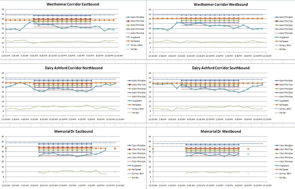
15 Exhibit 4 lists the segments that required multiple data points to be averaged to determine a common segment for the analysis. Exhibit 4. Combined Segments Road Name Bluetooth Segments (# Combined) INRIX Segments (# Combined) Memorial Dr Dairy Ashford-Wilcrest (2) Wilcrest-Blalock Rd (4) Briar Forest Dr Dairy Ashford-Wilcrest (2) Wilcrest-Gessner (2) Westheimer Pkwy - Wilcrest-Gessner (2) Dairy Ashford Rd - - Richmond Ave - - After segments were combined to produce a common dataset, both Bluetooth and INRIX speed data were graphed and compared. From this analysis and comparison, it was determined that the INRIX speed data sufficiently reflected the ground-truth Bluetooth speed data and are suitable for application. Exhibit 5 shows a comparison of Bluetooth and INRIX data for various segments along the Westheimer corridor in Houston. During the daylight hours, when most congestion occurs, the speeds from both sources are fairly consistent. During the overnight hours when the number of probes on the system is limited, there is a greater disparity between the data from the two providers, but this may be due to small sample sizes. A variety of techniques were explored to develop a suitable methodology for determining an accurate reference speed. Currently, INRIX supplies a single reference speed for the entire day for each road segment. All of the proposed methods studied the possibility of using a daytime reference speed and nighttime reference speed. To determine accurate daytime and nighttime periods, signal timing plans and information were provided by the City of Houston Public Works and Engineering Department and the Harris County Public Infrastructure Department. Because it is not possible to retrieve this type of data on a national scale, these signal timing data were used along with Bluetooth and INRIX data to see if there was a broadly applicable and analytical approach to define daytime and nighttime periods. Method 1 Approach After discussion with INRIX staff, it was found that their reference speed calculation is determined by taking the 85 th percentile of 672 speed bins created from the 15-minute average speeds for the average week of data (often resulting in speeds that occur at night [10:00p.m. to 6:00a.m.]). It was decided that a daytime variation of the 85 th percentile should be looked at as a possible new reference speed to better reflect the congestion seen on the arterial corridors. Two corridors in west Houston, Westheimer from SH 6 to Chimney Rock and Dairy Ashford from Westheimer to Memorial were chosen for further analysis. Using Bluetooth data as the ground truth data, two methods were devised to determine the beginning and end of this daytime period. Standard Deviation for Each Hour The first method uses the equation X. This equation was graphed with 24 Hour 85th Percentile time on the x-axis and the value X on the y-axis. Using these graphs, a value was determined that resulted in start/end points that generally occurred at the signal timing plan changes. Plots for the selected corridors can be found in Exhibit 6, with the vertical bars denoting signal timing changes. 13
16 Exhibit 5. Comparison of Bluetooth and INRIX on Westheimer TX6-Eldridge EB - Wed. Wilcrest-Kirkwood WB - Wed. Speed (mph) :00 2:00 4:00 6:00 AM AM AM AM 8:00 AM 10:00 Noon 2:00 4:00 6:00 AM PM PM PM Time Group 8:00 10:00 PM PM BT Inrix Speed (mph) :00 AM 2:00 4:00 6:00 AM AM AM 8:00 AM 10:00 Noon 2:00 4:00 6:00 AM PM PM PM Time Group 8:00 10:00 PM PM BT Inrix Eldridge-DairyAshford EB - Wed. Kirkwood-DairyAshford WB - Wed. Speed (mph) :00 2:00 4:00 6:00 AM AM AM AM 8:00 AM 10:00 Noon 2:00 4:00 6:00 AM PM PM PM Time Group 8:00 10:00 PM PM BT Inrix Speed (mph) :00 AM 2:00 4:00 6:00 AM AM AM 8:00 AM 10:00 Noon 2:00 4:00 6:00 AM PM PM PM Time Group 8:00 10:00 PM PM BT Inrix DairyAshford-Kirkwood EB - Wed. DairyAshford-Eldridge WB - Wed. Speed (mph) :00 AM 2:00 4:00 6:00 AM AM AM 8:00 AM 10:00 Noon 2:00 4:00 6:00 AM PM PM PM Time Group 8:00 10:00 PM PM BT Inrix Speed (mph) :00 AM 2:00 4:00 6:00 AM AM AM 8:00 AM 10:00 Noon 2:00 4:00 6:00 AM PM PM PM Time Group 8:00 10:00 PM PM BT Inrix Kirkwood-Wilcrest EB - Wed. Eldridge-TX6 WB - Wed. Speed (mph) :00 2:00 4:00 6:00 AM AM AM AM 8:00 AM 10:00 Noon 2:00 4:00 6:00 AM PM PM PM Time Group 8:00 10:00 PM PM BT Inrix Speed (mph) :00 AM 2:00 4:00 6:00 AM AM AM 8:00 AM 10:00 Noon 2:00 4:00 6:00 AM PM PM PM Time Group 8:00 10:00 PM PM BT Inrix 14

17 Exhibit 6. Method 1 Plots From the signal timing plans, it was found that the morning peak signal timing begins near 6:00a.m. Standard Deviation for Each Hour From the plots in Exhibit 6, a X value of ~ was found at 24 Hour 85th Percentile Standard Deviation for Each Hour 24 Hour 85th Percentile approximately 6:00a.m. It can be seen that the Xvalues are lower during the nighttime (off-peak) periods and begin to increase during the morning peak period, with a Standard Deviation for Each Hour noticeable increase in the X values between the 5:00a.m. and 24 Hour 85th Percentile 6:00a.m. data points. Using these findings, it was determined that the daytime peak begins when a value of 0.13 is reached. The evening peak signal timing plan is active from 3:30p.m.-7:30p.m. (7:00p.m. for Dairy Ashford). Both the Westheimer westbound and Dairy Ashford southbound plots show a decrease in the ratio value around 5:00p.m., but it is important to note that these two corridors experience heavy evening volumes and that this decrease is not as prevalent in the opposing directions. A possible cause for this decrease might be due to the initial inefficiency of the arterial system to handle evening demand. As volumes become similar to what the evening timing plan was designed for, the values begin to increase again as the real world conditions begin to match the design parameters. Another possible explanation is that this dip might represent where the evening peak ends and where the evening home-based trips begin. However, it is hypothesized that the former explanation is more plausible. For this analysis, it was 15

18 determined that the daytime 85 th Standard Deviation for Each Hour percentile would end where the X 24 Hour 85th Percentile value was the lowest between 4:00p.m. and 8:00p.m. If this method were to be explored in more depth, this endpoint might be shifted to an hour or more after the lowest value. Method 2 Approach The second method compared the 24-hour 85 th percentile to each hourly 85 th percentile and determined where they started to differ. The hourly 85 th percentile minus the 24-hour 85 th percentile was plotted with time on the x-axis and the difference on the y-axis and can be found in Exhibit 7. From these plots, it was seen that the hourly 85 th percentile usually began to decrease between 6:00a.m. and 7:00a.m. which coincides with the timing plan changes at 6:00a.m. Therefore, the daytime 85 th percentile was determined to be from the first negative (in morning peak) hourly 85 th percentile minus 24-hour 85 th percentile until the last negative hourly 85 th percentile minus 24-hour 85 th percentile (in evening peak). Exhibit 7. Method 2 Plots The evening peak timing plan begins at 3:30p.m. for both corridors studied. It is more difficult to predict the evening timing plan changes compared to the morning. In the evening, the hourly 85 th percentile remains lower than the 24-hour 85 th percentile until around 6:00p.m.-8:00p.m. depending on the road section. There was a noticeable drop in the hourly 85 th percentile during the evening peak for most of 16
19 the corridor sections examined. The beginning of this decrease might be useful in estimating the beginning of the evening signal timing plan if that information was desired. The Westheimer corridor reverts back to the off-peak timing plan at 7:30p.m. and the Dairy Ashford corridor reverts back to the off-peak timing plan at 7:00p.m. These times are fairly similar to when the 85 th percentiles begin to improve. Therefore, using a daytime 85 th percentile from 6:00a.m. or 7:00a.m. to 7:00p.m. or 8:00p.m. might be useful. For a broader application, one possible way of determining the end 85 th percentile range might be when the hourly 85 th percentile equals the 24-hour 85 th percentile. For most of the segments, this was around 7:00p.m.-8:00p.m., which coincides closely to when the evening peak timing plan ends. A summary of these two methods proposed criteria for determining daytime peak periods can be found in Exhibit 8. Exhibit 8. Daytime 85 th Percentile Criteria Daytime Period Method Daytime Period Begins (morning) Ends (evening) Standard Deviation for Each Hour 24 Hour 85th Percentile (Method 1) X When Standard Deviation for Each Hour 24 Hour 85th Percentile = 0.13 Lowest hour between 4:00p.m.-8:00p.m. Hourly 85 th Percentile minus 24-Hour 85 th Percentile (Method 2) First negative Hourly 85 th Percentile minus 24-Hour 85 th Percentile in the morning peak period Last negative Hourly 85 th Percentile minus 24-Hour 85 th Percentile in the evening peak period Exhibit 9 illustrates these new daytime and nighttime 85 th percentiles using the two methods previously described. The orange line (oval markers) represents the 24 hour 85 th percentile speed which is currently used to determine congestion. The lower red line (higher diamond marker) represents the new daytime 85 th percentile speed based on method 1, while the lower purple line (lower diamond marker) represents the new daytime 85 th percentile speed based on method 2. 17

20 Exhibit 9. New 85 th Percentiles From these plots, it can be seen that method 1 (red/upper diamond markers) tends to end before the average speeds return to normal. Method 2 tended to have a shorter daytime period, especially for directions experiencing heavy evening directional volumes as seen in Westheimer westbound. However, this was not seen for the Dairy Ashford southbound corridor. It was hypothesized that of the two methods, method 1 fits the best. After studying timing plans and the speed data, it was concluded that the daytime period fits approximately to 6:00a.m.-7:00p.m. This definite timeframe reflects the results of both methods and is easier to process on a large scale than time frames that can change depending on each segment. Therefore, it was initially thought that this 6:00a.m.-7:00p.m. timeframe for the daytime 85 th percentile should be used with the INRIX speed data for determining the daytime reference speed. 18
21 Review of the Daytime 85 th Percentile Speed After analysis over all five arterial corridors in the study area using the INRIX average speed data, it was found that the 6:00a.m.-7:00p.m. 85 th percentile still produced artificially high speed values which were not representative of actual conditions. This is evident in Exhibit 10. Based on the findings of this analysis, researchers rejected the notion of using the 85 th percentile of the 6:00a.m.-7:00p.m. time period as the new reference speed. mi/hr Exhibit 10. Daytime 85 th Percentile for the Dairy Ashford Southbound Dairy Ashford Southbound :00 AM 2:00 AM 4:00 AM 6:00 AM 8:00 AM 10:00 AM 12:00 PM 2:00 PM 4:00 PM 6:00 PM 8:00 PM 10:00 PM 12:00 AM Time of Day 6AM-7PM 85th Percentile 24 Hour 85th Percentile Average Speed Hourly Std Dev Ref Spd Investigation of Other Percentiles A new methodology was needed after the rejection of the first two methods based on the 85 th percentile. Researchers explored using other percentiles to accurately represent the reference speed. Exhibit 11 represents a range of percentiles (40 th, 50 th, 60 th, 70 th, 85 th ) using INRIX speed data for three of the corridors (which had all of the necessary statistics available) in the study area. These percentiles are based on average hourly INRIX speed data for the 6:00a.m.-7:00p.m. period, as determined previously. The hourly percentiles were averaged for the period from 6:00a.m. to 7:00p.m. so that the given percentile would not fluctuate from hour to hour. After analyzing the different percentiles over a variety of corridors, it was determined that the 60 th percentile (seen in green-triangle markers in Exhibit 11) appears to best represent the reference speed for these corridors. After studying the data, it was found that this new reference speed seems to depict what acceptable daytime speeds could be given the proper conditions. As it is a reference speed, it is used as a benchmark for congestion. As was the case in this study, actual speeds should not exceed it given the heavy daytime traffic volumes. By reducing the reference speed from one that is based on the 85 th percentile to the 60 th percentile, researchers were able to remove a lot of inherent delay that is constantly present on arterials due to the characteristics of interrupted flow that is not present on freeway systems. This inherent delay produced artificially high congestion numbers for many arterial streets. Removing this inherent delay allows for a better comparison and understanding of congestion when comparing arterials to freeways and provides improvements in accuracy and reliably to data found in the UMR congestion report. Based on these results, researchers recommend the implementation of the 60 th average speed percentile for 6:00a.m. to 7:00p.m. to replace the current INRIX reference speed for congestion calculations of arterial streets in the Urban Mobility Report. The INRIX reference speed will continue to be used for the 7:00p.m. to 6:00a.m. timeframe when most signalized systems are in some form of actuated mode. 19

22 20 Exhibit 11. INRIX Percentiles
23 Conclusions Interrupted flow found on arterial streets poses new challenges for accurately calculating congestion. New technologies such as GPS provide sufficient data but need refinement. This paper validated the use of Bluetooth readers for collecting accurate travel time data and also discussed current issues with using INRIX speed data and reference speeds on arterial roads. Multiple methods were explored for determining representative daytime periods and reference speeds. Based on this research, it appears that the 60 th percentile for a daytime period of 6:00a.m. to 7:00p.m. depicts a reasonable new reference speed when estimating delay. By reducing the reference speed from one that is based on the 85 th percentile to the 60 th percentile, researchers were able to remove a lot of inherent delay that is constantly present on arterials due to the characteristics of interrupted flow that is not present on freeway systems. It is hypothesized that this will allow for a better comparison and understanding of delay when comparing operations on arterial versus freeways and provides improvements in accuracy and reliably to data found in the UMR. REFERENCES Urban Mobility Report. Texas Transportation Institute. September Haghani, A., et al. (2010). Data Collection of Freeway Travel Time Ground Truth with Bluetooth Sensors. Transportation Research Record: Journal of the Transportation Research Board.,Vol pp INRIX National Traffic Scorecard. INRIX 2009 Annual Report, Kirkland, WA. pp. 4 21
24 22
25 APPENDIX A THE 2011 URBAN MOBILITY REPORT This appendix includes the 2011 Urban Mobility Report, which was released on September 27, See website 23
26 24
27 TTI s 2011 URBAN MOBILITY REPORT Powered by INRIX Traffic Data David Schrank Associate Research Scientist Tim Lomax Research Engineer And Bill Eisele Research Engineer Texas Transportation Institute The Texas A&M University System September
28 DISCLAIMER The contents of this report reflect the views of the authors, who are responsible for the facts and the accuracy of the information presented herein. This document is disseminated under the sponsorship of the U.S. Department of Transportation University Transportation Centers Program in the interest of information exchange. The U.S. Government assumes no liability for the contents or use thereof. Acknowledgements Shawn Turner, David Ellis and Greg Larson Concept and Methodology Development Michelle Young Report Preparation Lauren Geng, Nick Koncz and Eric Li GIS Assistance Tobey Lindsey Web Page Creation and Maintenance Richard Cole, Rick Davenport, Bernie Fette and Michelle Hoelscher Media Relations John Henry Cover Artwork Dolores Hott and Nancy Pippin Printing and Distribution Rick Schuman, Jeff Summerson and Jim Bak of INRIX Technical Support and Media Relations Support for this research was provided in part by a grant from the U.S. Department of Transportation University Transportation Centers Program to the University Transportation Center for Mobility (DTRT06-G-0044). Appendix A: TTI s 2011 Urban Mobility Report Powered by INRIX Traffic Data 26

29 Table of Contents Page 2011 Urban Mobility Report... 1 The Congestion Trends... 2 One Page of Congestion Problems... 5 More Detail about Congestion Problems... 6 The Future of Congestion... 9 Freight Congestion and Commodity Value Possible Solutions The Next Generation of Freight Measures Congestion Relief An Overview of the Strategies Congestion Solutions The Effects Benefits of Public Transportation Service Better Traffic Flow More Capacity Total Travel Time Using the Best Congestion Data & Analysis Methodologies Future Changes Concluding Thoughts Solutions and Performance Measurement National Congestion Tables References Sponsored by: University Transportation Center for Mobility Texas A&M University National Center for Freight and Infrastructure Research and Education (CFIRE) University of Wisconsin American Road & Transportation Builders Association Transportation Development Foundation American Public Transportation Association Texas Transportation Institute Appendix A: TTI s 2011 Urban Mobility Report Powered by INRIX Traffic Data - Page iii 27
30 28
31 2011 Urban Mobility Report For the complete report and congestion data on your city, see: Congestion is a significant problem in America s 439 urban areas. And, although readers and policy makers may have been distracted by the economy-based congestion reductions in the last few years, the 2010 data indicate the problem will not go away by itself action is needed. First, the problem is very large. In 2010, congestion caused urban Americans to travel 4.8 billion hours more and to purchase an extra 1.9 billion gallons of fuel for a congestion cost of $101 billion. (see Exhibit 1) Second, 2008 was the best year for congestion in recent times (see Exhibit 2); congestion was worse in 2009 and Third, there is only a short-term cause for celebration. Prior to the economy slowing, just 4 years ago, congestion levels were much higher than a decade ago; these conditions will return with a strengthening economy. There are many ways to address congestion problems; the data show that these are not being pursued aggressively enough. The most effective strategy is one where agency actions are complemented by efforts of businesses, manufacturers, commuters and travelers. There is no rigid prescription for the best way each region must identify the projects, programs and policies that achieve goals, solve problems and capitalize on opportunities. Exhibit 1. Major Findings of the 2011 Urban Mobility Report (439 U.S. Urban Areas) (Note: See page 2 for description of changes since the 2010 Report) Measures of Individual Congestion Yearly delay per auto commuter (hours) Travel Time Index Commuter Stress Index Wasted" fuel per auto commuter (gallons) Congestion cost per auto commuter (2010 dollars) $301 $701 $814 $723 $713 The Nation s Congestion Problem Travel delay (billion hours) Wasted fuel (billion gallons) Truck congestion cost (billions of 2010 dollars) $ $23 Congestion cost (billions of 2010 dollars) $21 $79 $108 $101 $101 The Effect of Some Solutions Yearly travel delay saved by: Operational treatments (million hours) Public transportation (million hours) Fuel saved by: Operational treatments (million gallons) Public transportation (million gallons) Yearly congestion costs saved by: Operational treatments (billions of 2010$) $0.2 $3.1 $6.5 $6.7 $6.9 Public transportation (billions of 2010$) $6.9 $12.0 $16.9 $16.5 $16.8 Yearly delay per auto commuter The extra time spent traveling at congested speeds rather than free-flow speeds by private vehicle drivers and passengers who typically travel in the peak periods. Travel Time Index (TTI) The ratio of travel time in the peak period to travel time at free-flow conditions. A Travel Time Index of 1.30 indicates a 20-minute free-flow trip takes 26 minutes in the peak period. Commuter Stress Index The ratio of travel time for the peak direction to travel time at free-flow conditions. A TTI calculation for only the most congested direction in both peak periods. Wasted fuel Extra fuel consumed during congested travel. Congestion cost The yearly value of delay time and wasted fuel Appendix A: TTI s 2011 Urban Mobility Report Powered by INRIX Traffic Data Page 1 29
32 The Congestion Trends (And the New Data Providing a More Accurate View) The 2011 Urban Mobility Report is the 2 nd prepared in partnership with INRIX, a leading private sector provider of travel time information for travelers and shippers. This means the 2011 Urban Mobility Report has millions of data points resulting in an average speed on almost every mile of major road in urban America for almost every hour of the day. For the congestion analyst, this is an awesome amount of information. For the policy analyst and transportation planner, these congestion problems can be described in detail and solutions can be targeted with much greater specificity and accuracy. The INRIX speed data is combined with traffic volume data from the states to provide a much better and more detailed picture of the problems facing urban travelers. This one-of-its-kind data combination gives the Urban Mobility Report an unrivaled picture of urban traffic congestion. INRIX (1) anonymously collects traffic speed data from personal trips, commercial delivery vehicle fleets and a range of other agencies and companies and compiles them into an average speed profile for most major roads. The data show conditions for every day of the year and include the effect of weather problems, traffic crashes, special events, holidays, work zones and the other congestion causing (and reducing) elements of today s traffic problems. TTI combined these speeds with detailed traffic volume data (2) to present an estimate of the scale, scope and patterns of the congestion problem in urban America. The new data and analysis changes the way the mobility information can be presented and how the problems are evaluated. Key aspects of the 2011 report are summarized below. Hour-by-hour speeds collected from a variety of sources on every day of the year on most major roads are used in the 101 detailed study areas and the 338 other urban areas. For more information about INRIX, go to The data for all 24 hours makes it possible to track congestion problems for the midday, overnight and weekend time periods. Truck freight congestion is explored in more detail thanks to research funding from the National Center for Freight and Infrastructure Research and Education (CFIRE) at the University of Wisconsin ( A new wasted fuel estimation process was developed to use the more detailed speed data. The procedure is based on the Environmental Protection Agency s new modeling procedure-motor Vehicle Emission Simulator (MOVES). While this model does not capture the second-to-second variations in fuel consumption due to stop-and-go driving, it, along with the INRIX hourly speed data, provides a better estimate than previous procedures based on average daily traffic speeds. One new congestion measure is debuted in the 2011 Urban Mobility Report. Total travel time is the sum of delay time and free-flow travel time. It estimates the amount of time spent on the road. More information on total travel time can be found at: Appendix A: TTI s 2011 Urban Mobility Report Powered by INRIX Traffic Data Page 2 30
33 31 Appendix A: TTI s 2011 Urban Mobility Report Powered by INRIX Traffic Data Page 3 Travel Time Index Delay per Commuter (hours) Total Delay (billion hours) Exhibit 2. National Congestion Measures, 1982 to 2010 Fuel Wasted (billion gallons) Total Cost (2010$ billion) Hours Saved (million hours) Operational Treatments & HOV Lanes Gallons Saved (million gallons) Operational Treatments & HOV Lanes Dollars Saved (billions of 2010$) Operational Treatments & HOV Lanes Public Public Public Year Transp Transp Transp Note: For more congestion information see Tables 1 to 9 and
34 Appendix A: TTI s 2011 Urban Mobility Report Powered by INRIX Traffic Data Page 4 32
35 One Page of Congestion Problems In many regions, traffic jams can occur at any daylight hour, many nighttime hours and on weekends. The problems that travelers and shippers face include extra travel time, unreliable travel time and a system that is vulnerable to a variety of irregular congestion-producing occurrences. All of these are a much greater problem now than in Some key descriptions are listed below. See data for your city at mobility.tamu.edu/ums/congestion_data. Congestion costs are increasing. The congestion invoice for the cost of extra time and fuel in 439 urban areas was (all values in constant 2010 dollars): In 2010 $101 billion In 2000 $79 billion In 1982 $21 billion Congestion wastes a massive amount of time, fuel and money. In 2010: 1.9 billion gallons of wasted fuel (equivalent to about 2 months of flow in the Alaska Pipeline). 4.8 billion hours of extra time (equivalent to the time Americans spend relaxing and thinking in 10 weeks). $101 billion of delay and fuel cost (the negative effect of uncertain or longer delivery times, missed meetings, business relocations and other congestion-related effects are not included). $23 billion of the delay cost was the effect of congestion on truck operations; this does not include any value for the goods being transported in the trucks. The cost to the average commuter was $713 in 2010 compared to an inflation-adjusted $301 in Congestion affects people who make trips during the peak period. Yearly peak period delay for the average commuter was 34 hours in 2010, up from 14 hours in Those commuters wasted 14 gallons of fuel in the peak periods in 2010 a week s worth of fuel for the average U.S. driver up from 6 gallons in Congestion effects were even larger in areas with over one million persons 44 hours and 20 gallons in Rush hour possibly the most misnamed period ever lasted 6 hours in the largest areas in Fridays are the worst days to travel. The combination of work, school, leisure and other trips mean that urban residents earn their weekend after suffering 200 million more delay hours than Monday. 60 million Americans suffered more than 30 hours of delay in Congestion is also a problem at other hours. Approximately 40 percent of total delay occurs in the midday and overnight (outside of the peak hours of 6 to 10 a.m. and 3 to 7 p.m.) times of day when travelers and shippers expect free-flow travel. Many manufacturing processes depend on a free-flow trip for efficient production; it is difficult to achieve the most desirable outcome with a network that may be congested at any time of day. Appendix A: TTI s 2011 Urban Mobility Report Powered by INRIX Traffic Data Page 5 33
36 More Detail About Congestion Problems Congestion, by every measure, has increased substantially over the 29 years covered in this report. The recent decline in congestion brought on by the economic recession has been reversed in most urban regions. This is consistent with the pattern seen in some metropolitan regions in the 1980s and 1990s; economic recessions cause fewer goods to be purchased, job losses mean fewer people on the road in rush hours and tight family budgets mean different travel decisions are made. As the economy recovers, so does traffic congestion. In previous regional recessions, once employment began a sustained, significant growth period, congestion increased as well. The total congestion problem in 2010 was approximately near the levels recorded in 2004; growth in the number of commuters means that the delay per commuter is less in This reset in the congestion trend, and the low prices for construction, should be used as a time to promote congestion reduction programs, policies and projects. Congestion is worse in areas of every size it is not just a big city problem. The growing delays also hit residents of smaller cities (Exhibit 3). Regions of all sizes have problems implementing enough projects, programs and policies to meet the demand of growing population and jobs. Major projects, programs and funding efforts take 10 to 15 years to develop. Hours of Delay per Commuter 70 Exhibit 3. Congestion Growth Trend Small Medium Large Very Large Small = less than 500,000 Medium = 500,000 to 1 million Population Area Size Large = 1 million to 3 million Very Large = more than 3 million Think of what else could be done with the 34 hours of extra time suffered by the average urban auto commuter in 2010: 4 vacation days The time the average American spends eating and drinking in a month. And the 4.8 billion hours of delay is the equivalent of more than 1,400 days of Americans playing Angry Birds this is a lot of time. Appendix A: TTI s 2011 Urban Mobility Report Powered by INRIX Traffic Data Page 6 34
37 Congestion builds through the week from Monday to Friday. The two weekend days have less delay than any weekday (Exhibit 4). Congestion is worse in the evening but it can be a problem all day (Exhibit 5). Midday hours comprise a significant share of the congestion problem (approximately 30% of total delay). Exhibit 4. Percent of Delay for Each Day Percent of Weekly Delay Mon Tue Wed Thu Fri Sat Sun Day of Week Exhibit 5. Percent of Delay by Time of Day Percent of Daily Delay Hour of Day Freeways have more delay than streets, but not as much as you might think (Exhibit 6). Exhibit 6. Percent of Delay for Road Types Peak Streets 21% Off-Peak Streets 19% Peak Freeways 42% Off-Peak Freeways 18% The surprising congestion levels have logical explanations in some regions. The urban area congestion level rankings shown in Tables 1 through 9 may surprise some readers. The areas listed below are examples of the reasons for higher than expected congestion levels. Work zones Baton Rouge. Construction, even when it occurs in the off-peak, can increase traffic congestion. Smaller urban areas with a major interstate highway Austin, Bridgeport, Salem. High volume highways running through smaller urban areas generate more traffic congestion than the local economy causes by itself. Tourism Orlando, Las Vegas. The traffic congestion measures in these areas are divided by the local population numbers causing the per-commuter values to be higher than normal Appendix A: TTI s 2011 Urban Mobility Report Powered by INRIX Traffic Data Page 7 35
38 Geographic constraints Honolulu, Pittsburgh, Seattle. Water features, hills and other geographic elements cause more traffic congestion than regions with several alternative routes. Travelers and shippers must plan around congestion more often. In all 439 urban areas, the worst congestion levels affected only 1 in 9 trips in 1982, but almost 1 in 4 trips in 2010 (Exhibit 7). The most congested sections of road account for 78% of peak period delays, with only 21% of the travel (Exhibit 7). Delay has grown about five times larger overall since Exhibit 7. Peak Period Congestion and Congested Travel in 2010 Vehicle travel in congestion ranges Travel delay in congestion ranges Severe 8% Extreme 13% Uncongested 21% Uncongested 0% Light 3% Moderate 9% Heavy 10% Heavy 9% Light 31% Extreme 64% Severe 14% Moderate 18% While trucks only account for about 6 percent of the miles traveled in urban areas, they are almost 26 percent of the urban congestion invoice. In addition, the cost in Exhibit 8 only includes the cost to operate the truck in heavy traffic; the extra cost of the commodities is not included. Exhibit Congestion Cost for Urban Passenger and Freight Vehicles Travel by Vehicle Type Truck 6% Congestion Cost by Vehicle Type Truck 26% Passenger Vehicle 94% Passenger Vehicle 74% Appendix A: TTI s 2011 Urban Mobility Report Powered by INRIX Traffic Data Page 8 36
39 The Future of Congestion As Yogi Berra said, I don t like to make predictions, especially about the future But with a few clearly stated assumptions, this report provides some estimates of the near-future congestion problem. Basically, these assumptions relate to the growth in travel and the amount of effort being made to accommodate that growth, as well as address the current congestion problem. In summary, the outlook is not sunshine and kittens. Population and employment growth two primary factors in rush hour travel demand are projected to grow slightly slower from 2010 to 2020 than in the previous ten years. The combined role of the government and private sector will yield approximately the same rate of transportation system expansion (both roadway and public transportation). (The analysis assumed that policies and funding levels will remain about the same). The growth in usage of any of the alternatives (biking, walking, work or shop at home) will continue at the same rate. Decisions as to the priorities and level of effort in solving transportation problems will continue as in the recent past. The period before the economic recession was used as the indicator of the effect of growth. The years from 2000 to 2006 had generally steady economic growth in most U.S. urban regions; these years are assumed to be a good indicator of the future level of investment in solutions and the resulting increase in congestion. If this status quo benchmark is applied to the next five to ten years, a rough estimate of future congestion can be developed. The congestion estimate for any single region will be affected by the funding, project selections and operational strategies; the simplified estimation procedure used in this report will not capture these variations. Combining all the regions into one value for each population group, however, may result in a balance between estimates that are too high and those that are too low. The national congestion cost will grow from $101 billion to $133 billion in 2015 and $175 billion in 2020 (in 2010 dollars). Delay will grow to 6.1 billion hours in 2015 and 7.7 billion hours in The average commuter will see their cost grow to $937 in 2015 and $1,232 in 2020 (in 2010 dollars). They will waste 37 hours and 16 gallons in 2015 and 41 hours and 19 gallons in Wasted fuel will increase to 2.5 billion gallons in 2015 and 3.2 billion gallons in If the price of gasoline grows to $5 per gallon, the congestion-related fuel cost would grow to $13 billion in 2015 and $16 billion in Appendix A: TTI s 2011 Urban Mobility Report Powered by INRIX Traffic Data Page 9 37
40 Freight Congestion and Commodity Value Trucks carry goods to suppliers, manufacturers and markets. They travel long and short distances in peak periods, middle of the day and overnight. Many of the trips conflict with commute trips, but many are also to warehouses, ports, industrial plants and other locations that are not on traditional suburb to office routes. Trucks are a key element in the just-in-time (or lean) manufacturing process; these business models use efficient delivery timing of components to reduce the amount of inventory warehouse space. As a consequence, however, trucks become a mobile warehouse and if their arrival times are missed, production lines can be stopped, at a cost of many times the value of the truck delay times. Congestion, then, affects truck productivity and delivery times and can also be caused by high volumes of trucks, just as with high car volumes. One difference between car and truck congestion costs is important; a significant share of the $23 billion in truck congestion costs in 2010 was passed on to consumers in the form of higher prices. The congestion effects extend far beyond the region where the congestion occurs. The 2010 Urban Mobility Report, with funding from the National Center for Freight and Infrastructure Research and Education (CFIRE) at the University of Wisconsin and data from USDOT s Freight Analysis Framework (6), developed an estimate of the value of commodities being shipped by truck to and through urban areas and in rural regions. The commodity values were matched with truck delay estimates to identify regions where high values of commodities move on congested roadway networks. Table 5 points to a correlation between commodity value and truck delay higher commodity values are associated with more people; more people are associated with more traffic congestion. Bigger cities consume more goods, which means a higher value of freight movement. While there are many cities with large differences in commodity and delay ranks, only 17 urban areas are ranked with commodity values much higher than their delay ranking. The Table also illustrates the role of long corridors with important roles in freight movement. Some of the smaller urban areas along major interstate highways along the east and west coast and through the central and Midwestern U.S., for example, have commodity value ranks much higher than their delay ranking. High commodity values and lower delay might sound advantageous lower congestion levels with higher commodity values means there is less chance of congestion getting in the way of freight movement. At the areawide level, this reading of the data would be correct, but in the real world the problem often exists at the road or even intersection level and solutions should be deployed in the same variety of ways. Appendix A: TTI s 2011 Urban Mobility Report Powered by INRIX Traffic Data- Page 10 38
41 Possible Solutions Urban and rural corridors, ports, intermodal terminals, warehouse districts and manufacturing plants are all locations where truck congestion is a particular problem. Some of the solutions to these problems look like those deployed for person travel new roads and rail lines, new lanes on existing roads, lanes dedicated to trucks, additional lanes and docking facilities at warehouses and distribution centers. New capacity to handle freight movement might be an even larger need in coming years than passenger travel capacity. Goods are delivered to retail and commercial stores by trucks that are affected by congestion. But upstream of the store shelves, many manufacturing operations use justin-time processes that rely on the ability of trucks to maintain a reliable schedule. Traffic congestion at any time of day causes potentially costly disruptions. The solutions might be implemented in a broad scale to address freight traffic growth or targeted to road sections that cause freight bottlenecks. Other strategies may consist of regulatory changes, operating practices or changes in the operating hours of freight facilities, delivery schedules or manufacturing plants. Addressing customs, immigration and security issues will reduce congestion at border ports-of-entry. These technology, operating and policy changes can be accomplished with attention to the needs of all stakeholders and can produce as much from the current systems and investments as possible. The Next Generation of Freight Measures The dataset used for Table 5 provides origin and destination information, but not routing paths. The 2011 Urban Mobility Report developed an estimate of the value of commodities in each urban area, but better estimates of value will be possible when new freight models are examined. Those can be matched with the detailed speed data from INRIX to investigate individual congested freight corridors and their value to the economy. Appendix A: TTI s 2011 Urban Mobility Report Powered by INRIX Traffic Data Page 11 39
42 40
43 Congestion Relief An Overview of the Strategies We recommend a balanced and diversified approach to reduce congestion one that focuses on more of everything. It is clear that our current investment levels have not kept pace with the problems. Population growth will require more systems, better operations and an increased number of travel alternatives. And most urban regions have big problems now more congestion, poorer pavement and bridge conditions and less public transportation service than they would like. There will be a different mix of solutions in metro regions, cities, neighborhoods, job centers and shopping areas. Some areas might be more amenable to construction solutions, other areas might use more travel options, productivity improvements, diversified land use patterns or redevelopment solutions. In all cases, the solutions need to work together to provide an interconnected network of transportation services. More information on the possible solutions, places they have been implemented, the effects estimated in this report and the methodology used to capture those benefits can be found on the website Get as much service as possible from what we have Many low-cost improvements have broad public support and can be rapidly deployed. These management programs require innovation, constant attention and adjustment, but they pay dividends in faster, safer and more reliable travel. Rapidly removing crashed vehicles, timing the traffic signals so that more vehicles see green lights, improving road and intersection designs, or adding a short section of roadway are relatively simple actions. Add capacity in critical corridors Handling greater freight or person travel on freeways, streets, rail lines, buses or intermodal facilities often requires more. Important corridors or growth regions can benefit from more road lanes, new streets and highways, new or expanded public transportation facilities, and larger bus and rail fleets. Change the usage patterns There are solutions that involve changes in the way employers and travelers conduct business to avoid traveling in the traditional rush hours. Flexible work hours, internet connections or phones allow employees to choose work schedules that meet family needs and the needs of their jobs. Provide choices This might involve different routes, travel modes or lanes that involve a toll for high-speed and reliable service a greater number of options that allow travelers and shippers to customize their travel plans. Diversify the development patterns These typically involve denser developments with a mix of jobs, shops and homes, so that more people can walk, bike or take transit to more, and closer, destinations. Sustaining the quality of life and gaining economic development without the typical increment of mobility decline in each of these sub-regions appear to be part, but not all, of the solution. Realistic expectations are also part of the solution. Large urban areas will be congested. Some locations near key activity centers in smaller urban areas will also be congested. But congestion does not have to be an all-day event. Identifying solutions and funding sources that meet a variety of community goals is challenging enough without attempting to eliminate congestion in all locations at all times. Appendix A: TTI s 2011 Urban Mobility Report Powered by INRIX Traffic Data Page 13 41
44 Congestion Solutions The Effects The 2011Urban Mobility Report database includes the effect of several widely implemented congestion solutions. These strategies provide faster and more reliable travel and make the most of the roads and public transportation systems that have been built. These solutions use a combination of information, technology, design changes, operating practices and construction programs to create value for travelers and shippers. There is a double benefit to efficient operations-travelers benefit from better conditions and the public sees that their tax dollars are being used wisely. The estimates described in the next few pages are a reflection of the benefits from these types of roadway operating strategies and public transportation systems. Benefits of Public Transportation Service Regular-route public transportation service on buses and trains provides a significant amount of peak-period travel in the most congested corridors and urban areas in the U.S. If public transportation service had been discontinued and the riders traveled in private vehicles in 2010, the 439 urban areas would have suffered an additional 796 million hours of delay and consumed 300 million more gallons of fuel (Exhibit 9). The value of the additional travel delay and fuel that would have been consumed if there were no public transportation service would be an additional $16.8 billion, a 17% increase over current congestion costs in the 439 urban areas. There were approximately 55 billion passenger-miles of travel on public transportation systems in the 439 urban areas in 2010 (4). The benefits from public transportation vary by the amount of travel and the road congestion levels (Exhibit 9). More information on the effects for each urban area is included in Table 3. Exhibit 9. Delay Increase in 2010 if Public Transportation Service Were Eliminated 439 Areas Reduction Due to Public Transportation Average Annual Passenger-Miles of Travel (Million) Gallons of Fuel (Million) Population Group and Number of Areas Hours of Delay Saved (Million) Percent of Base Delay Dollars Saved ($ Million) Very Large (15) 41, ,402 Large (33) 5, ,518 Medium (32) 1, Small (21) Other (338) 5, National Urban Total 55, $16,811 Source: Reference (4) and Review by Texas Transportation Institute Appendix A: TTI s 2011 Urban Mobility Report Powered by INRIX Traffic Data Page 14 42
45 Better Traffic Flow Improving transportation systems is about more than just adding road lanes, transit routes, sidewalks and bike lanes. It is also about operating those systems efficiently. Not only does congestion cause slow speeds, it also decreases the traffic volume that can use the roadway; stop-and-go roads only carry half to two-thirds of the vehicles as a smoothly flowing road. This is why simple volume-to-capacity measures are not good indicators; actual traffic volumes are low in stop-and-go conditions, so a volume/capacity measure says there is no congestion problem. Several types of improvements have been widely deployed to improve traffic flow on existing roadways. Five prominent types of operational treatments are estimated to relieve a total of 327 million hours of delay (6% of the total) with a value of $6.9 billion in 2010 (Exhibit 10). If the treatments were deployed on all major freeways and streets, the benefit would expand to almost 740 million hours of delay (14% of delay) and more than $15 billion would be saved. These are significant benefits, especially since these techniques can be enacted more quickly than significant roadway or public transportation system expansions can occur. The operational treatments, however, are not large enough to replace the need for those expansions. Exhibit 10. Operational Improvement Summary for All 439 Urban Areas Reduction Due to Current Projects Hours of Gallons of Fuel Dollars Delay Saved Saved Saved (Million) (Million) ($ Million) Population Group and Number of Areas Delay Reduction if In Place on All Roads (Million Hours) Very Large (15) , Large (33) , Medium (32) Small (21) Other (338) TOTAL $6, Note: This analysis uses nationally consistent data and relatively simple estimation procedures. Local or more detailed evaluations should be used where available. These estimates should be considered preliminary pending more extensive review and revision of information obtained from source databases (2, 5). More information about the specific treatments and examples of regions and corridors where they have been implemented can be found at the website Appendix A: TTI s 2011 Urban Mobility Report Powered by INRIX Traffic Data Page 15 43
46 More Capacity Projects that provide more road lanes and more public transportation service are part of the congestion solution package in most growing urban regions. New streets and urban freeways will be needed to serve new developments, public transportation improvements are particularly important in congested corridors and to serve major activity centers, and toll highways and toll lanes are being used more frequently in urban corridors. Capacity expansions are also important additions for freeway-to-freeway interchanges and connections to ports, rail yards, intermodal terminals and other major activity centers for people and freight transportation. Additional roadways reduce the rate of congestion increase. This is clear from comparisons between 1982 and 2010 (Exhibit 11). Urban areas where capacity increases matched the demand increase saw congestion grow much more slowly than regions where capacity lagged behind demand growth. It is also clear, however, that if only areas were able to accomplish that rate, there must be a broader and larger set of solutions applied to the problem. Most of these regions (listed in Table 9) were not in locations of high economic growth, suggesting their challenges were not as great as in regions with booming job markets. Percent Increase in Congestion 200 Exhibit 11. Road Growth and Mobility Level Demand grew less than 10% faster Demand grew 10% to 30% faster Demand grew 30% faster than supply 42 Areas 46 Areas Areas Source: Texas Transportation Institute analysis, see and Appendix A: TTI s 2011 Urban Mobility Report Powered by INRIX Traffic Data Page 16 44
47 Total Travel Time Another approach to measuring some aspects of congestion is the total time spent traveling in the peak periods. The measure can be used with other Urban Mobility Report statistics in a balanced transportation and land use pattern evaluation program. As with any measure, the analyst must understand the components of the measure and the implications of its use. In the Urban Mobility Report context where trends are important, values for cities of similar size and/or congestion levels can be used as comparisons. Year-to-year changes for an area can also be used to help an evaluation of long-term policies. The measure is particularly well-suited for long-range scenario planning as it shows the effect of the combination of different transportation investments and land use arrangements. Some have used total travel time to suggest that it shows urban residents are making poor home and job location decisions or are not correctly evaluating their travel options. There are several factors that should be considered when examining values of total travel time. Travel delay The extra travel time due to congestion Type of road network The mix of high-speed freeways and slower streets Development patterns The physical arrangement of living, working, shopping, medical, school and other activities Home and job location Distance from home to work is a significant portion of commuting Decisions and priorities It is clear that congestion is not the only important factor in the location and travel decisions made by families Individuals and families frequently trade one or two long daily commutes for other desirable features such as good schools, medical facilities, large homes or a myriad of other factors. Total travel time (see Table 4) can provide additional explanatory power to a set of mobility performance measures. It provides some of the desirable aspects of accessibility measures, while at the same time being a travel time quantity that can be developed from actual travel speeds. Regions that are developed in a relatively compact urban form will also score well, which is why the measure may be particularly well-suited to public discussions about regional plans and how investments support can support the attainment of goals. Preliminary Calculation for 2011 Report The calculation procedures and base data used for the total travel time measure in the 2011 Urban Mobility Report are a first attempt at combining several datasets that have not been used for these purposes. There are clearly challenges to a broader use of the data; the data will be refined in the next few years. Any measure that appears to suggest that Jackson, Mississippi has the second worst traffic conditions and Baltimore is 67th requires some clarification. The measure is in peak period minutes of road travel per auto commuter, so some of the problem may be in the estimates of commuters. Other problems may be derived from the local street travel estimates that have not been extensively used. Many of the values in Table 4 are far in excess of the average commuting times reported for the regions (for example, the time for a one-way commute multiplied by two trips per day). More information about total travel time measure can be found at: Appendix A: TTI s 2011 Urban Mobility Report Powered by INRIX Traffic Data Page 17 45
48 Using the Best Congestion Data & Analysis Methodologies The base data for the 2011 Urban Mobility Report come from INRIX, the U.S. Department of Transportation and the states (1, 2, 4). Several analytical processes are used to develop the final measures, but the biggest improvement in the last two decades is provided by INRIX data. The speed data covering most major roads in U.S. urban regions eliminates the difficult process of estimating speeds and dramatically improves the accuracy and level of understanding about the congestion problems facing US travelers. The methodology is described in a series of technical reports (7, 8, 9, 10) that are posted on the mobility report website: The INRIX traffic speeds are collected from a variety of sources and compiled in their National Average Speed (NAS) database. Agreements with fleet operators who have location devices on their vehicles feed time and location data points to INRIX. Individuals who have downloaded the INRIX application to their smart phones also contribute time/location data. The proprietary process filters inappropriate data (e.g., pedestrians walking next to a street) and compiles a dataset of average speeds for each road segment. TTI was provided a dataset of hourly average speeds for each link of major roadway covered in the NAS database for 2007 to 2010 (approximately 1 million centerline miles in 2010). Hourly travel volume statistics were developed with a set of procedures developed from computer models and studies of real-world travel time and volume data. The congestion methodology uses daily traffic volume converted to average hourly volumes using a set of estimation curves developed from a national traffic count dataset (11). The hourly INRIX speeds were matched to the hourly volume data for each road section on the FHWA maps. An estimation procedure was also developed for the INRIX data that was not matched with an FHWA road section. The INRIX sections were ranked according to congestion level (using the Travel Time Index); those sections were matched with a similar list of most to least congested sections according to volume per lane (as developed from the FHWA data) (2). Delay was calculated by combining the lists of volume and speed. The effect of operational treatments and public transportation services were estimated using methods similar to previous Urban Mobility Reports. The trend in delay from years 1982 to 2007 from the previous Urban Mobility Report methodology was used to create the updated urban delay values. Future Changes There will be other changes in the report methodology over the next few years. There is more information available every year from freeways, streets and public transportation systems that provides more descriptive travel time and volume data. Congested corridor data and travel time reliability statistics are two examples of how the improved data and analysis procedures can be used. In addition to the travel speed information from INRIX, some advanced transit operating systems monitor passenger volume, travel time and schedule information. These data can be used to more accurately describe congestion problems on public transportation and roadway systems. Appendix A: TTI s 2011 Urban Mobility Report Powered by INRIX Traffic Data Page 18 46
49 Concluding Thoughts Congestion has gotten worse in many ways since 1982: Trips take longer and are less reliable. Congestion affects more of the day. Congestion affects weekend travel and rural areas. Congestion affects more personal trips and freight shipments. The 2011 Urban Mobility Report points to a $101 billion congestion cost, $23 billion of which is due to truck congestion and that is only the value of wasted time, fuel and truck operating costs. Congestion causes the average urban resident to spend an extra 34 hours of travel time and use 14 extra gallons of fuel, which amounts to an average cost of $713 per commuter. The report includes a comprehensive picture of congestion in all 439 U.S. urban areas and provides an indication of how the problem affects travel choices, arrival times, shipment routes, manufacturing processes and location decisions. The economic slowdown points to one of the basic rules of traffic congestion if fewer people are traveling, there will be less congestion. Not exactly man bites dog type of findings. Before everyone gets too excited about the decline in congestion, consider these points: The decline in driving after more than a doubling in the price of fuel was the equivalent of about 1 mile per day for the person traveling the average 12,000 annual miles. Previous recessions in the 1980s and 1990s saw congestion declines that were reversed as soon as the economy began to grow again. And we think 2008 was the best year for mobility in the last several; congestion was worse in 2009 and Anyone who thinks the congestion problem has gone away should check the past. Solutions and Performance Measurement There are solutions that work. There are significant benefits from aggressively attacking congestion problems whether they are large or small, in big metropolitan regions or smaller urban areas and no matter the cause. Performance measures and detailed data like those used in the 2011 Urban Mobility Report can guide those investments, identify operating changes that should be made and provide the public with the assurance that their dollars are being spent wisely. Decision-makers and project planners alike should use the comprehensive congestion data to describe the problems and solutions in ways that resonate with traveler experiences and frustrations. All of the potential congestion-reducing strategies are needed. Getting more productivity out of the existing road and public transportation systems is vital to reducing congestion and improving travel time reliability. Businesses and employees can use a variety of strategies to modify their times and modes of travel to avoid the peak periods or to use less vehicle travel and more electronic travel. In many corridors, however, there is a need for additional capacity to move people and freight more rapidly and reliably. The good news from the 2011 Urban Mobility Report is that the data can improve decisions and the methods used to communicate the effects of actions. The information can be used to study congestion problems in detail and decide how to fund and implement projects, programs and policies to attack the problems. And because the data relate to everyone s travel experiences, the measures are relatively easy to understand and use to develop solutions that satisfy the transportation needs of a range of travelers, freight shippers, manufacturers and others. Appendix A: TTI s 2011 Urban Mobility Report Powered by INRIX Traffic Data Page 19 47
50 National Congestion Tables 48 Appendix A: TTI s 2011 Urban Mobility Report Powered by INRIX Traffic Data Page 20 Table 1. What Congestion Means to You, 2010 Yearly Delay per Auto Excess Fuel per Auto Congestion Cost per Urban Area Commuter Travel Time Index Commuter Auto Commuter Hours Rank Value Rank Gallons Rank Dollars Rank Very Large Average (15 areas) ,083 Washington DC-VA-MD ,495 2 Chicago IL-IN , Long Beach-Santa Ana CA ,334 3 Houston TX , Newark NY-NJ-CT ,126 5 San Francisco-Oakland CA ,019 7 Boston MA-NH-RI Dallas-Fort Worth-Arlington TX Seattle WA Atlanta GA Philadelphia PA-NJ-DE-MD Miami FL San Diego CA Phoenix AZ Detroit MI Very Large Urban Areas over 3 million population. Large Urban Areas over 1 million and less than 3 million population. Medium Urban Areas over 500,000 and less than 1 million population. Small Urban Areas less than 500,000 population. Yearly Delay per Auto Commuter Extra travel time during the year divided by the number of people who commute in private vehicles in the urban area. Travel Time Index The ratio of travel time in the peak period to the travel time at free-flow conditions. A value of 1.30 indicates a 20-minute free-flow trip takes 26 minutes in the peak period. Excess Fuel Consumed Increased fuel consumption due to travel in congested conditions rather than free-flow conditions. Congestion Cost Value of travel time delay (estimated at $8 per hour of person travel and $88 per hour of truck time) and excess fuel consumption (estimated using state average cost per gallon for gasoline and diesel). Note: Please do not place too much emphasis on small differences in the rankings. There may be little difference in congestion between areas ranked (for example) 6 th and 12 th. The actual measure values should also be examined. Also note: The best congestion comparisons use multi-year trends and are made between similar urban areas.
51 49 Appendix A: TTI s 2011 Urban Mobility Report Powered by INRIX Traffic Data Page 21 Table 1. What Congestion Means to You, 2010, Continued Yearly Delay per Auto Excess Fuel per Auto Congestion Cost per Urban Area Commuter Travel Time Index Commuter Auto Commuter Hours Rank Value Rank Gallons Rank Dollars Rank Large Average (32 areas) Baltimore MD ,102 6 Denver-Aurora CO Minneapolis-St. Paul MN Austin TX Orlando FL Portland OR-WA San Jose CA Nashville-Davidson TN New Orleans LA Virginia Beach VA San Juan PR Tampa-St. Petersburg FL Pittsburgh PA Riverside-San Bernardino CA San Antonio TX St. Louis MO-IL Las Vegas NV Milwaukee WI Salt Lake City UT Charlotte NC-SC Jacksonville FL Raleigh-Durham NC Sacramento CA Indianapolis IN Kansas City MO-KS Louisville KY-IN Memphis TN-MS-AR Cincinnati OH-KY-IN Cleveland OH Providence RI-MA Columbus OH Buffalo NY Very Large Urban Areas over 3 million population. Medium Urban Areas over 500,000 and less than 1 million population. Large Urban Areas over 1 million and less than 3 million population. Small Urban Areas less than 500,000 population. Yearly Delay per Auto Commuter Extra travel time during the year divided by the number of people who commute in private vehicles in the urban area. Travel Time Index The ratio of travel time in the peak period to the travel time at free-flow conditions. A value of 1.30 indicates a 20-minute free-flow trip takes 26 minutes in the peak period. Excess Fuel Consumed Increased fuel consumption due to travel in congested conditions rather than free-flow conditions. Congestion Cost Value of travel time delay (estimated at $16 per hour of person travel and $88 per hour of truck time) and excess fuel consumption (estimated using state average cost per gallon for gasoline and diesel). Note: Please do not place too much emphasis on small differences in the rankings. There may be little difference in congestion between areas ranked (for example) 6 th and 12 th. The actual measure values should also be examined. Also note: The best congestion comparisons use multi-year trends and are made between similar urban areas.
52 50 Appendix A: TTI s 2011 Urban Mobility Report Powered by INRIX Traffic Data Page 22 Table 1. What Congestion Means to You, 2010, Continued Yearly Delay per Auto Excess Fuel per Auto Congestion Cost per Urban Area Commuter Travel Time Index Commuter Auto Commuter Hours Rank Value Rank Gallons Rank Dollars Rank Medium Average (33 areas) Baton Rouge LA Bridgeport-Stamford CT-NY Honolulu HI Colorado Springs CO New Haven CT Birmingham AL Hartford CT Albuquerque NM Charleston-North Charleston SC Oklahoma City OK Tucson AZ Allentown-Bethlehem PA-NJ El Paso TX-NM Knoxville TN Omaha NE-IA Richmond VA Wichita KS Grand Rapids MI Oxnard-Ventura CA Springfield MA-CT Tulsa OK Albany-Schenectady NY Lancaster-Palmdale CA Sarasota-Bradenton FL Akron OH Dayton OH Indio-Cathedral City-Palm Springs CA Fresno CA Rochester NY Toledo OH-MI Bakersfield CA Poughkeepsie-Newburgh NY McAllen TX Very Large Urban Areas over 3 million population. Medium Urban Areas over 500,000 and less than 1 million population. Large Urban Areas over 1 million and less than 3 million population. Small Urban Areas less than 500,000 population. Yearly Delay per Auto Commuter Extra travel time during the year divided by the number of people who commute in private vehicles in the urban area. Travel Time Index The ratio of travel time in the peak period to the travel time at free-flow conditions. A value of 1.30 indicates a 20-minute free-flow trip takes 26 minutes in the peak period. Excess Fuel Consumed Increased fuel consumption due to travel in congested conditions rather than free-flow conditions. Congestion Cost Value of travel time delay (estimated at $16 per hour of person travel and $88 per hour of truck time) and excess fuel consumption (estimated using state average cost per gallon for gasoline and diesel). Note: Please do not place too much emphasis on small differences in the rankings. There may be little difference in congestion between areas ranked (for example) 6 th and 12 th. The actual measure values should also be examined. Also note: The best congestion comparisons use multi-year trends and are made between similar urban areas.
53 51 Appendix A: TTI s 2011 Urban Mobility Report Powered by INRIX Traffic Data Page 23 Table 1. What Congestion Means to You, 2010, Continued Yearly Delay per Auto Excess Fuel per Auto Congestion Cost per Urban Area Commuter Travel Time Index Commuter Auto Commuter Hours Rank Value Rank Gallons Rank Dollars Rank Small Average (21 areas) Columbia SC Little Rock AR Cape Coral FL Beaumont TX Salem OR Boise ID Jackson MS Pensacola FL-AL Worcester MA Greensboro NC Spokane WA Boulder CO Brownsville TX Winston-Salem NC Anchorage AK Provo UT Laredo TX Madison WI Corpus Christi TX Stockton CA Eugene OR Area Average Remaining Areas All 439 Urban Areas Very Large Urban Areas over 3 million population. Large Urban Areas over 1 million and less than 3 million population. Medium Urban Areas over 500,000 and less than 1 million population. Small Urban Areas less than 500,000 population. Yearly Delay per Auto Commuter Extra travel time during the year divided by the number of people who commute in private vehicles in the urban area. Travel Time Index The ratio of travel time in the peak period to the travel time at free-flow conditions. A value of 1.30 indicates a 20-minute free-flow trip takes 26 minutes in the peak period. Excess Fuel Consumed Increased fuel consumption due to travel in congested conditions rather than free-flow conditions. Congestion Cost Value of travel time delay (estimated at $16 per hour of person travel and $88 per hour of truck time) and excess fuel consumption (estimated using state average cost per gallon for gasoline and diesel). Note: Please do not place too much emphasis on small differences in the rankings. There may be little difference in congestion between areas ranked (for example) 6 th and 12 th. The actual measure values should also be examined. Also note: The best congestion comparisons use multi-year trends and are made between similar urban areas.
54 52 Appendix A: TTI s 2011 Urban Mobility Report Powered by INRIX Traffic Data Page 24 Table 2. What Congestion Means to Your Town, 2010 Urban Area Travel Delay Excess Fuel Consumed Truck Congestion Cost Total Congestion Cost (1000 Hours) Rank (1000 Gallons) Rank ($ million) Rank ($ million) Rank Very Large Average (15 areas) 187,872 90, ,981 -Long Beach-Santa Ana CA 521, , , , Newark NY-NJ-CT 465, , , ,794 2 Chicago IL-IN 367, , , ,206 3 Washington DC-VA-MD 188, , ,849 4 Dallas-Fort Worth-Arlington TX 163, , ,365 5 Houston TX 153, , ,203 6 Miami FL 139, , ,906 7 Philadelphia PA-NJ-DE-MD 134, , ,842 8 Atlanta GA 115, , ,489 9 San Francisco-Oakland CA 120, , , Boston MA-NH-RI 117, , , Phoenix AZ 81, , , Seattle WA 87, , , Detroit MI 87, , , San Diego CA 72, , , Very Large Urban Areas over 3 million population. Large Urban Areas over 1 million and less than 3 million population. Medium Urban Areas over 500,000 and less than 1 million population. Small Urban Areas less than 500,000 population. Travel Delay Value of extra travel time during the year (estimated at $16 per hour of person travel). Excess Fuel Consumed Value of increased fuel consumption due to travel in congested conditions rather than free-flow conditions (estimated using state average cost per gallon). Truck Congestion Cost Value of increased travel time and other operating costs of large trucks (estimated at $88 per hour of truck time) and the extra diesel consumed (estimated using state average cost per gallon). Congestion Cost Value of delay, fuel and truck congestion cost. Note: Please do not place too much emphasis on small differences in the rankings. There may be little difference in congestion between areas ranked (for example) 6 th and 12 th. The actual measure values should also be examined. Also note: The best congestion comparisons use multi-year trends and are made between similar urban areas.
55 53 Appendix A: TTI s 2011 Urban Mobility Report Powered by INRIX Traffic Data Page 25 Table 2. What Congestion Means to Your Town, 2010, Continued Urban Area Travel Delay Excess Fuel Consumed Truck Congestion Cost Total Congestion Cost (1000 Hours) Rank (1000 Gallons) Rank ($ million) Rank ($ million) Rank Large Average (32 areas) 33,407 11, Baltimore MD 87, , , Denver-Aurora CO 80, , , Minneapolis-St. Paul MN 78, , , Tampa-St. Petersburg FL 53, , , St. Louis MO-IL 47, , , San Juan PR 50, , , Riverside-San Bernardino CA 40, , Pittsburgh PA 41, , Portland OR-WA 41, , San Jose CA 42, , Orlando FL 38, , Virginia Beach VA 36, , Austin TX 31, , Sacramento CA 29, , San Antonio TX 30, , Nashville-Davidson TN 26, , Milwaukee WI 26, , Las Vegas NV 27, , Kansas City MO-KS 24, , Cincinnati OH-KY-IN 23, , New Orleans LA 20, , Indianapolis IN 20, , Raleigh-Durham NC 19, , Cleveland OH 21, , Charlotte NC-SC 17, , Jacksonville FL 18, , Memphis TN-MS-AR 17, , Louisville KY-IN 17, , Salt Lake City UT 18, , Providence RI-MA 15, , Columbus OH 14, , Buffalo NY 11, , Very Large Urban Areas over 3 million population. Medium Urban Areas over 500,000 and less than 1 million population. Large Urban Areas over 1 million and less than 3 million population. Small Urban Areas less than 500,000 population. Travel Delay Value of extra travel time during the year (estimated at $16 per hour of person travel). Excess Fuel Consumed Value of increased fuel consumption due to travel in congested conditions rather than free-flow conditions (estimated using state average cost per gallon). Truck Congestion Cost Value of increased travel time and other operating costs of large trucks (estimated at $88 per hour of truck time) and the extra diesel consumed (estimated using state average cost per gallon). Congestion Cost Value of delay, fuel and truck congestion cost. Note: Please do not place too much emphasis on small differences in the rankings. There may be little difference in congestion between areas ranked (for example) 6 th and 12 th. The actual measure values should also be examined. Also note: The best congestion comparisons use multi-year trends and are made between similar urban areas.
56 54 Appendix A: TTI s 2011 Urban Mobility Report Powered by INRIX Traffic Data Page 26 Table 2. What Congestion Means to Your Town, 2010, Continued Urban Area Travel Delay Excess Fuel Consumed Truck Congestion Cost Total Congestion Cost (1000 Hours) Rank (1000 Gallons) Rank ($ million) Rank ($ million) Rank Medium Average (33 areas) 9,513 2, Bridgeport-Stamford CT-NY 21, , Baton Rouge LA 14, , Oklahoma City OK 16, , Birmingham AL 15, , Hartford CT 15, , Honolulu HI 15, , Tucson AZ 11, , Richmond VA 13, , New Haven CT 11, , Albuquerque NM 10, , Colorado Springs CO 11, , El Paso TX-NM 10, , Allentown-Bethlehem PA-NJ 9, , Charleston-North Charleston SC 9, , Oxnard-Ventura CA 9, , Tulsa OK 9, , Omaha NE-IA 9, , Sarasota-Bradenton FL 8, , Springfield MA-CT 8, , Albany-Schenectady NY 7, , Grand Rapids MI 7, , Knoxville TN 7, , Dayton OH 7, , Lancaster-Palmdale CA 6, , Wichita KS 6, , Fresno CA 5, , Rochester NY 6, , Akron OH 6, , Indio-Cathedral City-Palm Springs CA 5, Bakersfield CA 4, Poughkeepsie-Newburgh NY 4, Toledo OH-MI 4, McAllen TX 2, Very Large Urban Areas over 3 million population. Medium Urban Areas over 500,000 and less than 1 million population. Large Urban Areas over 1 million and less than 3 million population. Small Urban Areas less than 500,000 population. Travel Delay Value of extra travel time during the year (estimated at $16 per hour of person travel). Excess Fuel Consumed Value of increased fuel consumption due to travel in congested conditions rather than free-flow conditions (estimated using state average cost per gallon). Truck Congestion Cost Value of increased travel time and other operating costs of large trucks (estimated at $88 per hour of truck time) and the extra diesel consumed (estimated using state average cost per gallon). Congestion Cost Value of delay, fuel and truck congestion cost. Note: Please do not place too much emphasis on small differences in the rankings. There may be little difference in congestion between areas ranked (for example) 6 th and 12 th. The actual measure values should also be examined. Also note: The best congestion comparisons use multi-year trends and are made between similar urban areas.
57 55 Appendix A: TTI s 2011 Urban Mobility Report Powered by INRIX Traffic Data Page 27 Table 2. What Congestion Means to Your Town, 2010, Continued Urban Area Travel Delay Excess Fuel Consumed Truck Congestion Cost Total Congestion Cost (1000 Hours) Rank (1000 Gallons) Rank ($ million) Rank ($ million) Rank Small Average (21 areas) 4, Columbia SC 8, , Cape Coral FL 7, , Little Rock AR 7, , Jackson MS 5, , Worcester MA 5, , Provo UT 5, Pensacola FL-AL 4, Greensboro NC 4, , Spokane WA 4, Winston-Salem NC 4, Salem OR 3, Beaumont TX 3, Boise ID 4, Madison WI 3, Anchorage AK 3, Stockton CA 2, Brownsville TX 2, Corpus Christi TX 2, Laredo TX 2, Boulder CO 1, Eugene OR 1, Area Total 4,288,547 1,835,371 19,989 89, Area Average 42,461 18, Remaining Area Total 534, ,964 2,846 11,011 Remaining Area Average 1, All 439 Areas Total 4,823,259 1,943,335 22, ,892 All 439 Areas Average 10,987 4, Very Large Urban Areas over 3 million population. Large Urban Areas over 1 million and less than 3 million population. Medium Urban Areas over 500,000 and less than 1 million population. Small Urban Areas less than 500,000 population. Travel Delay Value of extra travel time during the year (estimated at $16 per hour of person travel). Excess Fuel Consumed Value of increased fuel consumption due to travel in congested conditions rather than free-flow conditions (estimated using state average cost per gallon). Truck Congestion Cost Value of increased travel time and other operating costs of large trucks (estimated at $88 per hour of truck time) and the extra diesel consumed (estimated using state average cost per gallon).. Congestion Cost Value of delay, fuel and truck congestion cost. Note: Please do not place too much emphasis on small differences in the rankings. There may be little difference in congestion between areas ranked (for example) 6 th and 12 th. The actual measure values should also be examined. Also note: The best congestion comparisons use multi-year trends and are made between similar urban areas.
58 56 Appendix A: TTI s 2011 Urban Mobility Report Powered by INRIX Traffic Data Page 28 Table 3. Solutions to Congestion Problems, 2010 Operational Treatment Savings Public Transportation Savings Urban Area Treatments Delay (1000 Hours) Rank Cost ($ Million) Delay (1000 Hours) Rank Cost ($ Million) Very Large Average (15 areas) 15,636 $ ,381 $ Long Beach-Santa Ana CA r,i,s,a,h 63, , , Newark NY-NJ-CT r,i,s,a,h 46, , ,932.1 Houston TX r,i,s,a,h 15, , Chicago IL-IN r,i,s,a 15, , ,036.5 Washington DC-VA-MD r,i,s,a,h 14, , San Francisco-Oakland CA r,i,s,a,h 14, , Miami FL i,s,a,h 12, , Dallas-Fort Worth-Arlington TX r,i,s,a,h 10, , Philadelphia PA-NJ-DE-MD r,i,s,a,h 8, , Seattle WA r,i,s,a,h 7, , San Diego CA r,i,s,a 6, , Atlanta GA r,i,s,a,h 5, , Boston MA-NH-RI i,s,a 4, , Phoenix AZ r,i,s,a,h 4, , Detroit MI r,i,s,a 3, , Very Large Urban Areas over 3 million population. Large Urban Areas over 1 million and less than 3 million population. Medium Urban Areas over 500,000 and less than 1 million population. Small Urban Areas less than 500,000 population. Operational Treatments Freeway incident management (i), freeway ramp metering (r), arterial street signal coordination (s), arterial street access management (a) and high-occupancy vehicle lanes (h). Public Transportation Regular route service from all public transportation providers in an urban area. Delay savings are affected by the amount of treatment or service in each area, as well as the amount of congestion and the urban area population. Congestion Cost Savings Value of delay, fuel and truck congestion cost. Note: Please do not place too much emphasis on small differences in the rankings. There may be little difference in congestion between areas ranked (for example) 6 th and 12 th. The actual measure values should also be examined. Also note: The best congestion comparisons use multi-year trends and are made between similar urban areas.
59 57 Appendix A: TTI s 2011 Urban Mobility Report Powered by INRIX Traffic Data Page 29 Table 3. Solutions to Congestion Problems, 2010, Continued Operational Treatment Savings Public Transportation Savings Urban Area Treatments Delay (1000 Hours) Rank Cost ($ Million) Delay (1000 Hours) Rank Cost ($ Million) Large Average (32 areas) 1,934 $40.0 2,304 $47.0 Minneapolis-St. Paul MN r,i,s,a,h 7, , Denver-Aurora CO r,i,s,a,h 4, , Baltimore MD i,s,a 4, , Tampa-St. Petersburg FL i,s,a 3, , Portland OR-WA r,i,s,a,h 3, , Riverside-San Bernardino CA r,i,s,a,h 3, , San Jose CA r,i,s,a 3, , Virginia Beach VA i,s,a,h 2, , Sacramento CA r,i,s,a,h 2, , Orlando FL i,s,a 2, , Milwaukee WI r,i,s,a 2, , St. Louis MO-IL i,s,a 1, , Austin TX i,s,a 1, , Las Vegas NV i,s,a 1, , Pittsburgh PA i,s,a 1, , New Orleans LA i,s,a 1, , San Juan PR s,a 1, , Kansas City MO-KS i,s,a 1, San Antonio TX i,s,a 1, , Jacksonville FL i,s,a 1, Nashville-Davidson TN i,s,a 1, Charlotte NC-SC i,s,a Raleigh-Durham NC i,s,a Salt Lake City UT r,i,s,a , Cleveland OH i,s,a , Cincinnati OH-KY-IN r,i,s,a , Memphis TN-MS-AR i,s,a Columbus OH r,i,s,a Louisville KY-IN i,s,a Indianapolis IN i,s,a Providence RI-MA i,s,a Buffalo NY i,s,a Very Large Urban Areas over 3 million population. Medium Urban Areas over 500,000 and less than 1 million population. Large Urban Areas over 1 million and less than 3 million population. Small Urban Areas less than 500,000 population. Operational Treatments Freeway incident management (i), freeway ramp metering (r), arterial street signal coordination (s), arterial street access management (a) and high-occupancy vehicle lanes (h). Public Transportation Regular route service from all public transportation providers in an urban area. Delay savings are affected by the amount of treatment or service in each area, as well as the amount of congestion and the urban area population. Congestion Cost Savings Value of delay, fuel and truck congestion cost. Note: Please do not place too much emphasis on small differences in the rankings. There may be little difference in congestion between areas ranked (for example) 6 th and 12 th. The actual measure values should also be examined. Also note: The best congestion comparisons use multi-year trends and are made between similar urban areas.
60 58 Appendix A: TTI s 2011 Urban Mobility Report Powered by INRIX Traffic Data Page 30 Table 3. Solutions to Congestion Problems, 2010, Continued Operational Treatment Savings Public Transportation Savings Urban Area Treatments Delay (1000 Hours) Rank Cost ($ Million) Delay (1000 Hours) Rank Cost ($ Million) Medium Average (33 areas) 363 $ $5.0 Bridgeport-Stamford CT-NY i,s,a Baton Rouge LA i,s,a Honolulu HI i,s,a Birmingham AL i,s,a Albuquerque NM i,s,a Omaha NE-IA i,s,a Tucson AZ i,s,a El Paso TX-NM i,s,a Hartford CT i,s,a Richmond VA i,s,a Sarasota-Bradenton FL i,s,a Fresno CA r,i,s,a Colorado Springs CO i,s,a New Haven CT i,s,a Knoxville TN i,s,a Charleston-North Charleston SC i,s,a Oxnard-Ventura CA i,s,a Allentown-Bethlehem PA-NJ r,i,s,a Wichita KS i,s,a Albany-Schenectady NY i,s,a Indio-Cathedral City-Palm Springs CA i,s,a Oklahoma City OK i,s,a Rochester NY i,s,a Grand Rapids MI s,a Bakersfield CA i,s,a Dayton OH s,a Springfield MA-CT i,s,a Lancaster-Palmdale CA s,a Tulsa OK i,s,a Poughkeepsie-Newburgh NY s,a Toledo OH-MI i,s,a Akron OH i,s,a McAllen TX s,a Very Large Urban Areas over 3 million population. Medium Urban Areas over 500,000 and less than 1 million population. Large Urban Areas over 1 million and less than 3 million population. Small Urban Areas less than 500,000 population. Operational Treatments Freeway incident management (i), freeway ramp metering (r), arterial street signal coordination (s), arterial street access management (a) and high-occupancy vehicle lanes (h). Public Transportation Regular route service from all public transportation providers in an urban area. Delay savings are affected by the amount of treatment or service in each area, as well as the amount of congestion and the urban area population. Congestion Cost Savings Value of delay, fuel and truck congestion cost. Note: Please do not place too much emphasis on small differences in the rankings. There may be little difference in congestion between areas ranked (for example) 6 th and 12 th. The actual measure values should also be examined. Also note: The best congestion comparisons use multi-year trends and are made between similar urban areas.
61 59 Appendix A: TTI s 2011 Urban Mobility Report Powered by INRIX Traffic Data Page 31 Table 3. Solutions to Congestion Problems, 2010, Continued Operational Treatment Savings Public Transportation Savings Urban Area Treatments Delay (1000 Hours) Rank Cost ($ Million) Delay (1000 Hours) Rank Cost ($ Million) Small Average (21 areas) 142 $ $3.0 Little Rock AR i,s,a Cape Coral FL i,s,a Provo UT i,s,a Greensboro NC i,s,a Winston-Salem NC i,s,a Spokane WA i,s,a Jackson MS s,a Worcester MA s,a Columbia SC i,s,a Stockton CA i,s,a Salem OR s,a Beaumont TX s,a Anchorage AK s,a Eugene OR i,s,a Pensacola FL-AL s,a Boise ID i,s,a Madison WI s,a Brownsville TX s,a Laredo TX i,s,a Boulder CO s,a Corpus Christi TX s,a Area Total 309,455 6, ,886 16, Area Average 3, , All Urban Areas Total 327,157 6, ,668 16,811.0 All Urban Areas Average , Very Large Urban Areas over 3 million population. Large Urban Areas over 1 million and less than 3 million population. Medium Urban Areas over 500,000 and less than 1 million population. Small Urban Areas less than 500,000 population. Operational Treatments Freeway incident management (i), freeway ramp metering (r), arterial street signal coordination (s), arterial street access management (a) and high-occupancy vehicle lanes (h). Public Transportation Regular route service from all public transportation providers in an urban area. Delay savings are affected by the amount of treatment or service in each area, as well as the amount of congestion and the urban area population. Congestion Cost Savings Value of delay, fuel and truck congestion cost. Note: Please do not place too much emphasis on small differences in the rankings. There may be little difference in congestion between areas ranked (for example) 6 th and 12 th. The actual measure values should also be examined. Also note: The best congestion comparisons use multi-year trends and are made between similar urban areas.
62 60 Appendix A: TTI s 2011 Urban Mobility Report Powered by INRIX Traffic Data Page 32 Table 4. Other Congestion Measures, 2010 Urban Area Total Peak Period Travel Time Delay per Non-Peak Traveler Commuter Stress Index Minutes Rank Hours Rank Value Rank Very Large Area (15 areas) Washington DC-VA-MD Chicago IL-IN Long Beach-Santa Ana CA Houston TX Newark NY-NJ-CT San Francisco-Oakland CA Boston MA-NH-RI Dallas-Fort Worth-Arlington TX Seattle WA Atlanta GA Philadelphia PA-NJ-DE-MD Miami FL San Diego CA Phoenix AZ Detroit MI Very Large Urban Areas over 3 million population. Large Urban Areas over 1 million and less than 3 million population. Medium Urban Areas over 500,000 and less than 1 million population. Small Urban Areas less than 500,000 population. Total Travel Time Travel time during the typical weekday peak period for people who commute in private vehicles in the urban area. Yearly Delay per Non-Peak Traveler Extra travel time during midday, evening and weekends divided by the number of private vehicle travelers who do not typically travel in the peak periods. Commuter Stress Index The ratio of travel time in the peak period to the travel time at free-flow conditions for the peak directions of travel in both peak periods. A value of 1.40 indicates a 20- minute free-flow trip takes 28 minutes in the most congested directions of the peak periods. Note: Please do not place too much emphasis on small differences in the rankings. There may be little difference in congestion between areas ranked (for example) 6 th and 12 th. The actual measure values should also be examined. Also note: The best congestion comparisons use multi-year trends and are made between similar urban areas.
63 61 Appendix A: TTI s 2011 Urban Mobility Report Powered by INRIX Traffic Data Page 33 Table 4. Other Congestion Measures, 2010, Continued Urban Area Total Peak Period Travel Time Delay per Non-Peak Traveler Commuter Stress Index Minutes Rank Hours Rank Value Rank Large Area Average (32 areas) Baltimore MD Denver-Aurora CO Minneapolis-St. Paul MN Austin TX Orlando FL Portland OR-WA San Jose CA Nashville-Davidson TN New Orleans LA Virginia Beach VA San Juan PR Tampa-St. Petersburg FL Pittsburgh PA Riverside-San Bernardino CA San Antonio TX St. Louis MO-IL Las Vegas NV Milwaukee WI Salt Lake City UT Charlotte NC-SC Jacksonville FL Raleigh-Durham NC Sacramento CA Indianapolis IN Kansas City MO-KS Louisville KY-IN Memphis TN-MS-AR Cincinnati OH-KY-IN Cleveland OH Providence RI-MA Columbus OH Buffalo NY Very Large Urban Areas over 3 million population. Medium Urban Areas over 500,000 and less than 1 million population. Large Urban Areas over 1 million and less than 3 million population. Small Urban Areas less than 500,000 population. Total Travel Time Travel time during the typical weekday peak period for people who commute in private vehicles in the urban area. Yearly Delay per Non-Peak Traveler Extra travel time during midday, evening and weekends divided by the number of private vehicle travelers who do not typically travel in the peak periods. Commuter Stress Index The ratio of travel time in the peak period to the travel time at free-flow conditions for the peak directions of travel in both peak periods. A value of 1.40 indicates a 20-minute free-flow trip takes 28 minutes in the most congested directions of the peak periods. Note: Please do not place too much emphasis on small differences in the rankings. There may be little difference in congestion between areas ranked (for example) 6 th and 12 th. The actual measure values should also be examined. Also note: The best congestion comparisons use multi-year trends and are made between similar urban areas.
64 62 Appendix A: TTI s 2011 Urban Mobility Report Powered by INRIX Traffic Data Page 34 Table 4. Other Congestion Measures, 2010, Continued Urban Area Total Peak Period Travel Time Delay per Non-Peak Traveler Commuter Stress Index Minutes Rank Hours Rank Value Rank Medium Area Average (33 areas) Baton Rouge LA Bridgeport-Stamford CT-NY Honolulu HI Colorado Springs CO New Haven CT Birmingham AL Hartford CT Albuquerque NM Charleston-North Charleston SC Oklahoma City OK Tucson AZ Allentown-Bethlehem PA-NJ El Paso TX-NM Knoxville TN Omaha NE-IA Richmond VA Wichita KS Grand Rapids MI Oxnard-Ventura CA Springfield MA-CT Tulsa OK Albany-Schenectady NY Lancaster-Palmdale CA Sarasota-Bradenton FL Akron OH Dayton OH Indio-Cathedral City-Palm Springs CA Fresno CA Rochester NY Toledo OH-MI Bakersfield CA Poughkeepsie-Newburgh NY McAllen TX Very Large Urban Areas over 3 million population. Medium Urban Areas over 500,000 and less than 1 million population. Large Urban Areas over 1 million and less than 3 million population. Small Urban Areas less than 500,000 population. Total Travel Time Travel time during the typical weekday peak period for people who commute in private vehicles in the urban area. Yearly Delay per Non-Peak Traveler Extra travel time during midday, evening and weekends divided by the number of private vehicle travelers who do not typically travel in the peak periods. Commuter Stress Index The ratio of travel time in the peak period to the travel time at free-flow conditions for the peak directions of travel in both peak periods. A value of 1.40 indicates a 20-minute free-flow trip takes 28 minutes in the most congested directions of the peak periods. Note: Please do not place too much emphasis on small differences in the rankings. There may be little difference in congestion between areas ranked (for example) 6 th and 12 th. The actual measure values should also be examined. Also note: The best congestion comparisons use multi-year trends and are made between similar urban areas.
65 63 Appendix A: TTI s 2011 Urban Mobility Report Powered by INRIX Traffic Data Page 35 Table 4. Other Congestion Measures, 2010, Continued Urban Area Total Peak Period Travel Time Delay per Non-Peak Traveler Commuter Stress Index Minutes Rank Hours Rank Value Rank Small Area Average (21 areas) Columbia SC Little Rock AR Cape Coral FL Beaumont TX Salem OR Boise ID Jackson MS Pensacola FL-AL Worcester MA Greensboro NC Spokane WA Boulder CO Brownsville TX Winston-Salem NC Anchorage AK Provo UT Laredo TX Madison WI Corpus Christi TX Stockton CA Eugene OR Area Average Remaining Area Average All 439 Area Average Very Large Urban Areas over 3 million population. Large Urban Areas over 1 million and less than 3 million population. Medium Urban Areas over 500,000 and less than 1 million population. Small Urban Areas less than 500,000 population. Total Travel Time Travel time during the typical weekday peak period for people who commute in private vehicles in the urban area. Yearly Delay per Non-Peak Traveler Extra travel time during midday, evening and weekends divided by the number of private vehicle travelers who do not typically travel in the peak periods. Commuter Stress Index The ratio of travel time in the peak period to the travel time at free-flow conditions for the peak directions of travel in both peak periods. A value of 1.40 indicates a 20- minute free-flow trip takes 28 minutes in the most congested directions of the peak periods. Note: Please do not place too much emphasis on small differences in the rankings. There may be little difference in congestion between areas ranked (for example) 6 th and 12 th. The actual measure values should also be examined. Also note: The best congestion comparisons use multi-year trends and are made between similar urban areas.
66 64 Appendix A: TTI s 2011 Urban Mobility Report Powered by INRIX Traffic Data Page 36 Table 5. Truck Commodity Value and Truck Delay, 2010 Total Delay Truck Delay Truck Commodity Value Urban Area Congestion Cost (1000 Hours) Rank (1000 Hours) Rank ($ million) ($ million) Rank Very Large Average (15 areas) 187,872 12, ,375 Chicago IL-IN 367, , , , Long Beach-Santa Ana CA 521, , , , Newark NY-NJ-CT 465, , , ,730 1 Houston TX 153, , ,769 4 Washington DC-VA-MD 188, , , Dallas-Fort Worth-Arlington TX 163, , ,514 5 Philadelphia PA-NJ-DE-MD 134, , ,905 7 Atlanta GA 115, , ,488 6 Miami FL 139, , ,596 9 Phoenix AZ 81, , , San Francisco-Oakland CA 120, , , Seattle WA 87, , , Boston MA-NH-RI 117, , , Detroit MI 87, , ,328 8 San Diego CA 72, , , Very Large Urban Areas over 3 million population. Large Urban Areas over 1 million and less than 3 million population. Medium Urban Areas over 500,000 and less than 1 million population. Small Urban Areas less than 500,000 population. Travel Delay Travel time above that needed to complete a trip at free-flow speeds for all vehicles. Truck Delay Travel time above that needed to complete a trip at free-flow speeds for large trucks. Truck Commodity Value Value of all commodities moved by truck estimated to be traveling in the urban area. Note: Please do not place too much emphasis on small differences in the rankings. There may be little difference in congestion between areas ranked (for example) 6 th and 12 th. The actual measure values should also be examined. Also note: The best congestion comparisons use multi-year trends and are made between similar urban areas
67 65 Appendix A: TTI s 2011 Urban Mobility Report Powered by INRIX Traffic Data Page 37 Table 5. Truck Commodity Value and Truck Delay, 2010, Continued Total Delay Truck Delay Truck Commodity Value Urban Area Congestion Cost (1000 Hours) Rank (1000 Hours) Rank ($million) ($ million) Rank Large Average (32 areas) 33,407 2, ,310 Baltimore MD 87, , , Denver-Aurora CO 80, , , Minneapolis-St. Paul MN 78, , , St. Louis MO-IL 47, , , Riverside-San Bernardino CA 40, , , Orlando FL 38, , , Tampa-St. Petersburg FL 53, , , Pittsburgh PA 41, , , Portland OR-WA 41, , , San Juan PR 50, , , Nashville-Davidson TN 26, , , New Orleans LA 20, , , San Jose CA 42, , , Milwaukee WI 26, , , Sacramento CA 29, , , Cincinnati OH-KY-IN 23, , , Indianapolis IN 20, , , Kansas City MO-KS 24, , , Austin TX 31, , , Raleigh-Durham NC 19, , , San Antonio TX 30, , , Charlotte NC-SC 17, , , Virginia Beach VA 36, , , Memphis TN-MS-AR 17, , , Louisville KY-IN 17, , , Jacksonville FL 18, , , Las Vegas NV 27, , , Cleveland OH 21, , , Salt Lake City UT 18, , Columbus OH 14, , Buffalo NY 11, , Providence RI-MA 15, , Very Large Urban Areas over 3 million population. Medium Urban Areas over 500,000 and less than 1 million population. Large Urban Areas over 1 million and less than 3 million population. Small Urban Areas less than 500,000 population. Travel Delay Travel time above that needed to complete a trip at free-flow speeds for all vehicles. Truck Delay Travel time above that needed to complete a trip at free-flow speeds for large trucks. Truck Commodity Value Value of all commodities moved by truck estimated to be traveling in the urban area. Note: Please do not place too much emphasis on small differences in the rankings. There may be little difference in congestion between areas ranked (for example) 6 th and 12 th. The actual measure values should also be examined. Also note: The best congestion comparisons use multi-year trends and are made between similar urban areas
68 66 Appendix A: TTI s 2011 Urban Mobility Report Powered by INRIX Traffic Data Page 38 Table 5. Truck Commodity Value and Truck Delay, 2010, Continued Total Delay Truck Delay Truck Commodity Value Urban Area Congestion Cost (1000 Hours) Rank (1000 Hours) Rank ($ million) ($ million) Rank Medium Average (33 areas) 9, ,478 Baton Rouge LA 14, , , Bridgeport-Stamford CT-NY 21, , , Tucson AZ 11, , , Birmingham AL 15, , Albuquerque NM 10, , Oklahoma City OK 16, , Hartford CT 15, , El Paso TX-NM 10, , Charleston-North Charleston SC 9, , New Haven CT 11, , Allentown-Bethlehem PA-NJ 9, , Honolulu HI 15, , Tulsa OK 9, , Richmond VA 13, , Oxnard-Ventura CA 9, , Colorado Springs CO 11, , Albany-Schenectady NY 7, , Grand Rapids MI 7, , Sarasota-Bradenton FL 8, , Knoxville TN 7, , Bakersfield CA 4, , Fresno CA 5, , Indio-Cathedral City-Palm Springs CA 5, , Dayton OH 7, , Springfield MA-CT 8, , Omaha NE-IA 9, , Lancaster-Palmdale CA 6, , Rochester NY 6, , Akron OH 6, , Wichita KS 6, , Poughkeepsie-Newburgh NY 4, , Toledo OH-MI 4, , McAllen TX 2, , Very Large Urban Areas over 3 million population. Medium Urban Areas over 500,000 and less than 1 million population. Large Urban Areas over 1 million and less than 3 million population. Small Urban Areas less than 500,000 population. Travel Delay Travel time above that needed to complete a trip at free-flow speeds for all vehicles. Truck Delay Travel time above that needed to complete a trip at free-flow speeds for large trucks. Truck Commodity Value Value of all commodities moved by truck estimated to be traveling in the urban area. Note: Please do not place too much emphasis on small differences in the rankings. There may be little difference in congestion between areas ranked (for example) 6 th and 12 th. The actual measure values should also be examined. Also note: The best congestion comparisons use multi-year trends and are made between similar urban areas
69 67 Appendix A: TTI s 2011 Urban Mobility Report Powered by INRIX Traffic Data Page 39 Table 5. Truck Commodity Value and Truck Delay, 2010, Continued Total Delay Truck Delay Truck Commodity Value Urban Area Congestion Cost (1000 Hours) Rank (1000 Hours) Rank ($ million) ($ million) Rank Small Average (21 areas) 4, ,275 Columbia SC 8, , Jackson MS 5, , Cape Coral FL 7, , Little Rock AR 7, , Greensboro NC 4, , Spokane WA 4, , Winston-Salem NC 4, , Pensacola FL-AL 4, , Worcester MA 5, , Salem OR 3, , Madison WI 3, , Provo UT 5, , Beaumont TX 3, , Laredo TX 2, , Brownsville TX 2, , Stockton CA 2, , Anchorage AK 3, , Corpus Christi TX 2, , Boise ID 4, , Eugene OR 1, , Boulder CO 1, Area Average 42,461 2, ,981 Remaining Area Average 1, ,183 All 439 Area Average 10, ,021 Very Large Urban Areas over 3 million population. Large Urban Areas over 1 million and less than 3 million population. Medium Urban Areas over 500,000 and less than 1 million population. Small Urban Areas less than 500,000 population. Travel Delay Travel time above that needed to complete a trip at free-flow speeds for all vehicles. Truck Delay Travel time above that needed to complete a trip at free-flow speeds for large trucks. Truck Commodity Value Value of all commodities moved by truck estimated to be traveling in the urban area. Note: Please do not place too much emphasis on small differences in the rankings. There may be little difference in congestion between areas ranked (for example) 6 th and 12 th. The actual measure values should also be examined. Also note: The best congestion comparisons use multi-year trends and are made between similar urban areas.
70 68 Appendix A: TTI s 2011 Urban Mobility Report Powered by INRIX Traffic Data Page 40 Table 6. State Truck Commodity Value, 2010 State Total Truck Commodity Value Rural Truck Commodity Value Urban Truck Commodity Value ($ million) ($ million) ($ million) Alabama 225, ,281 85,035 Alaska 17,161 12,082 5,079 Arizona 266, , ,872 Arkansas 160, ,440 29,609 California 1,235, , ,164 Colorado 153,998 62,081 91,917 Connecticut 110,515 7, ,937 Delaware 35,030 12,397 22,633 Florida 552, , ,151 Georgia 417, , ,178 Hawaii 16,307 5,592 10,715 Idaho 57,974 47,004 10,970 Illinois 548, , ,810 Indiana 368, , ,296 Iowa 157, ,758 26,255 Kansas 142, ,076 42,458 Kentucky 222, ,951 75,929 Louisiana 217, , ,029 Maine 44,693 36,143 8,550 Maryland 205,976 51, ,878 Massachusetts 164,871 10, ,438 Michigan 348, , ,977 Minnesota 189,643 86, ,923 Mississippi 155, ,572 34,249 Missouri 297, , ,425 Montana 41,673 39,489 2,184 Nebraska 96,020 84,448 11,572 Nevada 78,514 37,075 41,440 New Hampshire 38,649 23,312 15,338 New Jersey 295,927 12, ,026 New Mexico 111,128 91,403 19, , , ,451 North Carolina 373, , ,652 North Dakota 47,109 42,718 4,391 Total Truck Commodity Value Value of all commodities moved by truck estimated to be traveling in the state. Rural Truck Commodity Value Value of all commodities moved by truck estimated to be traveling in the rural areas of the state. Urban Truck Commodity Value Value of all commodities moved by truck estimated to be traveling in the urban areas of the state.
71 69 Appendix A: TTI s 2011 Urban Mobility Report Powered by INRIX Traffic Data Page 41 Table 6. State Truck Commodity Value, 2010, Continued State Total Truck Commodity Value Rural Truck Commodity Value Urban Truck Commodity Value ($ million) ($ million) ($ million) Ohio 447, , ,805 Oklahoma 205, ,892 67,453 Oregon 153,382 82,144 71,239 Pennsylvania 443, , ,286 Rhode Island 21,139 3,786 17,353 South Carolina 192,648 97,765 94,883 South Dakota 44,693 39,879 4,813 Tennessee 349, , ,337 Texas 1,150, , ,828 Utah 143,138 60,146 82,992 Vermont 24,158 21,648 2,510 Virginia 253, , ,471 Washington 273,611 91, ,756 West Virginia 85,762 62,040 23,722 Wisconsin 326, , ,536 Wyoming 48,921 46,372 2,549 District of Columbia 9,059-9,059 Puerto Rico 38,653 3,494 35,159 Total Truck Commodity Value Value of all commodities moved by truck estimated to be traveling in the state. Rural Truck Commodity Value Value of all commodities moved by truck estimated to be traveling in the rural areas of the state. Urban Truck Commodity Value Value of all commodities moved by truck estimated to be traveling in the urban areas of the state.
72 70 Appendix A: TTI s 2011 Urban Mobility Report Powered by INRIX Traffic Data Page 42 Table 7. Congestion Trends Wasted Hours (Yearly Delay per Auto Commuter, 1982 to 2010) Long-Term Change Urban Area Yearly Hours of Delay per Auto Commuter 1982 to Hours Rank Very Large Average (15 areas) Washington DC-VA-MD Chicago IL-IN Newark NY-NJ-CT Dallas-Fort Worth-Arlington TX Boston MA-NH-RI Seattle WA Houston TX Atlanta GA Philadelphia PA-NJ-DE-MD San Diego CA San Francisco-Oakland CA Miami FL Long Beach-Santa Ana CA Detroit MI Phoenix AZ Very Large Urban Areas over 3 million population. Medium Urban Areas over 500,000 and less than 1 million population. Large Urban Areas over 1 million and less than 3 million population. Small Urban Areas less than 500,000 population. Yearly Delay per Auto Commuter Extra travel time during the year divided by the number of people who commute in private vehicles in the urban area. Note: Please do not place too much emphasis on small differences in the rankings. There may be little difference in congestion between areas ranked (for example) 6 th and 12 th. The actual measure values should also be examined. Also note: The best congestion comparisons use multi-year trends and are made between similar urban areas.
73 71 Appendix A: TTI s 2011 Urban Mobility Report Powered by INRIX Traffic Data Page 43 Table 7. Congestion Trends Wasted Hours (Yearly Delay per Auto Commuter, 1982 to 2010), Continued Long-Term Change Urban Area Yearly Hours of Delay per Auto Commuter 1982 to Hours Rank Large Average (32 areas) Baltimore MD Minneapolis-St. Paul MN Denver-Aurora CO Austin TX Riverside-San Bernardino CA San Juan PR Orlando FL Portland OR-WA San Antonio TX Las Vegas NV Salt Lake City UT Charlotte NC-SC Raleigh-Durham NC San Jose CA Virginia Beach VA Kansas City MO-KS St. Louis MO-IL Tampa-St. Petersburg FL Memphis TN-MS-AR Milwaukee WI Nashville-Davidson TN New Orleans LA Cincinnati OH-KY-IN Cleveland OH Providence RI-MA Columbus OH Sacramento CA Jacksonville FL Indianapolis IN Louisville KY-IN Buffalo NY Pittsburgh PA Very Large Urban Areas over 3 million population. Large Urban Areas over 1 million and less than 3 million population. Medium Urban Areas over 500,000 and less than 1 million population. Small Urban Areas less than 500,000 population. Yearly Delay per Auto Commuter Extra travel time during the year divided by the number of people who commute in private vehicles in the urban area. Note: Please do not place too much emphasis on small differences in the rankings. There may be little difference in congestion between areas ranked (for example) 6 th and 12 th. The actual measure values should also be examined. Also note: The best congestion comparisons use multi-year trends and are made between similar urban areas.
74 72 Appendix A: TTI s 2011 Urban Mobility Report Powered by INRIX Traffic Data Page 44 Table 7. Congestion Trends Wasted Hours (Yearly Delay per Auto Commuter, 1982 to 2010), Continued Long-Term Change Urban Area Yearly Hours of Delay per Auto Commuter 1982 to Hours Rank Medium Average (33 areas) Baton Rouge LA Bridgeport-Stamford CT-NY Colorado Springs CO Hartford CT New Haven CT Birmingham AL Honolulu HI Oklahoma City OK El Paso TX-NM Omaha NE-IA Oxnard-Ventura CA Albuquerque NM Richmond VA Allentown-Bethlehem PA-NJ Charleston-North Charleston SC Grand Rapids MI Knoxville TN Albany-Schenectady NY Tulsa OK Wichita KS Akron OH Tucson AZ Rochester NY Toledo OH-MI Bakersfield CA Springfield MA-CT Dayton OH Sarasota-Bradenton FL Fresno CA McAllen TX Poughkeepsie-Newburgh NY Lancaster-Palmdale CA Indio-Cathedral City-Palm Springs CA Very Large Urban Areas over 3 million population. Medium Urban Areas over 500,000 and less than 1 million population. Large Urban Areas over 1 million and less than 3 million population. Small Urban Areas less than 500,000 population. Yearly Delay per Auto Commuter Extra travel time during the year divided by the number of people who commute in private vehicles in the urban area. Note: Please do not place too much emphasis on small differences in the rankings. There may be little difference in congestion between areas ranked (for example) 6 th and 12 th. The actual measure values should also be examined. Also note: The best congestion comparisons use multi-year trends and are made between similar urban areas.
75 73 Appendix A: TTI s 2011 Urban Mobility Report Powered by INRIX Traffic Data Page 45 Table 7. Congestion Trends Wasted Hours (Yearly Delay per Auto Commuter, 1982 to 2010), Continued Long-Term Change Urban Area Yearly Hours of Delay per Auto Commuter 1982 to Hours Rank Small Average (21 areas) Columbia SC Little Rock AR Salem OR Beaumont TX Boise ID Jackson MS Cape Coral FL Pensacola FL-AL Brownsville TX Greensboro NC Laredo TX Winston-Salem NC Worcester MA Spokane WA Provo UT Madison WI Stockton CA Boulder CO Corpus Christi TX Eugene OR Anchorage AK Area Average Remaining Area Average All 439 Area Average Very Large Urban Areas over 3 million population. Large Urban Areas over 1 million and less than 3 million population. Medium Urban Areas over 500,000 and less than 1 million population. Small Urban Areas less than 500,000 population. Yearly Delay per Auto Commuter Extra travel time during the year divided by the number of people who commute in private vehicles in the urban area. Note: Please do not place too much emphasis on small differences in the rankings. There may be little difference in congestion between areas ranked (for example) 6 th and 12 th. The actual measure values should also be examined. Also note: The best congestion comparisons use multi-year trends and are made between similar urban areas.
76 74 Appendix A: TTI s 2011 Urban Mobility Report Powered by INRIX Traffic Data Page 46 Table 8. Congestion Trends Wasted Time (Travel Time Index, 1982 to 2010) Point Change in Peak-Period Urban Area Travel Time Index Time Penalty 1982 to Points Rank Very Large Average (15 areas) Washington DC-VA-MD Seattle WA Dallas-Fort Worth-Arlington TX Newark NY-NJ-CT Long Beach-Santa Ana CA Chicago IL-IN San Francisco-Oakland CA Atlanta GA San Diego CA Miami FL Boston MA-NH-RI Philadelphia PA-NJ-DE-MD Phoenix AZ Houston TX Very Large Urban Areas over 3 million population. Large Urban Areas over 1 million and less than 3 million population. Medium Urban Areas over 500,000 and less than 1 million population. Small Urban Areas less than 500,000 population. Travel Time Index The ratio of travel time in the peak period to the travel time at free-flow conditions. A value of 1.30 indicates a 20-minute free-flow trip takes 26 minutes in the peak period. Note: Please do not place too much emphasis on small differences in the rankings. There may be little difference in congestion between areas ranked (for example) 6 th and 12 th. The actual measure values should also be examined. Also note: The best congestion comparisons use multi-year trends and are made between similar urban areas.
77 75 Appendix A: TTI s 2011 Urban Mobility Report Powered by INRIX Traffic Data Page 47 Table 8. Congestion Trends Wasted Time (Travel Time Index, 1982 to 2010), Continued Point Change in Peak-Period Urban Area Travel Time Index Time Penalty 1982 to Points Rank Large Average (31 areas) Austin TX Portland OR-WA Las Vegas NV Minneapolis-St. Paul MN San Juan PR Denver-Aurora CO Riverside-San Bernardino CA San Antonio TX Baltimore MD Sacramento CA San Jose CA Milwaukee WI Charlotte NC-SC Indianapolis IN Orlando FL Cincinnati OH-KY-IN Raleigh-Durham NC Columbus OH Providence RI-MA Virginia Beach VA Cleveland OH Kansas City MO-KS Memphis TN-MS-AR Nashville-Davidson TN Buffalo NY Salt Lake City UT Louisville KY-IN Jacksonville FL New Orleans LA Pittsburgh PA Tampa-St. Petersburg FL St. Louis MO-IL Very Large Urban Areas over 3 million population. Medium Urban Areas over 500,000 and less than 1 million population. Large Urban Areas over 1 million and less than 3 million population. Small Urban Areas less than 500,000 population. Travel Time Index The ratio of travel time in the peak period to the travel time at free-flow conditions. A value of 1.30 indicates a 20-minute free-flow trip takes 26 minutes in the peak period. Note: Please do not place too much emphasis on small differences in the rankings. There may be little difference in congestion between areas ranked (for example) 6 th and 12 th. The actual measure values should also be examined. Also note: The best congestion comparisons use multi-year trends and are made between similar urban areas.
78 76 Appendix A: TTI s 2011 Urban Mobility Report Powered by INRIX Traffic Data Page 48 Table 8. Congestion Trends Wasted Time (Travel Time Index, 1982 to 2010), Continued Point Change in Peak-Period Urban Area Travel Time Index Time Penalty 1982 to Points Rank Medium Average (33 areas) Bridgeport-Stamford CT-NY Baton Rouge LA El Paso TX-NM Oxnard-Ventura CA Birmingham AL Colorado Springs CO Hartford CT McAllen TX Honolulu HI New Haven CT Oklahoma City OK Omaha NE-IA Charleston-North Charleston SC Bakersfield CA Tulsa OK Albany-Schenectady NY Albuquerque NM Indio-Cathedral City-Palm Springs CA Fresno CA Toledo OH-MI Tucson AZ Wichita KS Akron OH Allentown-Bethlehem PA-NJ Grand Rapids MI Lancaster-Palmdale CA Richmond VA Sarasota-Bradenton FL Springfield MA-CT Knoxville TN Rochester NY Dayton OH Poughkeepsie-Newburgh NY Very Large Urban Areas over 3 million population. Medium Urban Areas over 500,000 and less than 1 million population. Large Urban Areas over 1 million and less than 3 million population. Small Urban Areas less than 500,000 population. Travel Time Index The ratio of travel time in the peak period to the travel time at free-flow conditions. A value of 1.30 indicates a 20-minute free-flow trip takes 26 minutes in the peak period. Note: Please do not place too much emphasis on small differences in the rankings. There may be little difference in congestion between areas ranked (for example) 6 th and 12 th. The actual measure values should also be examined. Also note: The best congestion comparisons use multi-year trends and are made between similar urban areas.
79 77 Appendix A: TTI s 2011 Urban Mobility Report Powered by INRIX Traffic Data Page 49 Table 8. Congestion Trends Wasted Time (Travel Time Index, 1982 to 2010), Continued Point Change in Peak-Period Urban Area Travel Time Index Time Penalty 1982 to Points Rank Small Average (21 areas) Boulder CO Boise ID Little Rock AR Columbia SC Beaumont TX Laredo TX Provo UT Salem OR Greensboro NC Pensacola FL-AL Spokane WA Winston-Salem NC Corpus Christi TX Jackson MS Cape Coral FL Madison WI Worcester MA Brownsville TX Eugene OR Stockton CA Anchorage AK Area Average Remaining Areas All 439 Urban Areas Very Large Urban Areas over 3 million population. Large Urban Areas over 1 million and less than 3 million population. Medium Urban Areas over 500,000 and less than 1 million population. Small Urban Areas less than 500,000 population. Travel Time Index The ratio of travel time in the peak period to the travel time at free-flow conditions. A value of 1.30 indicates a 20-minute free-flow trip takes 26 minutes in the peak period. Note: Please do not place too much emphasis on small differences in the rankings. There may be little difference in congestion between areas ranked (for example) 6 th and 12 th. The actual measure values should also be examined. Also note: The best congestion comparisons use multi-year trends and are made between similar urban areas.
80 78 Appendix A: TTI s 2011 Urban Mobility Report Powered by INRIX Traffic Data Page 50 Table 9. Urban Area Demand and Roadway Growth Trends Less Than 10% Faster (13) 10% to 30% Faster (46) 10% to 30% Faster (cont.) More Than 30% Faster (40) More Than 30% Faster (cont.) Anchorage AK Allentown-Bethlehem PA-NJ Memphis TN-MS-AR Akron OH Minneapolis-St. Paul MN Boulder CO Baton Rouge LA Milwaukee WI Albany-Schenectady NY New Haven CT Dayton OH Beaumont TX Nashville-Davidson TN Albuquerque NM -Newark NY-NJ-CT Greensboro NC Boston MA-NH-RI Oklahoma City OK Atlanta GA Omaha NE-IA Indio-Cath City-P Springs CA Brownsville TX Pensacola FL-AL Austin TX Orlando FL Lancaster-Palmdale CA Buffalo NY Philadelphia PA-NJ-DE-MD Bakersfield CA Oxnard-Ventura CA Madison WI Cape Coral FL Phoenix AZ Baltimore MD Providence RI-MA New Orleans LA Charleston-N Charleston SC Portland OR-WA Birmingham AL Raleigh-Durham NC Pittsburgh PA Charlotte NC-SC Richmond VA Boise ID Riverside-S Bernardino CA Poughkeepsie-Newburgh NY Cleveland OH Rochester NY Bridgeport-Stamford CT-NY Sacramento CA Provo UT Corpus Christi TX Salem OR Chicago IL-IN San Antonio TX St. Louis MO-IL Detroit MI Salt Lake City UT Cincinnati OH-KY-IN San Diego CA Wichita KS El Paso TX-NM San Jose CA Colorado Springs CO San Francisco-Oakland CA Eugene OR Seattle WA Columbia SC San Juan PR Fresno CA Spokane WA Columbus OH Sarasota-Bradenton FL Grand Rapids MI Springfield MA-CT Dallas-Ft Worth-Arlington TX Stockton CA Honolulu HI Tampa-St. Petersburg FL Denver-Aurora CO Washington DC-VA-MD Houston TX Toledo OH-MI Hartford CT Indianapolis IN Tucson AZ Jacksonville FL Jackson MS Tulsa OK Laredo TX Kansas City MO-KS Virginia Beach VA Las Vegas NV Knoxville TN Winston-Salem NC Little Rock AR Louisville KY-IN Worcester MA -L Bch-S Ana CA McAllen TX Miami FL Note: See Exhibit 12 for comparison of growth in demand, road supply and congestion.
81 References 1 National Average Speed Database, 2007, 2008, 2009, INRIX. Bellevue, WA. 2 Highway Performance Monitoring System to 2008 Data. Federal Highway Administration. Washington D.C. November Time Management Company Calculates Time You Spend Online Techuncover. June 4, National Transit Database. Federal Transit Administration Available: 5 ITS Deployment Statistics Database. U.S. Department of Transportation Available: 6 Freight Analysis Framework (FAF) Version 2.2, User Guide Commodity Origin-Destination Database 2002 to Federal Highway Administration. Washington D.C. November Urban Mobility Report Methodology. Prepared by Texas Transportation Institute For University Transportation Center for Mobility, College Station, Texas Available: 8 An Early Look at the 2010 Urban Mobility Report: Change is Improving the Information. Prepared by Texas Transportation Institute For University Transportation Center for Mobility, College Station, TX. September Developing a Total Travel Time Performance Measure: A Concept Paper. Prepared by Texas Transportation Institute For Mobility Measurement in Urban Transportation Pooled Fund Study. College Station, TX. August Incorporating Sustainability Factors Into The Urban Mobility Report: A Draft Concept Paper. Prepared by Texas Transportation Institute For Mobility Measurement in Urban Transportation Pooled Fund Study. College Station, TX. August Development of Diurnal Traffic Distribution and Daily, Peak and Off-Peak Vehicle Speed Estimation Procedures for Air Quality Planning. Final Report, Work Order B-94-06, Prepared for Federal Highway Administration, April Appendix A: TTI s 2011 Urban Mobility Report Powered by INRIX Traffic Data Page 51 79
82 80
83 APPENDIX B METHODOLOGY FOR THE 2011 URBAN MOBILITY REPORT This appendix includes the methodology used to produce the 2011 Urban Mobility Report (Appendix A). See website 81
84 82
85 Methodology for the 2011 Urban Mobility Report The procedures used in the 2011 Urban Mobility Report have been developed by the Texas Transportation Institute over several years and several research projects. The congestion estimates for all study years are recalculated every time the methodology is altered to provide a consistent data trend. The estimates and methodology from this report should be used in place of any other previous measures. All the measures and many of the input variables for each year and every city are provided in a spreadsheet that can be downloaded at This memo documents the analysis conducted for the methodology utilized in preparing the 2011 Urban Mobility Report. This methodology incorporates private sector traffic speed data from INRIX for calendar year 2010 into the calculation of the mobility performance measures presented in the initial calculations. The roadway inventory data source for most of the calculations is the Highway Performance Monitoring System from the Federal Highway Administration (1). A detailed description of that dataset can be found at: Methodology Changes to the 2011 UMR There are several changes to the UMR methodology for the 2011 report. The largest changes have to do with how wasted fuel is calculated and how commercial vehicle operating costs are calculated. These changes are documented in more detail in the following sections of the Methodology. Here are brief summaries of what has changed: New fuel efficiency equations have been incorporated that are based on the more fuel efficient fleets that we operate in the U.S. as compared with 10 and 20 years ago. The previous fuel efficiency equation used in the UMR was based on 1980 s data. Separate fuel efficiency equations for passenger cars and commercial vehicles are now being used in calculating the UMR statistics. In the past, one efficiency equation was used for all vehicle types. Diesel costs are now being utilized to calculate commercial vehicle operating costs. In the past, the fuel costs were rolled into the hourly operating costs of commercial vehicles. Now the fuel costs are separated out for commercial vehicles just like passenger vehicles and the diesel prices are applied to the commercial vehicle wasted fuel. The commercial vehicle hourly operating costs in the 2011 UMR only reflect such items as wasted time and operating/maintenance costs; fuel is no longer a component Appendix B: 2011 Urban Mobility Report Methodology Page 1 83
86 Summary The Urban Mobility Report (UMR) procedures provide estimates of mobility at the areawide level. The approach that is used describes congestion in consistent ways allowing for comparisons across urban areas or groups of urban areas. As with the last several editions of the UMR, this report includes the effect of several operational treatments and to public transportation. The goal is to include all improvements, but good data is necessary to accomplish this. The previous UMR methodology used a set of estimation procedures and data provided by state DOT s and regional planning agencies to develop a set of mobility measures. This memo describes the congestion calculation procedure that uses a dataset of traffic speeds from INRIX, a private company that provides travel time information to a variety of customers. INRIX s 2010 data is an annual average of traffic speed for each section of road for every hour of each day for a total of 168 day/time period cells (24 hours x 7 days). The travel speed data addresses the biggest shortcoming of previous editions of the UMR the speed estimation process. INRIX s speed data improves the freeway and arterial street congestion measures in the following ways: Real rush hour speeds used to estimate a range of congestion measures; speeds are measured not estimated. Overnight speeds were used to identify the free-flow speeds that are used as a comparison standard; low-volume speeds on each road section were used as the comparison standard. The volume and roadway inventory data from FHWA s Highway Performance Monitoring System (HPMS) files were used with the speeds to calculate travel delay statistics; the best speed data is combined with the best volume information to produce high-quality congestion measures. The Congestion Measure Calculation with Speed and Volume Datasets The following steps were used to calculate the congestion performance measures for each urban roadway section. 1. Obtain HPMS traffic volume data by road section 2. Match the HPMS road network sections with the traffic speed dataset road sections Appendix B: 2011 Urban Mobility Report Methodology Page 2 84
87 3. Estimate traffic volumes for each hour time interval from the daily volume data 4. Calculate average travel speed and total delay for each hour interval 5. Establish free-flow (i.e., low volume) travel speed 6. Calculate congestion performance measures 7. Additional steps when volume data had no speed data match The mobility measures require four data inputs: Actual travel speed Free-flow travel speed Vehicle volume Vehicle occupancy (persons per vehicle) to calculate person-hours of travel delay The 2010 private sector traffic speed data provided a better data source for the first two inputs, actual and free-flow travel time. The UMR analysis required vehicle and person volume estimates for the delay calculations; these were obtained from FHWA s HPMS dataset. The geographic referencing systems are different for the speed and volume datasets, a geographic matching process was performed to assign traffic speed data to each HPMS road section for the purposes of calculating the performance measures. When INRIX traffic speed data was not available for sections of road or times of day in urban areas, the speeds were estimated. This estimation process is described in more detail in Step 7. Step 1. Identify Traffic Volume Data The HPMS dataset from FHWA provided the source for traffic volume data, although the geographic designations in the HPMS dataset are not identical to the private sector speed data. The daily traffic volume data must be divided into the same time interval as the traffic speed data (hour intervals). While there are some detailed traffic counts on major roads, the most widespread and consistent traffic counts available are average daily traffic (ADT) counts. The hourly traffic volumes for each section, therefore, were estimated from these ADT counts using typical time-of-day traffic volume profiles developed from continuous count locations or other data sources. The section Estimation of Hourly Traffic Volumes shows the average hourly volume profiles used in the measure calculations. Volume estimates for each day of the week (to match the speed database) were created from the average volume data using the factors in Exhibit 1. Automated traffic recorders from around the country were reviewed and the factors in Exhibit 1 are a best-fit average for both freeways and Appendix B: 2011 Urban Mobility Report Methodology Page 3 85
88 major streets. Creating an hourly volume to be used with the traffic speed values, then, is a process of multiplying the annual average by the daily factor and by the hourly factor. Exhibit 1. Day of Week Volume Conversion Factors Adjustment Factor Day of Week (to convert average annual volume into day of week volume) Monday to Thursday +5% Friday +10% Saturday -10% Sunday -20% Step 2. Combine the Road Networks for Traffic Volume and Speed Data The second step was to combine the road networks for the traffic volume and speed data sources, such that an estimate of traffic speed and traffic volume was available for each roadway segment in each urban area. The combination (also known as conflation) of the traffic volume and traffic speed networks was accomplished using Geographic Information Systems (GIS) tools. The INRIX speed network was chosen as the base network; an ADT count from the HPMS network was applied to each segment of roadway in the speed network. The traffic count and speed data for each roadway segment were then combined into areawide performance measures. Step 3. Estimate Traffic Volumes for Shorter Time Intervals The third step was to estimate traffic volumes for one-hour time intervals for each day of the week. Typical time-of-day traffic distribution profiles are needed to estimate hourly traffic flows from average daily traffic volumes. Previous analytical efforts 1,2 have developed typical traffic profiles at the hourly level (the roadway traffic and inventory databases are used for a variety of traffic and economic studies). These traffic distribution profiles were developed for the following different scenarios (resulting in 16 unique profiles): Functional class: freeway and non-freeway Day type: weekday and weekend 1 Roadway Usage Patterns: Urban Case Studies. Prepared for Volpe National Transportation Systems Center and Federal Highway Administration, July 22, Development of Diurnal Traffic Distribution and Daily, Peak and Off-peak Vehicle Speed Estimation Procedures for Air Quality Planning. Final Report, Work Order B-94-06, Prepared for Federal Highway Administration, April Appendix B: 2011 Urban Mobility Report Methodology Page 4 86
89 Traffic congestion level: percentage reduction in speed from free-flow (varies for freeways and streets) Directionality: peak traffic in the morning (AM), peak traffic in the evening (PM), approximately equal traffic in each peak The 16 traffic distribution profiles shown in Exhibits 2 through 6 are considered to be very comprehensive, as they were developed based upon 713 continuous traffic monitoring locations in urban areas of 37 states. Appendix B: 2011 Urban Mobility Report Methodology Page 5 87
90 Exhibit 2. Weekday Traffic Distribution Profile for No to Low Congestion 12% 10% Percent of Daily Volume 8% 6% 4% 2% 0% 0:00 2:00 4:00 6:00 8:00 10:00 12:00 14:00 16:00 18:00 20:00 22:00 Hour of Day AM Peak, Freeway Weekday AM Peak, Non-Freeway Weekday PM Peak, Freeway Weekday PM Peak, Non-Freeway Weekday Exhibit 3. Weekday Traffic Distribution Profile for Moderate Congestion 12% 10% Percent of Daily Volume 8% 6% 4% 2% 0% 0:00 2:00 4:00 6:00 8:00 10:00 12:00 14:00 16:00 18:00 20:00 22:00 Hour of Day AM Peak, Freeway Weekday AM Peak, Non-Freeway Weekday PM Peak, Freeway Weekday PM Peak, Non-Freeway Weekday Appendix B: 2011 Urban Mobility Report Methodology Page 6 88
91 Exhibit 4. Weekday Traffic Distribution Profile for Severe Congestion Percent of Daily Volume 8% 6% 4% 2% 0% 0:00 2:00 4:00 6:00 8:00 10:00 12:00 14:0 16:00 18:00 20:00 22:00 Hour of Day AM Peak, Freeway Weekday AM Peak, Non-Freeway Weekday PM Peak, Freeway Weekday PM Peak, Non-Freeway Weekday Exhibit 5. Weekend Traffic Distribution Profile 12% 10% Percent of Daily Volume 8% 6% 4% 2% 0% 0:00 2:00 4:00 6:00 8:00 10:00 12:00 14:00 16:00 18:00 20:00 22:00 Hour of Day Freeway Weekend Non-Freeway Weekend Appendix B: 2011 Urban Mobility Report Methodology Page 7 89
92 12% Exhibit 6. Weekday Traffic Distribution Profile for Severe Congestion and Similar Speeds in Each Peak Period 10% Percent of Daily Volume 8% 6% 4% 2% 0% 0:00 2:00 4:00 6:00 8:00 10:00 12:00 14:00 16:00 18:00 20:00 22:00 Hour of Day Freeway Non-Freeway The next step in the traffic flow assignment process is to determine which of the 16 traffic distribution profiles should be assigned to each Traffic Message Channel (TMC) path (the geography used by the private sector data providers), such that the hourly traffic flows can be calculated from traffic count data supplied by HPMS. The assignment should be as follows: Functional class: assign based on HPMS functional road class o Freeway access-controlled highways o Non-freeway all other major roads and streets Day type: assign volume profile based on each day o Weekday (Monday through Friday) o Weekend (Saturday and Sunday) Traffic congestion level: assign based on the peak period speed reduction percentage calculated from the private sector speed data. The peak period speed reduction is calculated as follows: 1) Calculate a simple average peak period speed (add up all the morning and evening peak period speeds and divide the total by the 8 periods in the eight peak hours) for each TMC path Appendix B: 2011 Urban Mobility Report Methodology Page 8 90
93 using speed data from 6 a.m. to 10 a.m. (morning peak period) and 3 p.m. to 7 p.m. (evening peak period). 2) Calculate a free-flow speed during the light traffic hours (e.g., 10 p.m. to 5 a.m.) to be used as the baseline for congestion calculations. 3) Calculate the peak period speed reduction by dividing the average combined peak period speed by the free-flow speed. Average Peak Speed Reduction Factor = Period Speed Free-Flow Speed (10 p. m. to 5 a. m. ) (Eq. 1) For Freeways: o speed reduction factor ranging from 90% to 100% (no to low congestion) o speed reduction factor ranging from 75% to 90% (moderate congestion) o speed reduction factor less than 75% (severe congestion) For Non-Freeways: o o o speed reduction factor ranging from 80% to 100% (no to low congestion) speed reduction factor ranging from 65% to 80% (moderate congestion) speed reduction factor less than 65% (severe congestion) Directionality: Assign this factor based on peak period speed differentials in the private sector speed dataset. The peak period speed differential is calculated as follows: 1) Calculate the average morning peak period speed (6 a.m. to 10 a.m.) and the average evening peak period speed (3 p.m. to 7 p.m.) 2) Assign the peak period volume curve based on the speed differential. The lowest speed determines the peak direction. Any section where the difference in the morning and evening peak period speeds is 6 mph or less will be assigned the even volume distribution. Step 4. Calculate Travel and Time The hourly speed and volume data was combined to calculate the total travel time for each one hour time period. The one hour volume for each segment was multiplied by the corresponding travel time to get a quantity of vehicle-hours; these were summed across the entire urban area. Appendix B: 2011 Urban Mobility Report Methodology Page 9 91
94 Step 5. Establish Free-Flow Travel Speed and Time The calculation of congestion measures required establishing a congestion threshold, such that delay was accumulated for any time period once the speeds are lower than the congestion threshold. There has been considerable debate about the appropriate congestion thresholds, but for the purpose of the UMR methodology, the data was used to identify the speed at low volume conditions (for example, 10 p.m. to 5 a.m.). This speed is relatively high, but varies according to the roadway design characteristics. An upper limit of 65 mph was placed on the freeway free-flow speed to maintain a reasonable estimate of delay; no limit was placed on the arterial street free-flow speeds. Step 6. Calculate Congestion Performance Measures The mobility performance measures were calculated using the equations shown in the next section of this methodology once the one-hour dataset of actual speeds, free-flow travel speeds and traffic volumes was prepared. Step 7. Estimate Speed Data Where Volume Data Had No Matched Speed Data The UMR methodology analyzes travel on all freeways and arterial streets in each urban area. In many cases, the arterial streets are not maintained by the state DOT s so they are not included in the roadway network GIS shapefile that is reported in HPMS (all roadway classes will be added to the GIS roadway shapefiles within the next few years by the state DOTs as mandated by FHWA). A technique for handling the unmatched sections of roadway was developed for the 2010 UMR. The percentage of arterial streets that had INRIX speed data match ranged from about 20 to 40 percent across the U.S. while the freeway match percentages ranged from about 80 to 100 percent. After the original conflation of the volume and speed networks in each urban area was completed, there were unmatched volume sections of roadway and unmatched INRIX speed sections of roadway. After reviewing how much speed data was unmatched in each urban area, it was decided that unmatched data would be handled differently in urban areas over under one million in population versus areas over one million in population. Appendix B: 2011 Urban Mobility Report Methodology Page 10 92
95 Areas Under One Million Population The HPMS volume data for each urban area that was unmatched was separated into freeway and arterial street sections. The HPMS sections of road were divided by each county in which the urban area was located. If an urban area was located in two counties, the unmatched traffic volume data from each county would be analyzed separately. The volume data was then aggregated such that it was treated like one large traffic count for freeways and another for street sections.0. The unmatched speed data was separated by county also. All of the speed data and freeflow speed data was then averaged together to create a speed profile to represent the unmatched freeway sections and unmatched street sections. The volume data and the speed data were combined and Steps 1 through 6 were repeated for the unmatched data in these smaller urban areas. Areas Over One Million Population In urban areas with populations over one million, the unmatched data was handled in one or two steps depending on the area. The core counties of these urban areas (these include the counties with at least 15 to 20 percent of the entire urban area s VMT) were treated differently because they tended to have more unmatched speed data available than some of the more suburban counties. In the suburban counties (non-core), where less than 15 or 20 percent of the area s VMT was in a particular county, the volume and speed data from those counties were treated the same as the data in smaller urban areas with populations below one million discussed earlier. Steps 1 through 6 were repeated for the non-core counties of these urban areas. In each of the core counties, all of the unmatched HPMS sections were gathered and ranked in order of highest traffic density (VMT per lane-mile) down to lowest for both freeways and arterial streets. These sections of roadway were divided into three groups. The top 25 percent of the lane-miles, with highest traffic density, were grouped together into the first set. The next 25 percent were grouped into a second set and the remaining lane-miles were grouped into a third set. Similar groupings were made with the unmatched speed data for each core county for both functional classes of roadway. The roadway sections of unmatched speed data were ordered from most congested Appendix B: 2011 Urban Mobility Report Methodology Page 11 93
96 to least congested based on their Travel Time Index value. Since the lane-miles of roadway for these sections were not available with the INRIX speed data, the listing was divided into the same splits as the traffic volume data (25/25/50 percent). (The Travel Time Index was used instead of speed because the TTI includes both free-flow and actual speed). The volume data from each of the 3 groups was matched with the corresponding group of speed data and steps 1 through 6 were repeated for the unmatched data in the core counties. Calculation of the Congestion Measures This section summarizes the methodology utilized to calculate many of the statistics shown in the Urban Mobility Report and is divided into three main sections containing information on the constant values, variables and calculation steps of the main performance measures of the mobility database. 1. National Constants 2. Urban Area Constants and Inventory Values 3. Variable and Performance Measure Calculation Descriptions 1) Travel Speed 2) Travel Delay 3) Annual Person Delay 4) Annual Delay per Auto Commuter 5) Annual Peak Period Travel Time 6) Travel Time Index 7) Commuter Stress Index 8) Wasted Fuel 9) Total Congestion Cost and Truck Congestion Cost 10) Truck Commodity Value 11) Roadway Congestion Index 12) Number of Rush Hours 13) Percent of Daily and Peak Travel in Congested Conditions 14) Percent of Congested Travel Generally, the sections are listed in the order that they will be needed to complete all calculations. Appendix B: 2011 Urban Mobility Report Methodology Page 12 94
97 National Constants The congestion calculations utilize the values in Exhibit 7 as national constants values used in all urban areas to estimate the effect of congestion. Exhibit 7. National Congestion Constants for 2011 Urban Mobility Report Constant Vehicle Occupancy Average Cost of Time ($2010)* Commercial Vehicle Operating Cost ($2010) Working Days (5x50) Total Travel Days (7x52) 1 Adjusted annually using the Consumer Price Index. Value 1.25 persons per vehicle $16.30 per person hour 1 $88.12 per vehicle hour 1, days 364 days 2 Adjusted periodically using industry cost and logistics data. *Source: (Reference 7,8) Vehicle Occupancy The average number of persons in each vehicle during peak period travel is Working Days and Weeks With the addition of the INRIX speed data in the 2011 UMR, the calculations are based on a full year of data that includes all days of the week rather than just the working days. The delay from each day of the week is multiplied by 50 work weeks to annualize the delay. The weekend days are multiplied by 57 to help account for the lighter traffic days on holidays. Total delay for the year is based on 364 total travel days in the year. Average Cost of Time The 2010 value of person time used in the report is $16.30 per hour based on the value of time, rather than the average or prevailing wage rate (7). Commercial Vehicle Operating Cost Truck travel time and operating costs (excluding diesel costs) are valued at $88.12 per hour (8). Appendix B: 2011 Urban Mobility Report Methodology Page 13 95
98 Urban Area Variables In addition to the national constants, four urbanized area or state specific values were identified and used in the congestion cost estimate calculations. Daily Vehicle-Miles of Travel The daily vehicle-miles of travel (DVMT) is the average daily traffic (ADT) of a section of roadway multiplied by the length (in miles) of that section of roadway. This allows the daily volume of all urban facilities to be presented in terms that can be utilized in cost calculations. DVMT was estimated for the freeways and principal arterial streets located in each urbanized study area. These estimates originate from the HPMS database and other local transportation data sources. Population, Peak Travelers and Commuters Population data were obtained from a combination of U.S. Census Bureau estimates and the Federal Highway Administration s Highway Performance Monitoring System (HPMS) (1,9). Estimates of peak period travelers are derived from the National Household Travel Survey (NHTS) (10) data on the time of day when trips begin. Any resident who begins a trip, by any mode, between 6 a.m. and 10 a.m. or 3 p.m. and 7 p.m. is counted as a peak-period traveler. Data are available for many of the major urban areas and a few of the smaller areas. Averages for areas of similar size are used in cities with no specific data. The traveler estimate for some regions, specifically high tourism areas, may not represent all of the transportation users on an average day. These same data from NHTS was also used to calculate an estimate of commuters who were traveling during the peak periods by private vehicle a subset of the peak period travelers. Fuel Costs Statewide average fuel cost estimates were obtained from daily fuel price data published by the American Automobile Association (AAA) (11). Values for gasoline and diesel are reported separately. Appendix B: 2011 Urban Mobility Report Methodology Page 14 96
99 Truck Percentage The percentage of passenger cars and trucks for each urban area was estimated from the Highway Performance Monitoring System dataset (1). The values are used to estimate congestion costs and are not used to adjust the roadway capacity. Variable and Performance Measure Calculation Descriptions The major calculation products are described in this section. In some cases the process requires the use of variables described elsewhere in this methodology. Travel Speed The peak period average travel speeds from INRIX are shown in Exhibit 8 for the freeways and arterial streets. Also shown are the freeflow travel speeds used to calculate the delay-based measures in the report. These speeds are based on the matched traffic volume/speeds datasets as well as the unmatched traffic volume/speed datasets described in Step 7 of the Process description. Appendix B: 2011 Urban Mobility Report Methodology Page 15 97
100 Appendix B: 2011 Urban Mobility Report Methodology Page Peak Speed Freeway Freeflow Speed Exhibit Traffic Speed Data Arterial Streets Peak Freeflow Speed Speed Peak Speed Freeway Freeflow Speed Arterial Streets Peak Speed Freeflow Speed Urban Area Urban Area Very Large Areas Large Areas Atlanta GA Minneapolis-St. Paul MN Boston MA-NH-RI Nashville-Davidson TN Chicago IL-IN New Orleans LA Dallas-Fort Worth-Arlington TX Orlando FL Detroit MI Pittsburgh PA Houston TX Portland OR-WA Long Beach-Santa Ana CA Providence RI-MA Miami FL Raleigh-Durham NC Newark NY-NJ-CT Riverside-San Bernardino CA Philadelphia PA-NJ-DE-MD Sacramento CA Phoenix AZ San Antonio TX San Diego CA Salt Lake UT San Francisco-Oakland CA San Jose CA Seattle WA San Juan PR Washington DC-VA-MD St. Louis MO-IL Tampa-St. Petersburg FL Large Areas Virginia Beach VA Austin TX Baltimore MD Buffalo NY Charlotte NC-SC Cincinnati OH-KY-IN Cleveland OH Columbus OH Denver-Aurora CO Indianapolis IN Jacksonville FL Kansas City MO-KS Las Vegas NV Louisville KY-IN Memphis TN-MS-AR Milwaukee WI
101 Appendix B: 2011 Urban Mobility Report Methodology Page Peak Speed Exhibit Traffic Speed Data, continued Freeway Arterial Streets Freeflow Peak Freeflow Speed Speed Speed Peak Speed Freeway Freeflow Speed Arterial Streets Peak Speed Freeflow Speed Urban Area Urban Area Medium Areas Medium Areas Akron OH Toledo OH-MI Albany-Schenectady NY Tucson AZ Albuquerque NM Tulsa OK Allentown-Bethlehem PA-NJ Wichita KS Bakersfield CA Baton Rouge LA Small Areas Birmingham AL Anchorage AK Bridgeport-Stamford CT-NY Beaumont TX Charleston-North Charleston SC Boise ID Colorado Springs CO Boulder CO Dayton OH Brownsville TX El Paso TX-NM Cape Coral FL Fresno CA Columbia SC Grand Rapids MI Corpus Christi TX Hartford CT Eugene OR Honolulu HI Greensboro NC Indio-Cathedral City-Palm Springs CA Jackson MS Knoxville TN Laredo TX Lancaster-Palmdale CA Little Rock AR McAllen TX Madison WI New Haven CT Pensacola FL-AL Oklahoma City OK Provo UT Omaha NE-IA Salem OR Oxnard-Ventura CA Spokane WA Poughkeepsie-Newburgh NY Stockton CA Richmond VA Winston-Salem NC Rochester NY Worcester MA Sarasota-Bradenton FL Springfield MA-CT
102 Travel Delay Most of the basic performance measures presented in the Urban Mobility Report are developed in the process of calculating travel delay the amount of extra time spent traveling due to congestion. The travel delay calculations have been greatly simplified with the addition of the INRIX speed data. This speed data reflects the effects of both recurring delay (or usual) and incident delay (crashes, vehicle breakdowns, etc.). The delay calculations are performed at the individual roadway section level and for each hour of the week. Depending on the application, the delay can be aggregated into summaries such as weekday peak period, weekend, weekday off-peak period, etc. Daily Vehicle-Hours of Delay DailyVehicle-Miles DailyVehicle-Miles = of Travel of Travel (Eq. 2) Speed Free-Flow Speed Annual Person Delay This calculation is performed to expand the daily vehicle-hours of delay estimates for freeways and arterial streets to a yearly estimate in each study area. To calculate the annual person-hours of delay, multiply each day-of-the-week delay estimate by the average vehicle occupancy (1.25 persons per vehicle) and by 50 working weeks per year (Equation 3). Annual Daily Vehicle-Hours Persons-Hours = of Delay on of Delay Frwys and Arterial Streets Annual Conversion 1.25 Persons Factor per Vehicle (Eq. 3) Annual Delay per Auto Commuter Annual delay per auto commuter is a measure of the extra travel time endured throughout the year by auto commuters who make trips during the peak period. The procedure used in the Urban Mobility Report applies estimates of the number of people and trip departure times during the morning and evening peak periods from the National Household Travel Survey (10) to the urban area population estimate to derive the average number of auto commuters and number of travelers during the peak periods (15). The delay calculated for each commuter comes from delay during peak commute times and delay that occurs during other times of the day. All of the delay that occurs during the peak hours of the day (6:00 a.m. to 10:00 a.m. and 3:00 p.m. to 7:00 p.m.) is assigned to the pool of commuters. In addition to this, Appendix B: 2011 Urban Mobility Report Methodology Page
103 the delay that occurs outside of the peak period is assigned to the entire population of the urban area. Equation 4 shows how the delay per auto commuter is calculated. The reason that the off-peak delay is also assigned to the commuters is that their trips are not limited to just peak driving times but they also contribute to the delay that occurs during other times of the weekdays and the weekends. Delay per Auto Commuter = Peak Period Delay Auto Commuters Delay + Remaining (Eq. 4) Population Annual Peak Period Major Road Travel Time Total travel time can be used as both a performance measure and as a component in other calculations. The 2010 Urban Mobility Report used travel time as a component; future reports will incorporate other information and expand on the use of total travel time as a performance measure. Total travel time is the sum of travel delay and free-flow travel time. Both of the quantities are only calculated for freeways and arterial streets. Free-flow travel time is the amount of time needed to travel the roadway section length at the free-flow speeds (provided by INRIX for each roadway section) (Equation 5). Annual Free-Flow Travel Time (Vehicle-Hours) = 1 Free-Flow Travel Speed Daily Vehicle-Miles of Travel Annual Conversion Factor (Eq. 5) Annual Travel Time = Freeway Delay + Arterial Freeway Arterial Street Delay + Free-Flow + Free-Flow (Eq. 6) Travel Time Travel Time Travel Time Index The Travel Time Index (TTI) compares peak period travel time to free-flow travel time. The Travel Time Index includes both recurring and incident conditions and is, therefore, an estimate of the conditions faced by urban travelers. Equation 5 illustrates the ratio used to calculate the TTI. The ratio has units of time divided by time and the Index, therefore, has no units. This unitless feature allows the Index to be used to compare trips of different lengths to estimate the travel time in excess of that experienced in free-flow conditions. (Eq. 3) (Eq. 5) Appendix B: 2011 Urban Mobility Report Methodology Page
104 The free-flow travel time for each functional class is subtracted from the average travel time to estimate delay. The Travel Time Index is calculated by comparing total travel time to the free-flow travel time (Equations 7 and 8). Travel Time Index = Peak Travel Time Free-Flow Travel Time (Eq. 7) Travel Time Index = Delay Time + Free-Flow Travel Time Free-Flow Travel Time (Eq. 8) Commuter Stress Index The Commuter Stress Index (CSI) is the same as the TTI except that it includes only the travel in the peak directions during the peak periods; the TTI includes travel in all directions during the peak period. Thus, the CSI is more indicative of the work trip experienced by each commuter on a daily basis. Wasted Fuel The average fuel economy calculation is used to estimate the difference in fuel consumption of the vehicles operating in congested and uncongested conditions. Equations 9 and 10 are the regression equations resulting from fuel efficiency data from EPA/FHWA s MOVES model (16). Passenger Car Fuel Economy = (speed) (speed) (Eq. 9) Truck Fuel Economy = x In(speed) (Eq. 10) The Urban Mobility Report calculates the wasted fuel due to vehicles moving at speeds slower than freeflow throughout the day. Equation 11 calculates the fuel wasted in delay conditions from Equation 3, the average hourly speed, and the average fuel economy associated with the hourly speed (Equation 9 and 10). Appendix B: 2011 Urban Mobility Report Methodology Page
105 Annual Fuel Wasted = Travel Time (vehicle hours) (Eq. 5) Average Hourly Speed (Eq. 2) Average Fuel Economy (Eq. 9,10) Annual Conversion Factor (Eq. 11) Equation 12 incorporates the same factors to calculate fuel that would be consumed in free-flow conditions. The fuel that is deemed wasted due to congestion is the difference between the amount consumed at peak speeds and free-flow speeds (Equation 11). Annual Fuel Travel Time Consumed in = (Eq. 5) Free-Flow Conditions Average Fuel Free-Flow Speed from INRIX Data Economy for Free-Flow Speeds (Eq. 9,10) Annual Conversion Factor (Eq. 12) Annual Fuel Annual Fuel Wasted in Congestion = Consumed in Congestion Annual Fuel That Would be Consumed in Free-flow Conditions (Eq. 13) Total Congestion Cost and Truck Congestion Cost Two cost components are associated with congestion: delay cost and fuel cost. These values are directly related to the travel speed calculations. The following sections and Equations 14 through 16 show how to calculate the cost of delay and fuel effects of congestion. Passenger Vehicle Delay Cost. The delay cost is an estimate of the value of lost time in passenger vehicles in congestion. Equation 14 shows how to calculate the passenger vehicle delay costs that result from lost time. Annual Psgr-Veh Delay Cost = Daily Psgr Vehicle Hours of Delay (Eq. 4) Value of Person Time ($ hour) Vehicle Occupancy (pers vehicle) Annual Conversion Factor (Eq. 14) Passenger Vehicle Fuel Cost. Fuel cost due to congestion is calculated for passenger vehicles in Equation 15. This is done by associating the wasted fuel, the percentage of the vehicle mix that is passenger, and the fuel costs. Appendix B: 2011 Urban Mobility Report Methodology Page
106 Daily Fuel Annual Fuel Cost = Wasted (Eq. 13) Percent of Passenger Vehicles Gasoline Cost Annual Conversion Factor (Eq. 15) Truck or Commercial Vehicle Delay Cost. The delay cost is an estimate of the value of lost time in commercial vehicles and the increased operating costs of commercial vehicles in congestion. Equation 16 shows how to calculate the passenger vehicle delay costs that result from lost time. Annual Comm-Veh Delay Cost = Daily Comm Vehicle Hours of Delay (Eq. 4) Value of Comm Vehicle Time ($ hour) Annual Conversion Factor (Eq. 16) Truck or Commercial Vehicle Fuel Cost. Fuel cost due to congestion is calculated for commercial vehicles in Equation A-16. This is done by associating the wasted fuel, the percentage of the vehicle mix that is commercial, and the fuel costs. Daily Fuel Annual Fuel Cost = Wasted (Eq. 13) Percent of Commercial Vehicles Diesel Cost Annual Conversion Factor (Eq. 17) Total Congestion Cost. Equation 18 combines the cost due to travel delay and wasted fuel to determine the annual cost due to congestion resulting from incident and recurring delay. Annual Cost Due to Congestion Annual Passenger = Vehicle Delay Cost (Eq. 14) Annual Passenger + Fuel Cost + (Eq. 15) Annual Comm Veh Delay Cost + (Eq. 16) Annual Comm Veh Fuel Cost (Eq. 17) (Eq. 18) Truck Commodity Value The data for this performance measure came from the Freight Analysis Framework (FAF) and the Highway Performance Monitoring System (HPMS) from the Federal Highway Administration. The basis of this measure is the integration of the commodity value supplied by FAF and the truck vehicle-miles of travel (VMT) calculated from the HPMS roadway inventory database. There are 5 steps involved in calculating the truck commodity value for each urban area. 1. Calculate the national commodity value for all truck movements 2. Calculate the HPMS truck VMT percentages for states, urban areas and rural roadways Appendix B: 2011 Urban Mobility Report Methodology Page
107 3. Estimate the state and urban commodity values using the HPMS truck VMT percentages 4. Calculate the truck commodity value of origins and destinations for each urban area 5. Average the VMT-based commodity value with the origin/destination-based commodity value for each urban area. Step 1 - National Truck Commodity Value. The FAF (version 3) database has truck commodity values that originate and end in 131 regions of the U.S. The database contains a 131 by 131 matrix of truck goods movements (tons and dollars) between these regions. Using just the value of the commodities that originate within the 131 regions, the value of the commodities moving within the 131 regions is determined (if the value of the commodities destined for the 131 regions was included also, the commodity values would be double-counted). The FAF database has commodity value estimates for different years. The base year for FAF-3 is 2007 with estimates of commodity values in 2010 through 2040 in 5-year increments. The 2008 and 2009 commodity value was estimated using a constant percentage growth trend between the 2007 and 2010 FAF values. Step 2 Truck VMT Percentages. The HPMS state truck VMT percentages are calculated in Equation 19 using each state s estimated truck VMT and the national truck VMT. This percentage will be used to approximate total commodity value at the state level. State Truck VMT Percentage Truck VMT = State 100% (Eq. 19) U. S. Truck VMT The urban percentages within each state are calculated similarly, but with respect to the state VMT. The equation used for the urban percentage is given in Equation 20. The rural truck VMT percentage for each state is shown in Equation 21. State Urban State Urban Truck VMT Percentage = Truck VMT 100% (Eq. 20) State Truck VMT State Rural Truck VMT Percentage State Urban Truck = 100% VMT Percentage (Eq. 21) The urban area truck VMT percentage is used in the final calculation. The truck VMT in each urban area in a given state is divided by all of the urban truck VMT for the state (Equation 20). Appendix B: 2011 Urban Mobility Report Methodology Page
108 Urban Area Urban Area Truck VMT Percentage = Truck VMT (Eq. 22) State Urban Truck VMT Step 3 Estimate State and Urban Area VMT from Truck VMT percentages. The national estimate of truck commodity value from Step 1 is used with the percentages calculated in Step 2 to assign a VMTbased commodity value to the urban and rural roadways within each state and to each urban area. State Urban Truck VMT-Based Commodity Value = U. S. Truck Commodity Value State Urban Truck Percentage (Eq. 23) State Rural Truck VMT-Based Commodity Value = U. S. Truck Commodity Value State Rural Truck Percentage (Eq. 24) Urban Area Truck VMT-Based Commodity Value State Urban = Truck VMT-Based Commodity Value Urban Area Truck VMT Percentage (Eq. 25) Step 4 Calculate Origin/Destination-Based Commodity Value. The results in Step 3 show the commodity values for the U.S. distributed based on the truck VMT flowing through states in both rural portions and urban areas. The Step 3 results place equal weighting on a truck mile in a rural area and a truck mile in an urban area. Step 4 redistributes the truck commodity values with more emphasis placed on the urban regions where the majority of the truck trips were originating or ending. The value of commodities with trips that began or ended in each of the 131 FAF regions was calculated and the results were combined to get a total for the U.S. The percentage of the total U.S. origin/ destination-based commodity values corresponding to each of the FAF regions, shown in Equations 26 and 27, was calculated and these percentages were used to redistribute the national freight commodity value estimated in Step 1 that were based only on the origin-based commodities. Equation 28 shows that this redistribution was first done at the state level by summing the FAF regions within each state. After the new state commodity values were calculated, the commodity values were assigned to each urban area within each state based on the new percentages calculated from the origin/destinationbased commodity data. Urban areas not included in a FAF region were assigned a commodity value based on their truck VMT relative to all the truck VMT which remained unassigned to a FAF region (Equation 29). Appendix B: 2011 Urban Mobility Report Methodology Page
109 FAF Region FAF Region O/D-Based Commodity Value % = O/D-Based Commodity Value 100% (Eq. 26) U. S. O/D-Based Commodity Value FAF Region O/D-Based Commodity Value = FAF Region O/D-Based Commodity Value % U. S. O/D-Based Commodity Value (Eq. 27) O D -Based Commodity Value for State 1 = FAF Region 1 Value from State 1 + FAF Region 2 Value from State 1 (Eq. 28) Non-FAF Region Urban Area O/D-Based Commodity Value from State 1 = Remaining Unassigned State 1 FAF O/D-Based Commodity Value Non-FAF Urban Area Truck VMT Percentage Remaining Unassigned State 1 Truck VMT Percentage (Eq. 29) Step 5 Final Commodity Value for Each Urban Area. The VMT-based commodity value and the O/Dbased commodity value were averaged for each urban area to create the final commodity value to be presented in the Urban Mobility Report. Final Commodity Value for Urban Area Urban Area = VMT-Based + Commodity Value Urban Area O/D-Based 2 (Eq. 30) Commodity Value Roadway Congestion Index Early versions of the Urban Mobility Report used the roadway congestion index as a primary measure. While other measures that define congestion in terms of travel time and delay have replaced the RCI, it is still a useful performance measure in some applications. The RCI measures the density of traffic across the urban area using generally available data. Urban area estimates of vehicle-miles of travel (VMT) and lane-miles of roadway (Ln-Mi) are combined in a ratio using the amount of travel on each portion of the system. The combined index measures conditions on the freeway and arterial street systems according to the amount of travel on each type of road (Eq. 31). This variable weighting factor allows comparisons between areas that carry different percentages of regional vehicle travel on arterial streets and freeways. The resulting ratio indicates an undesirable level of areawide congestion if the index value is greater than or equal to 1.0. Appendix B: 2011 Urban Mobility Report Methodology Page
110 The traffic density ratio (VMT per lane-mile) is divided by a value that represents congestion for a system with the same mix of freeway and street volume. The RCI is, therefore, a measure of both intensity and duration of congestion. While it may appear that the travel volume factors (e.g., freeway VMT) on the top and bottom of the equation cancel each other, a sample calculation should satisfy the reader that this is not the case. Freeway Freeway Prin Art Str Roadway + VMT Ln. Mi. VMT VMT Ln. Mi. Congestion = Freeway Index 14, ,000 VMT An Illustration of Travel Conditions When an Urban Area RCI Equals 1.0 Prin Art Str VMT Prin Art Str VMT The congestion index is a macroscopic measure which does not account for local bottlenecks or (Eq. 31) variations in travel patterns that affect time of travel or origin-destination combinations. It also does not include the effect of improvements such as freeway entrance ramp signals, or treatments designed to give a travel speed advantage to transit and carpool riders. The urban area may see several of the following effects: Typical commute time 25% longer than off-peak travel time. Slower moving traffic during the peak period on the freeways, but not sustained stop-and-go conditions. Moderate congestion for 1 1/2 to 2 hours during each peak-period. Wait through one or two red lights at heavily traveled intersections. The RCI includes the effect of roadway expansion, demand management, and vehicle travel reduction programs. The RCI does not include the effect of operations improvements (e.g., clearing accidents quickly, regional traffic signal coordination), person movement efficiencies (e.g., bus and carpool lanes) or transit improvements (e.g., priority at traffic signals). The RCI does not address situations where a traffic bottleneck means much less capacity than demand over a short section of road (e.g., a narrow bridge or tunnel crossing a harbor or river), or missing capacity due to a gap in the system. The urban area congestion index averages all the developments within an urban area; there will be locations where congestion is much worse or much better than average. Appendix B: 2011 Urban Mobility Report Methodology Page
111 Number of Rush Hours The length of time each day that the roadway system contains congestion is presented as the number of rush hours of traffic. This measure is calculated differently than under previous methodologies. The average Travel Time Index is calculated for each urban area for each hour of the average weekday. The TTI for each hour of the day and the population of the urban area determine the number of rush hours. For each hour of the average weekday in each urban area, the TTI values are analyzed with the criteria in Exhibit 9. For example, if the TTI value meets the highest criteria, the entire hour is considered congested. The TTI values in these calculations are based on areawide statistics. In order to be considered a rush hour the amount of congestion has to meet a certain level of congestion to be considered areawide. In the case of Very Large urban areas, the minimum TTI value for a portion of an hour to be considered congested is Exhibit 9. Estimation of Rush Hours Population Group TTI Range Number of Hours of Congestion Very Large Over Under Large Over Under Medium/Small Over Under The following two measures are not based on the INRIX speeds and the new methodology. Due to some low match rates in some of the urban areas between the INRIX speed network and the HPMS roadway inventory data and because we currently use hourly speed and volume data instead of 15-minute, these measures are based on the previous methodology with estimated speeds. In the future as the match rate improves, these measures will be based on the new methodology with measured speeds. Appendix B: 2011 Urban Mobility Report Methodology Page
112 Percent of Daily and Peak Travel in Congested Conditions Traditional peak travel periods in urban areas are the morning and evening rush hours when slow speeds are most likely to occur. The length of the peak period is held constant essentially the most traveled four hours in the morning and evening but the amount of the peak period that may suffer congestion is estimated separately. Large urban areas have peak periods that are typically longer than smaller or less congested areas because not all of the demand can be handled by the transportation network during a single hour. The congested times of day have increased since the start of the UMR. These percentages have been estimated again for the 2010 UMR. The historical measured speed data will make it possible in future reports to calculate the travel that occurs at a speed that is under a certain congestion threshold speed. However, in this report, the travel percentages were estimated using the process described below as changes to the methodology were not incorporated prior to this release. Exhibit 10 illustrates the estimation procedure used for all urban areas. The UMR procedure uses the Roadway Congestion Index (RCI) a ratio of daily traffic volume to the number of lane-miles of arterial street and freeway to estimate the length of the peak period. In this application, the RCI acts as an indicator of the number of hours of the day that might be affected by congested conditions (a higher RCI value means more traffic during more hours of the day). Exhibit 10 illustrates the process used to estimate the amount of the day (and the amount of travel) when travelers might encounter congestion. Travel during the peak period, but outside these possibly congested times, is considered uncongested and is assigned a free-flow speed. The maximum percentage of daily travel that can be in congestion is 50 percent which is also the maximum amount of travel that can occur in the peak periods of the day. The percentage of peak period travel that is congested comes from the 50 percent of travel that is assigned to the peak periods. Appendix B: 2011 Urban Mobility Report Methodology Page
113 Exhibit 10. Percent of Daily Travel in Congested Conditions Percent of Congested Travel The percentage of travel in each urban area that is congested both for peak travel and daily travel can be calculated. The equations are very similar with the only difference being the amount of travel in the denominator. For calculations involving only the congested periods (Equations 32 and 33), the amount of travel used is half of the daily total since the assumption is made that only 50 percent of daily travel occurs in the peak driving times. For the daily percentage (Equation 34), the factor in the denominator is the daily miles of travel. Peak Period Congested Travel = Percent of Congested Peak Period Travel VMT for Roadway Type (Eq. 32) Percent Congested Peak Period Travel Percent Congested = 50 percent (Eq. 33) Daily Travel Percent Congested Daily Travel = Freeway Congested Travel + Daily Travel Arterial Congested Travel (Eq. 34) Appendix B: 2011 Urban Mobility Report Methodology Page
114 112
115 APPENDIX C TTI S 2011 CONGESTED CORRIDORS REPORT This appendix includes the 2011 Congested s Report which was released on November 15, See website 113
116 114
117 TTI s 2011 CONGESTED CORRIDORS REPORT Powered by INRIX Traffic Data Bill Eisele Research Engineer David Schrank Associate Research Scientist And Tim Lomax Research Engineer Texas Transportation Institute The Texas A&M University System November 2011 Appendix C: TTI s 2011 Congested s Report Powered by INRIX Traffic Data 115
118 DISCLAIMER The contents of this report reflect the views of the authors, who are responsible for the facts and the accuracy of the information presented herein. This document is disseminated under the sponsorship of the U.S. Department of Transportation University Transportation Centers Program in the interest of information exchange. The U.S. Government assumes no liability for the contents or use thereof. Acknowledgements Michelle Young and Bonnie Duke Report Preparation Lauren Geng GIS Assistance Tobey Lindsey Web Page Creation and Maintenance Richard Cole, Rick Davenport, Bernie Fette and Michelle Hoelscher Media Relations John Henry Cover Artwork Dolores Hott and Nancy Pippin Printing and Distribution Rick Schuman, Jeff Summerson and Jim Bak of INRIX Technical Support and Media Relations Support for this research was provided in part by a grant from the U.S. Department of Transportation University Transportation Centers Program to the University Transportation Center for Mobility (DTRT06-G-0044). Appendix C: TTI s 2011 Congested s Report Powered by INRIX Traffic Data 116
119 Table of Contents 2011 Congested s Report... 1 Travel Time Reliability... 3 The Congested Rankings... 5 Using the Best Congestion Data & Analysis Methodologies... 9 Congestion Relief An Overview of the Strategies Concluding Thoughts Tables of Rankings References Page Sponsored by: University Transportation Center for Mobility Texas A&M University Texas Transportation Institute INRIX Appendix C: TTI s 2011 Congested s Report Powered by INRIX Traffic Data Page iii 117
120
121 2011 Congested s Report Congestion is a significant problem in America s urban areas. This is well documented in the Texas Transportation Institute s Urban Mobility Report (1). Powered by 2010 INRIX traffic data, the 2011 Congested s Report includes analysis along 328 specific (directional) freeway corridors in the United States. These corridors include many of the worst places for congestion in the United States, and the detailed data allow for more extensive analysis and a better picture of the locations, times and effects of stop-and-go traffic. The report doesn t list every bad location for congestion, but the issues explored here advance the understanding of when, how and where congestion occurs. What did we find? The 328 directional corridors account for: 6 percent of the national urban freeway lane-miles 36 percent of the urban freeway delay with only 10 percent of the national urban freeway vehicle-miles of travel 33 percent of the urban freeway truck delay with only 8 percent of the national urban freeway truck vehicle-miles of travel These roads have more stop-and-go traffic than others, but perhaps more frustrating, it is also difficult to predict how much time the trips will take. For important trips, this forces motorists and truckers to plan much more time to ensure they will not be late. What are the purposes of this report? We show congestion levels along specific corridors the level where transportation improvements are determined. The very detailed hour-by-hour data shows when and where congestion occurs. We can suggest how much extra buffer time to allow. In addition to average congestion conditions, we include performance measures that describe the unreliability of congested corridors. While you know how long a trip will take on average, what about those days that you have to be on time? This report has a measure for that! How did we perform the analysis? We let the data tell these stories; we investigated all freeways and highways in the United States looking for traffic problems. As first explored in the 2010 INRIX National Traffic Scorecard (2), a short directional roadway segment (less than 1 mile) with congestion for more than 10 hours in a week was the beginning of a congested corridor. ( Congestion was having a speed less than half of the free-flow speed). Each directional, adjacent and upstream segment of roadway that was congested for 4 hours per week was included in the corridor. Four hours was chosen as the threshold after reviewing the data which showed that many upstream segments had some congestion nearly every weekday. Since it typically did not constitute every day of the week, choosing four hours allows one day per week to have a different queuing pattern. A minimum corridor length was set at 3 miles. This resulted in 328 directional freeway corridors. We combined traffic volume information from the states with the speed data to compute the performance measures along these corridors. Appendix C: TTI s 2011 Congested s Report Powered by INRIX Traffic Data Page 1 119
122 What measures are included? The 2011 Congested s Report measures the extra travel time, increased fuel consumption and the congestion costs; it also measures the reliability problem how much the congestion problems change from day to day. Tables illustrate the corridors with the most congestion or the worst reliability all day, in the morning, the mid-day, in the afternoon or on the weekends. The measures show conditions for all traffic and for trucks. Can you tell me more about reliability? A predictable transportation system is important to motorists and goods movers. Reliability describes the extra time you add to a trip to ensure you will be on time. Reliability is important if you have to be on time for work, to catch an airplane, to pick up a child at daycare, to ensure just-in-time deliveries are made any trip when you simply can t be late. We all make important trips, and we add additional time over what a trip takes on a typical day so that we know we will make it on time. Reliability performance measures illustrate the variability in traffic congestion so that we can estimate the extra buffer time we need to add to be sure we are on time. At the national level, the Federal Highway Administration (FHWA) is moving towards a greater focus on performance management in its programs. FHWA s Office of Operations has been focusing on supporting system reliability, and specifically, the use of travel-time based reliability measures (3). Many state departments of transportation (DOTs) and metropolitan planning organizations (MPOs) are investigating the use of reliability measures. Some examples of FHWA s efforts supporting reliability measures are documented in: 2010 Urban Congestion Trends: Enhancing System Reliability with Operations produced annually to identify urban congestion trends (3), and Urban Congestion Reports produced on a quarterly basis to characterize congestion and reliability trends both nationally and at the city level (4). Travel Time Reliability: Making It There on Time, All the Time describes reliability measures and applications (5). The 2011 Congested s Report highlights the use of similar congestion and reliability measures. What can we do to fix these congestion problems? We suggest that implementing congestion solutions would start at the to end of the corridors identified in the tables of this report; that s close to where the bottleneck is and where solutions would be most effective. Once the start of the problem is located, the next step is identifying the types of congestion problems and when they occur. There are many types of congestion problems too many travelers, not enough roads, buses, or rail capacity; crashes and stalled vehicles; or special events, to name a few. Each of these problems has different solutions. As far as solutions go, there are many ways to address congestion problems identified on these specific corridors; the Urban Mobility Report data show that there is still work to do. The most effective strategy is one where agency actions are complemented by efforts of businesses, manufacturers, commuters and travelers. There is no rigid prescription for the best way each region must identify the projects, programs and policies that achieve goals, solve problems and capitalize on opportunities. Appendix C: TTI s 2011 Congested s Report Powered by INRIX Traffic Data Page 2 120
123 Travel Time Reliability Concepts and Measures I ve got to get to work on time today or Mr. NoLeeway will surely fire me! If this delivery is late, the assembly line will shut down! If I don t get to the daycare by 5:30 to pick up Zach, Ms. Timely will make me pay extra again! I can t miss the start of my daughter s soccer game! Any of these sound familiar? We ve all made urgent trips. Motorists and truckers make them every day. For trips that are not urgent, you have an expectation of how long it will take you to get there. On your daily commute trips, this is the average time it takes you based on your past experiences. For more urgent trips, you will add extra time to your average trip time to ensure you get there on time. That extra time buffer is what reliability performance measures are designed to help us understand. As shown in the graphic below, your travel time can vary greatly from day to day. The bad days (very unreliable) are the ones you will remember. That s the day there was a crash, several stalled vehicles, a snowstorm, or construction that made the trip take much longer. When you have an urgent trip, you will use these bad days to help you estimate the extra buffer time you need to guarantee you get there on time. Source: Federal Highway Administration (4) The travel time index (TTI) is a congestion measure that captures average congestion levels. It compares travel conditions in the peak period to travel conditions during free-flow conditions. For example, a TTI of 1.50 means that a trip that takes 20-minutes in light traffic will take 30 minutes (on average) in the peak period (20 minutes x 1.50 = 30 minutes). We estimated reliability using 2 measures the planning time index and the buffer index. With the INRIX speed data, we captured travel time values for every hour of every weekday (say 7 to 8 am); the reliability measures show the amount of variation in travel time between those weekdays. Appendix C: TTI s 2011 Congested s Report Powered by INRIX Traffic Data Page 3 121
124 The planning time index (PTI) represents the total travel time that you should plan for a trip. It differs from the BI in that it includes typical delay as well as unexpected delay. For example, a PTI of 2.25 means that for a 20-minute trip in light traffic, 45 minutes should be planned (20 minutes x 2.25 = 45 minutes). Both the TTI and PTI measure congestion relative to free-flow conditions. The buffer index (BI) is a measure of trip reliability that expresses the amount of extra buffer time needed to be on time for 95 percent of trips (e.g., the time you would need to add to the average travel time so that you are only late for 1 trip out of 20). The BI is expressed as a percentage. For example, a BI of 50 percent means that for a trip that usually takes 30 minutes, you should plan for an extra 15 minutes of buffer time (30 minutes x 50% = 15 minutes). The BI identifies how much extra time you need to add to your average trip time. The Detailed Methodology section of Appendix C provides a brief summary of the methodology used to compute of all the congestion measures used in this report. Appendix C: TTI s 2011 Congested s Report Powered by INRIX Traffic Data Page 4 122
125 The Congested Rankings The analysis is performed using several types of measures to examine the various congestion problems. Total measures (including hours of delay, gallons of fuel wasted, and congestion cost) are calculated on an hourly basis for each day of the week and then annualized by multiplying by 52 weeks. Peak measures (including peak period delay, buffer index, planning time index, travel time index) are based on travel during the peak period times (6 to 10 am and 3 to 7 pm). Delay per mile is the primary ranking measure because the corridors in this analysis vary a great deal in length. This measure allows corridors of different lengths to be compared because this measure focuses on the intensity of the delay. The magnitude of the congestion problems in each corridor are further described with the total gallons of wasted fuel and the total congestion cost. Several tabular groupings were created to show that the corridors in the study have different peaking characteristics. For example, some corridors have a greater proportion of their daily delay in the morning peak period, while others have more delay occurring on the weekend. The following tables are included in this report to show these various characteristics: Table 1 Reliably Unreliable (top 40 corridors ranked by buffer index) Table 2 Congestion Leaders (top 40 corridors ranked by delay per mile) Table 3 3-cup Mornings (top 40 corridors for morning peak period delay per mile) Table 4 Dog Day Afternoon (top 40 corridors for afternoon peak period delay per mile) Table 5 Lunch Bunch (top 40 corridors for mid-day delay per mile) Table 6 Weekend Warriors (top 40 corridors for weekend delay per mile) Table 7 Where the Big Trucks Are (top 40 corridors for truck delay per mile) Table 8 One-Hit Wonders (corridors in cities with only one or 2 corridors from the 328 corridors) Table 9 Reliably Unreliable (all 328 corridors ranked by buffer index) Table 10 Congestion Leaders (all 328 corridors ranked by delay per mile) The following pages include descriptions and performance measure values. Appendix C: TTI s 2011 Congested s Report Powered by INRIX Traffic Data Page 5 123

126 Reliably Unreliable (Table 1) Table 1 shows the top 40 corridors from 2010 ranked by the buffer index (weekday peak period travel time reliability). The full ranking of these corridors is shown in Tables 9 and 10. Key findings of Table 1 are: The least reliable corridor is the southbound section of GA 400 in Atlanta between Toll Plaza and I-85. This corridor has a buffer index of 256 percent. This means that drivers have to allow 256 percent more time than the average to complete their trip on time 19 out of 20 times. The northbound Van Wyck Expressway in between Belt Parkway and Main Street ranked highest in the planning time index. The planning time index of 6.88 means that a driver has to add 588 percent more time to ensure on-time arrival for 95 percent of the trips. This is a very congested corridor; the travel time index of 3.72 shows that it takes 272 percent longer to make a peak period trip than the same trip at free-flow speeds. The area has 5 of the top 20 corridors for least reliable travel based on the buffer index. Atlanta and Washington, D.C. each have 2 corridors in the top 20. Congestion Leaders (Table 2) Table 2 contains the top 40 corridors from 2010 ranked by annual delay per mile. Also shown in the table are the annual gallons of wasted fuel and the annual congestion cost associated with the delay and fuel. The full ranking of these corridors is shown in Tables 9 and 10. Key findings of Table 2 are: The highest ranked corridor for delay per mile is the Harbor Freeway (northbound) in Los Angeles from I-10 to Stadium Way. While this corridor ranks first in delay per mile, it ranks 27 th in total congestion cost because it is one of the shorter corridors in the study. This corridor has about 1.4 million hours of delay per mile. 7 of the 10 most congested corridors in the U.S. are found in the region. The top 21 corridors in this list had at least a half million hours of delay per mile in corridors contained at least 100,000 hours of delay per mile in The most wasted fuel and highest congestion cost occurred on US 101 southbound in Los Angeles between Ventura Boulevard and Vignes Street. This is a long corridor (approximately 27 miles) so it is not surprising that it would rank near the top of the magnitude measures in the table. Highlights when comparing the Reliably Unreliable (Table 1) with the Congestion Leaders (Table 2) rankings: There are more regions represented in the Reliably Unreliable (Table 1) list than the Congestion Leaders (Table 2). Unreliability is a more distributed problem. The corridors with geographic or operational challenges (e.g., narrow roads, bridges, tunnels, toll plazas, etc) may rank worse in reliability than some of their more congested counterparts because a crash or bad weather event can have more affect on these constrained corridors. Appendix C: TTI s 2011 Congested s Report Powered by INRIX Traffic Data Page 6 124
Technical Memorandum Analysis Procedures and Mobility Performance Measures 100 Most Congested Texas Road Sections What s New for 2015
 Technical Memorandum Analysis Procedures and Mobility Performance Measures 100 Most Congested Texas Road Sections Prepared by Texas A&M Transportation Institute August 2015 This memo documents the analysis
Performance Measures and Definition of Terms
 Performance Measure Summary - All 471 Areas Sum There are several inventory and performance measures listed in the pages of this Urban Area Report for the years from 1982 to 2014. There is no single performance
Performance Measure Summary - Austin TX. Performance Measures and Definition of Terms
 Performance Measure Summary - Austin TX There are several inventory and performance measures listed in the pages of this Urban Area Report for the years from 1982 to 2014. There is no single performance
Performance Measure Summary - Portland OR-WA. Performance Measures and Definition of Terms
 Performance Measure Summary - Portland OR-WA There are several inventory and performance measures listed in the pages of this Urban Area Report for the years from 1982 to 2014. There is no single performance
Performance Measure Summary - Seattle WA. Performance Measures and Definition of Terms
 Performance Measure Summary - Seattle WA There are several inventory and performance measures listed in the pages of this Urban Area Report for the years from 1982 to 2014. There is no single performance
Performance Measure Summary - Spokane WA. Performance Measures and Definition of Terms
 Performance Measure Summary - Spokane WA There are several inventory and performance measures listed in the pages of this Urban Area Report for the years from 1982 to 2014. There is no single performance
Performance Measure Summary - Washington DC-VA-MD. Performance Measures and Definition of Terms
 Performance Measure Summary - Washington DC-VA-MD There are several inventory and performance measures listed in the pages of this Urban Area Report for the years from 1982 to 2014. There is no single
Performance Measure Summary - Large Area Sum. Performance Measures and Definition of Terms
 Performance Measure Summary - Large Area Sum There are several inventory and performance measures listed in the pages of this Urban Area Report for the years from 1982 to 2014. There is no single performance
Performance Measure Summary - Medium Area Sum. Performance Measures and Definition of Terms
 Performance Measure Summary - Medium Area Sum There are several inventory and performance measures listed in the pages of this Urban Area Report for the years from 1982 to 2014. There is no single performance
Performance Measure Summary - Corpus Christi TX. Performance Measures and Definition of Terms
 Performance Measure Summary - Corpus Christi TX There are several inventory and performance measures listed in the pages of this Urban Area Report for the years from 1982 to 2014. There is no single performance
Performance Measure Summary - Pensacola FL-AL. Performance Measures and Definition of Terms
 Performance Measure Summary - Pensacola FL-AL There are several inventory and performance measures listed in the pages of this Urban Area Report for the years from 1982 to 2014. There is no single performance
Performance Measure Summary - El Paso TX-NM. Performance Measures and Definition of Terms
 Performance Measure Summary - El Paso TX-NM There are several inventory and performance measures listed in the pages of this Urban Area Report for the years from 1982 to 2014. There is no single performance
Performance Measure Summary - Louisville-Jefferson County KY-IN. Performance Measures and Definition of Terms
 Performance Measure Summary - Louisville-Jefferson County KY-IN There are several inventory and performance measures listed in the pages of this Urban Area Report for the years from 1982 to 2014. There
Performance Measure Summary - Pittsburgh PA. Performance Measures and Definition of Terms
 Performance Measure Summary - Pittsburgh PA There are several inventory and performance measures listed in the pages of this Urban Area Report for the years from 1982 to 2014. There is no single performance
Performance Measure Summary - New Orleans LA. Performance Measures and Definition of Terms
 Performance Measure Summary - New Orleans LA There are several inventory and performance measures listed in the pages of this Urban Area Report for the years from 1982 to 2014. There is no single performance
Performance Measure Summary - Oklahoma City OK. Performance Measures and Definition of Terms
 Performance Measure Summary - Oklahoma City OK There are several inventory and performance measures listed in the pages of this Urban Area Report for the years from 1982 to 2014. There is no single performance
Performance Measure Summary - Buffalo NY. Performance Measures and Definition of Terms
 Performance Measure Summary - Buffalo NY There are several inventory and performance measures listed in the pages of this Urban Area Report for the years from 1982 to 2014. There is no single performance
Performance Measure Summary - Fresno CA. Performance Measures and Definition of Terms
 Performance Measure Summary - Fresno CA There are several inventory and performance measures listed in the pages of this Urban Area Report for the years from 1982 to 2014. There is no single performance
Performance Measure Summary - Hartford CT. Performance Measures and Definition of Terms
 Performance Measure Summary - Hartford CT There are several inventory and performance measures listed in the pages of this Urban Area Report for the years from 1982 to 2014. There is no single performance
Performance Measure Summary - Boise ID. Performance Measures and Definition of Terms
 Performance Measure Summary - Boise ID There are several inventory and performance measures listed in the pages of this Urban Area Report for the years from 1982 to 2014. There is no single performance
Performance Measure Summary - Tucson AZ. Performance Measures and Definition of Terms
 Performance Measure Summary - Tucson AZ There are several inventory and performance measures listed in the pages of this Urban Area Report for the years from 1982 to 2014. There is no single performance
Performance Measure Summary - Wichita KS. Performance Measures and Definition of Terms
 Performance Measure Summary - Wichita KS There are several inventory and performance measures listed in the pages of this Urban Area Report for the years from 1982 to 2014. There is no single performance
Performance Measure Summary - Grand Rapids MI. Performance Measures and Definition of Terms
 Performance Measure Summary - Grand Rapids MI There are several inventory and performance measures listed in the pages of this Urban Area Report for the years from 1982 to 2014. There is no single performance
Performance Measure Summary - Charlotte NC-SC. Performance Measures and Definition of Terms
 Performance Measure Summary - Charlotte NC-SC There are several inventory and performance measures listed in the pages of this Urban Area Report for the years from 1982 to 2014. There is no single performance
Performance Measure Summary - Toledo OH-MI. Performance Measures and Definition of Terms
 Performance Measure Summary - Toledo OH-MI There are several inventory and performance measures listed in the pages of this Urban Area Report for the years from 1982 to 2014. There is no single performance
Performance Measure Summary - Omaha NE-IA. Performance Measures and Definition of Terms
 Performance Measure Summary - Omaha NE-IA There are several inventory and performance measures listed in the pages of this Urban Area Report for the years from 1982 to 2014. There is no single performance
Performance Measure Summary - Allentown PA-NJ. Performance Measures and Definition of Terms
 Performance Measure Summary - Allentown PA-NJ There are several inventory and performance measures listed in the pages of this Urban Area Report for the years from 1982 to 2014. There is no single performance
Performance Measure Summary - Nashville-Davidson TN. Performance Measures and Definition of Terms
 Performance Measure Summary - Nashville-Davidson TN There are several inventory and performance measures listed in the pages of this Urban Area Report for the years from 1982 to 2014. There is no single
Performance Measure Summary - Boston MA-NH-RI. Performance Measures and Definition of Terms
 Performance Measure Summary - Boston MA-NH-RI There are several inventory and performance measures listed in the pages of this Urban Area Report for the years from 1982 to 2014. There is no single performance
Performance Measure Summary - Minneapolis-St. Paul MN-WI. Performance Measures and Definition of Terms
 Performance Measure Summary - Minneapolis-St. Paul MN-WI There are several inventory and performance measures listed in the pages of this Urban Area Report for the years from 1982 to 2014. There is no
Performance Measure Summary - New York-Newark NY-NJ-CT. Performance Measures and Definition of Terms
 Performance Measure Summary - New York-Newark NY-NJ-CT There are several inventory and performance measures listed in the pages of this Urban Area Report for the years from 1982 to 2014. There is no single
KENTUCKY TRANSPORTATION CENTER
 Research Report KTC-08-10/UI56-07-1F KENTUCKY TRANSPORTATION CENTER EVALUATION OF 70 MPH SPEED LIMIT IN KENTUCKY OUR MISSION We provide services to the transportation community through research, technology
Project Title: Using Truck GPS Data for Freight Performance Analysis in the Twin Cities Metro Area Prepared by: Chen-Fu Liao (PI) Task Due: 7/31/2013
 Task Due: 7/31/2013") Project Title: Using Truck GPS Data for Freight Performance Analysis in the Twin Cities Metro Area Prepared by: Chen-Fu Liao (PI) Task Due: 7/31/2013 TASK #3 PROCESS TRUCK GPS DATA AND DERIVE PERFORMANCE
Project Title: Using Truck GPS Data for Freight Performance Analysis in the Twin Cities Metro Area Prepared by: Chen-Fu Liao (PI) Task Due: 7/31/2013 TASK #3 PROCESS TRUCK GPS DATA AND DERIVE PERFORMANCE
Traffic Engineering Study
 Traffic Engineering Study Bellaire Boulevard Prepared For: International Management District Technical Services, Inc. Texas Registered Engineering Firm F-3580 November 2009 Executive Summary has been requested
Open House. Highway212. Meetings. Corridor Access Management, Safety & Phasing Plan. 5:30 to 6:30 p.m. - Southwest Corridor Transportation Coalition
 Welcome Meetings 5:30 to 6:30 p.m. - Southwest Corridor Transportation Coalition 6:30 to 8:00 p.m. - Open House Why is Highway 212 Project Important? Important Arterial Route Local Support Highway 212
Metropolitan Freeway System 2013 Congestion Report
 Metropolitan Freeway System 2013 Congestion Report Metro District Office of Operations and Maintenance Regional Transportation Management Center May 2014 Table of Contents PURPOSE AND NEED... 1 INTRODUCTION...
1 On Time Performance
 MEMORANDUM: US 29 Travel Time & OTP To: From: Joana Conklin, Montgomery County DOT James A. Bunch, SWAI Subject: US 29 Travel Time and On Time Performance Analysis Date: This memorandum documents the US
Travel Time Savings Memorandum
 04-05-2018 TABLE OF CONTENTS 1 Background 3 Methodology 3 Inputs and Calculation 3 Assumptions 4 Light Rail Transit (LRT) Travel Times 5 Auto Travel Times 5 Bus Travel Times 6 Findings 7 Generalized Cost
TRAFFIC SIMULATION IN REGIONAL MODELING: APPLICATION TO THE INTERSTATEE INFRASTRUCTURE NEAR THE TOLEDO SEA PORT
 MICHIGAN OHIO UNIVERSITY TRANSPORTATION CENTER Alternate energy and system mobility to stimulate economic development. Report No: MIOH UTC TS41p1-2 2012-Final TRAFFIC SIMULATION IN REGIONAL MODELING: APPLICATION
THE 2001 URBAN MOBILITY REPORT
 THE 2001 URBAN MOBILITY REPORT David Schrank Assistant Research Scientist And Tim Lomax Research Engineer Texas Transportation Institute The Texas A&M University System http://mobility.tamu.edu The Urban
WHITE PAPER. Preventing Collisions and Reducing Fleet Costs While Using the Zendrive Dashboard
 WHITE PAPER Preventing Collisions and Reducing Fleet Costs While Using the Zendrive Dashboard August 2017 Introduction The term accident, even in a collision sense, often has the connotation of being an
Appendix SAN San Diego, California 2003 Annual Report on Freeway Mobility and Reliability
 (http://mobility.tamu.edu/mmp) Office of Operations, Federal Highway Administration Appendix SAN San Diego, California 2003 Annual Report on Freeway Mobility and Reliability This report is a supplement
BENEFITS OF RECENT IMPROVEMENTS IN VEHICLE FUEL ECONOMY
 UMTRI-2014-28 OCTOBER 2014 BENEFITS OF RECENT IMPROVEMENTS IN VEHICLE FUEL ECONOMY MICHAEL SIVAK BRANDON SCHOETTLE BENEFITS OF RECENT IMPROVEMENTS IN VEHICLE FUEL ECONOMY Michael Sivak Brandon Schoettle
Heating Comparison of Radial and Bias-Ply Tires on a B-727 Aircraft
 'S Heating Comparison of Radial and Bias-Ply Tires on a B-727 Aircraft November 1997 DOT/FAA/AR-TN97/50 This document is available to the U.S. public through the National Technical Information Service
Alpine Highway to North County Boulevard Connector Study
 Alpine Highway to North County Boulevard Connector Study prepared by Avenue Consultants March 16, 2017 North County Boulevard Connector Study March 16, 2017 Table of Contents 1 Summary of Findings... 1
Exploring Electric Vehicle Battery Charging Efficiency
 September 2018 Exploring Electric Vehicle Battery Charging Efficiency The National Center for Sustainable Transportation Undergraduate Fellowship Report Nathaniel Kong, Plug-in Hybrid & Electric Vehicle
BROWARD BOULEVARD CORRIDOR TRANSIT STUDY
 BROWARD BOULEVARD CORRIDOR TRANSIT STUDY FM # 42802411201 EXECUTIVE SUMMARY July 2012 GOBROWARD Broward Boulevard Corridor Transit Study FM # 42802411201 Executive Summary Prepared For: Ms. Khalilah Ffrench,
Spatial and Temporal Analysis of Real-World Empirical Fuel Use and Emissions
 Spatial and Temporal Analysis of Real-World Empirical Fuel Use and Emissions Extended Abstract 27-A-285-AWMA H. Christopher Frey, Kaishan Zhang Department of Civil, Construction and Environmental Engineering,
I-95 Corridor Coalition Vehicle Probe Project: HERE, INRIX and TOMTOM Data Validation. Report for North Carolina (#08) I-240, I-40 and I-26
 I-240, I-40 and I-26") I-95 Corridor Coalition Vehicle Probe Project: HERE, INRIX and TOMTOM Data Validation Report for North Carolina (#08) I-240, I-40 and I-26 Prepared by: Masoud Hamedi, Sanaz Aliari University of Maryland,
I-95 Corridor Coalition Vehicle Probe Project: HERE, INRIX and TOMTOM Data Validation Report for North Carolina (#08) I-240, I-40 and I-26 Prepared by: Masoud Hamedi, Sanaz Aliari University of Maryland,
Traffic and Toll Revenue Estimates
 The results of WSA s assessment of traffic and toll revenue characteristics of the proposed LBJ (MLs) are presented in this chapter. As discussed in Chapter 1, Alternatives 2 and 6 were selected as the
June Safety Measurement System Changes
 June 2012 Safety Measurement System Changes The Federal Motor Carrier Safety Administration s (FMCSA) Safety Measurement System (SMS) quantifies the on-road safety performance and compliance history of
Table Existing Traffic Conditions for Arterial Segments along Construction Access Route. Daily
 5.8 TRAFFIC, ACCESS, AND CIRCULATION This section describes existing traffic conditions in the project area; summarizes applicable regulations; and analyzes the potential traffic, access, and circulation
Analyzing Crash Risk Using Automatic Traffic Recorder Speed Data
 Analyzing Crash Risk Using Automatic Traffic Recorder Speed Data Thomas B. Stout Center for Transportation Research and Education Iowa State University 2901 S. Loop Drive Ames, IA 50010 stouttom@iastate.edu
Table of Contents INTRODUCTION... 3 PROJECT STUDY AREA Figure 1 Vicinity Map Study Area... 4 EXISTING CONDITIONS... 5 TRAFFIC OPERATIONS...
 Crosshaven Drive Corridor Study City of Vestavia Hills, Alabama Table of Contents INTRODUCTION... 3 PROJECT STUDY AREA... 3 Figure 1 Vicinity Map Study Area... 4 EXISTING CONDITIONS... 5 TRAFFIC OPERATIONS...
Change in Vehicle Occupancy Used in Mobility Monitoring Efforts
 Change in Vehicle Occupancy Used in Mobility Monitoring Efforts By Phil Lasley, PhD, AICP, PMP Assistant Research Scientist Mobility Analysis Program Texas A&M Transportation Institute August 2017 Summary
Project Title: Using Truck GPS Data for Freight Performance Analysis in the Twin Cities Metro Area Prepared by: Chen-Fu Liao (PI) Task Due: 9/30/2013
 Task Due: 9/30/2013") MnDOT Contract No. 998 Work Order No.47 213 Project Title: Using Truck GPS Data for Freight Performance Analysis in the Twin Cities Metro Area Prepared by: Chen-Fu Liao (PI) Task Due: 9/3/213 TASK #4:
MnDOT Contract No. 998 Work Order No.47 213 Project Title: Using Truck GPS Data for Freight Performance Analysis in the Twin Cities Metro Area Prepared by: Chen-Fu Liao (PI) Task Due: 9/3/213 TASK #4:
HAS MOTORIZATION IN THE U.S. PEAKED? PART 2: USE OF LIGHT-DUTY VEHICLES
 UMTRI-2013-20 JULY 2013 HAS MOTORIZATION IN THE U.S. PEAKED? PART 2: USE OF LIGHT-DUTY VEHICLES MICHAEL SIVAK HAS MOTORIZATION IN THE U.S. PEAKED? PART 2: USE OF LIGHT-DUTY VEHICLES Michael Sivak The University
4 COSTS AND OPERATIONS
 4 COSTS AND OPERATIONS 4.1 INTRODUCTION This chapter summarizes the estimated capital and operations and maintenance (O&M) costs for the Modal and High-Speed Train (HST) Alternatives evaluated in this
I-95 Corridor Coalition Vehicle Probe Project: HERE, INRIX and TOMTOM Data Validation
 I-95 Corridor Coalition Vehicle Probe Project: HERE, INRIX and TOMTOM Data Validation Report for Georgia (#03) I-75 Prepared by: Masoud Hamedi, Sanaz Aliari, Sara Zahedian University of Maryland, College
M E M O R A N D U M. Texas Department of Transportation Construction Division
 M E M O R A N D U M TO: FROM: Texas Department of Transportation Construction Division David R. Ellis, Ph.D. Senior Research Scientist Texas A&M Transportation Institute DATE: March 5, 2018 RE: Updated
HAS MOTORIZATION IN THE U.S. PEAKED? PART 5: UPDATE THROUGH 2012
 UMTRI-2014-11 APRIL 2013 HAS MOTORIZATION IN THE U.S. PEAKED? PART 5: UPDATE THROUGH 2012 MICHAEL SIVAK HAS MOTORIZATION IN THE U.S. PEAKED? PART 5: UPDATE THROUGH 2012 Michael Sivak The University of
Sample Validation of Vehicle Probe Data Using Bluetooth Traffic Monitoring Technology
 Sample Validation of Vehicle Probe Data Using Bluetooth Traffic Monitoring Technology Data taken from the Northern Section of I-49 (Capitol Beltway) on June 17, 28 The I-9 Corridor Coalition is a partnership
I-95 Corridor Coalition. I-95 Corridor Coalition Vehicle Probe Project: Validation of INRIX Data Monthly Report Virginia
 I-95 Corridor Coalition I-95 Corridor Coalition Vehicle Probe Project: Validation of INRIX Data Monthly Report Virginia February 2010 I-95 CORRIDOR COALITION VEHICLE PROBE PROJECT: VALIDATION OF INRIX
RTID Travel Demand Modeling: Assumptions and Method of Analysis
 RTID Travel Demand Modeling: Assumptions and Method of Analysis Overall Model and Scenario Assumptions The Puget Sound Regional Council s (PSRC) regional travel demand model was used to forecast travel
WASHINGTON STATE ROAD USAGE CHARGE ASSESSMENT
 1 WASHINGTON STATE ROAD USAGE CHARGE ASSESSMENT Anthony L. Buckley Director, Office of Innovative Partnerships Washington State Department of Transportation Overview: Washington State Infrastructure 2
Development of Turning Templates for Various Design Vehicles
 Transportation Kentucky Transportation Center Research Report University of Kentucky Year 1991 Development of Turning Templates for Various Design Vehicles Kenneth R. Agent Jerry G. Pigman University of
LONG RANGE PERFORMANCE REPORT. Study Objectives: 1. To determine annually an index of statewide turkey populations and production success in Georgia.
 State: Georgia Grant Number: 08-953 Study Number: 6 LONG RANGE PERFORMANCE REPORT Grant Title: State Funded Wildlife Survey Period Covered: July 1, 2010 - June 30, 2011 Study Title: Wild Turkey Production
2016 Congestion Report
 2016 Congestion Report Metropolitan Freeway System May 2017 2016 Congestion Report 1 Table of Contents Purpose and Need...3 Introduction...3 Methodology...4 2016 Results...5 Explanation of Percentage Miles
Fatal Motor Vehicle Crashes on Indian Reservations
 April 2004 DOT HS 809 727 Fatal Motor Vehicle Crashes on Indian Reservations 1975-2002 Technical Report Colleges & Universities 2% Other Federal Properties 9% Other 4% Indian Reservations 65% National
FHWA/IN/JTRP-2000/23. Final Report. Sedat Gulen John Nagle John Weaver Victor Gallivan
 FHWA/IN/JTRP-2000/23 Final Report DETERMINATION OF PRACTICAL ESALS PER TRUCK VALUES ON INDIANA ROADS Sedat Gulen John Nagle John Weaver Victor Gallivan December 2000 Final Report FHWA/IN/JTRP-2000/23 DETERMINATION
I-95 Corridor Coalition
 I-95 Corridor Coalition I-95 Corridor Coalition Vehicle Probe Project: Validation of INRIX Data Report for New Hampshire (#1) I-89 and I-93 October 2016 I-95 CORRIDOR COALITION VEHICLE PROBE PROJECT VALIDATION
Missouri Seat Belt Usage Survey for 2017
 Missouri Seat Belt Usage Survey for 2017 Conducted for the Highway Safety & Traffic Division of the Missouri Department of Transportation by The Missouri Safety Center University of Central Missouri Final
Public Transportation Problems and Solutions in the Historical Center of Quito
 TRANSPORTATION RESEARCH RECORD 1266 205 Public Transportation Problems and Solutions in the Historical Center of Quito JACOB GREENSTEIN, Lours BERGER, AND AMIRAM STRULOV Quito, the capital of Ecuador,
MILLERSVILLE PARK TRAFFIC IMPACT ANALYSIS ANNE ARUNDEL COUNTY, MARYLAND
 MILLERSVILLE PARK TRAFFIC IMPACT ANALYSIS ANNE ARUNDEL COUNTY, MARYLAND Prepared for: Department of Public Works Anne Arundel County Prepared by: URS Corporation 4 North Park Drive, Suite 3 Hunt Valley,
Exhibit F - UTCRS. 262D Whittier Research Center P.O. Box Lincoln, NE Office (402)
") UTC Project Information Project Title University Principal Investigator PI Contact Information Funding Source(s) and Amounts Provided (by each agency or organization) Exhibit F - UTCRS Improving Safety
UTC Project Information Project Title University Principal Investigator PI Contact Information Funding Source(s) and Amounts Provided (by each agency or organization) Exhibit F - UTCRS Improving Safety
Who has trouble reporting prior day events?
 Vol. 10, Issue 1, 2017 Who has trouble reporting prior day events? Tim Triplett 1, Rob Santos 2, Brian Tefft 3 Survey Practice 10.29115/SP-2017-0003 Jan 01, 2017 Tags: missing data, recall data, measurement
Policy Note. Vanpools in the Puget Sound Region The case for expanding vanpool programs to move the most people for the least cost.
 Policy Note Vanpools in the Puget Sound Region The case for expanding vanpool programs to move the most people for the least cost Recommendations 1. Saturate vanpool market before expanding other intercity
Comprehensive Regional Goods Movement Plan and Implementation Strategy Goods Movement in the 2012 RTP/SCS
 Comprehensive Regional Goods Movement Plan and Implementation Strategy Goods Movement in the 2012 RTP/SCS Annie Nam Southern California Association of Governments September 24, 2012 The Goods Movement
The Value of Travel-Time: Estimates of the Hourly Value of Time for Vehicles in Oregon 2007
 The Value of Travel-Time: Estimates of the Hourly Value of Time for Vehicles in Oregon 2007 Oregon Department of Transportation Long Range Planning Unit June 2008 For questions contact: Denise Whitney
Interstate Operations Study: Fargo-Moorhead Metropolitan Area Simulation Output
 NDSU Dept #2880 PO Box 6050 Fargo, ND 58108-6050 Tel 701-231-8058 Fax 701-231-6265 www.ugpti.org www.atacenter.org Interstate Operations Study: Fargo-Moorhead Metropolitan Area 2015 Simulation Output Technical
Independence Institute Denver West Parkway, Suite 185 Golden, Colorado i2i.org/cad.aspx BRT = BTR
 Independence Institute 14142 Denver West Parkway, Suite 185 Golden, Colorado 80401 303-279-6536 i2i.org/cad.aspx BRT = BTR Bus-Rapid Transit Is Better Than Rail: The Smart Alternative to Light Rail Joseph
V. DEVELOPMENT OF CONCEPTS
 Martin Luther King, Jr. Drive Extension FINAL Feasibility Study Page 9 V. DEVELOPMENT OF CONCEPTS Throughout the study process several alternative alignments were developed and eliminated. Initial discussion
March 2, 2017 Integrating Transportation Planning, Project Development, and Project Programming
 COORDINATION WITH VDOT DISTRICTS TO DELIVER IMPLEMENTABLE IMPROVEMENT PROJECTS March 2, 2017 Integrating Transportation Planning, Project Development, and Project Programming PRESENTATION OUTLINE What
Transportation Demand Management Element
 Transportation Demand Management Element Over the years, our reliance on the private automobile as our primary mode of transportation has grown substantially. Our dependence on the automobile is evidenced
Motorcoach Census. A Study of the Size and Activity of the Motorcoach Industry in the United States and Canada in 2015
 Motorcoach Census A Study of the Size and Activity of the Motorcoach Industry in the United States and Canada in 2015 Prepared for the American Bus Association Foundation by John Dunham & Associates October
Highway 18 BNSF Railroad Overpass Feasibility Study Craighead County. Executive Summary
 Highway 18 BNSF Railroad Overpass Feasibility Study Craighead County Executive Summary October 2014 Highway 18 BNSF Railroad Overpass Feasibility Study Craighead County Executive Summary October 2014 Prepared
IS THE U.S. ON THE PATH TO THE LOWEST MOTOR VEHICLE FATALITIES IN DECADES?
 UMTRI-2008-39 JULY 2008 IS THE U.S. ON THE PATH TO THE LOWEST MOTOR VEHICLE FATALITIES IN DECADES? MICHAEL SIVAK IS THE U.S. ON THE PATH TO THE LOWEST MOTOR VEHICLE FATALITIES IN DECADES? Michael Sivak
National Household Travel Survey Add-On Use in the Des Moines, Iowa, Metropolitan Area
 National Household Travel Survey Add-On Use in the Des Moines, Iowa, Metropolitan Area Presentation to the Transportation Research Board s National Household Travel Survey Conference: Data for Understanding
I-95 Corridor Coalition. I-95 Corridor Coalition Vehicle Probe Project: Validation of INRIX Data Monthly Report North Carolina
 I-95 Corridor Coalition I-95 Corridor Coalition Vehicle Probe Project: Validation of INRIX Data Monthly Report North Carolina June 2010 I-95 CORRIDOR COALITION VEHICLE PROBE PROJECT: VALIDATION OF INRIX
Metropolitan Freeway System 2007 Congestion Report
 Metropolitan Freeway System 2007 Congestion Report Minnesota Department of Transportation Office of Traffic, Safety and Operations Freeway Operations Section Regional Transportation Management Center March
D-25 Speed Advisory System
 Report Title Report Date: 2002 D-25 Speed Advisory System Principle Investigator Name Pesti, Geza Affiliation Texas Transportation Institute Address CE/TTI, Room 405-H 3135 TAMU College Station, TX 77843-3135
Operate a Reliable and Convenient. Becky Allmeroth, State Maintenance Engineer. Tracker. Measures of Departmental Performance
 Operate a Reliable and Convenient Transportation System Becky Allmeroth, State Maintenance Engineer Tracker Measures of Departmental Performance Missourians expect to get to their destinations on time,
DRAFT Evaluation Scores. Transit
 DRAFT Evaluation s The criteria for evaluating applications for new funding commitments are used to measure how well they advance the six goals identified for the MTP. Through transportation: Reduce per
Interstate Operations Study: Fargo-Moorhead Metropolitan Area Simulation Results
 NDSU Dept #2880 PO Box 6050 Fargo, ND 58108-6050 Tel 701-231-8058 Fax 701-231-6265 www.ugpti.org www.atacenter.org Interstate Operations Study: Fargo-Moorhead Metropolitan Area 2025 Simulation Results
New Jersey Pilot Study Testing Potential MAP-21 System Performance Measures
 New Jersey Department of Transportation NATMEC 2014 Improving Traffic Data Collection, Analysis and Use New Jersey Pilot Study What We ll Cover Today Project Approach Pilot Corridors Data Sources Performance
Additional Transit Bus Life Cycle Cost Scenarios Based on Current and Future Fuel Prices
 U.S. Department Of Transportation Federal Transit Administration FTA-WV-26-7006.2008.1 Additional Transit Bus Life Cycle Cost Scenarios Based on Current and Future Fuel Prices Final Report Sep 2, 2008
Mobility Fee Applications from Research Design
 PLANNING AND DEVELOPMENT D E P A R T M E N T Mobility Fee Applications from 2014-2016 Research Design The focus of this study is Mobility Fee applications submitted during the years between 2014 and 2016,
The Status of Transportation Funding, Road Charge and Vehicle Miles Traveled in California
 The Status of Transportation Funding, Road Charge and Vehicle Miles Traveled in California Long-Term Policy Options for Sustainable Transportation Options NCSL State Transportation Leaders Symposium October
Introduction and Background Study Purpose
 Introduction and Background The Brent Spence Bridge on I-71/75 across the Ohio River is arguably the single most important piece of transportation infrastructure the Ohio-Kentucky-Indiana (OKI) region.
DRIVER SPEED COMPLIANCE WITHIN SCHOOL ZONES AND EFFECTS OF 40 PAINTED SPEED LIMIT ON DRIVER SPEED BEHAVIOURS Tony Radalj Main Roads Western Australia
 DRIVER SPEED COMPLIANCE WITHIN SCHOOL ZONES AND EFFECTS OF 4 PAINTED SPEED LIMIT ON DRIVER SPEED BEHAVIOURS Tony Radalj Main Roads Western Australia ABSTRACT Two speed surveys were conducted on nineteen